Home
Infographics
Book
Tools
Tools Directory
DataViz Guides
DataViz Shows
Word Clouds
Sankey Diagrams
Online Infographics Design
Online DataViz
Analytics Platforms
Infographic Resumes
Vector Graphics
Icon Libraries
Color Pickers
Presentation Design
JavaScript Charts
Free Stock Images
Jobs
Posters
Links
Appearances
About
Contact
Follow Cool Infographics
Need Infographics?
Randy Krum
Designer | Author | Instructor | Speaker
FREE Sample Chapter
Read More
All tagged
auto
Mar
4
Mar 4
Planes, Trains & Automobiles of U.S. Presidents
Randy Krum
Feb
17
Feb 17
A Year of Driving 2016
Randy Krum
Jun
22
Jun 22
Venn Diagram shows Tesla-SolarCity-SpaceX overlap
Randy Krum
Mar
25
Mar 25
Ten Classic Superhero Vehicles
Randy Krum
Jan
27
Jan 27
2012 Statistics: Pennsylvania Crashes
Randy Krum
Jun
4
Jun 4
How to Buy a Used Car: 12 Things You Didn’t Know About Car Buying
Randy Krum
Jan
13
Jan 13
What Does the Colour of Your Car Say About You?
Randy Krum
Jun
20
Jun 20
The Cost of a Road Trip to the Top 10 U.S. Vacation Cities
Randy Krum
Jun
6
Jun 6
Most Reliable Cars
Randy Krum
Nov
30
Nov 30
The Dangers of Speeding While Driving
Randy Krum
Nov
16
Nov 16
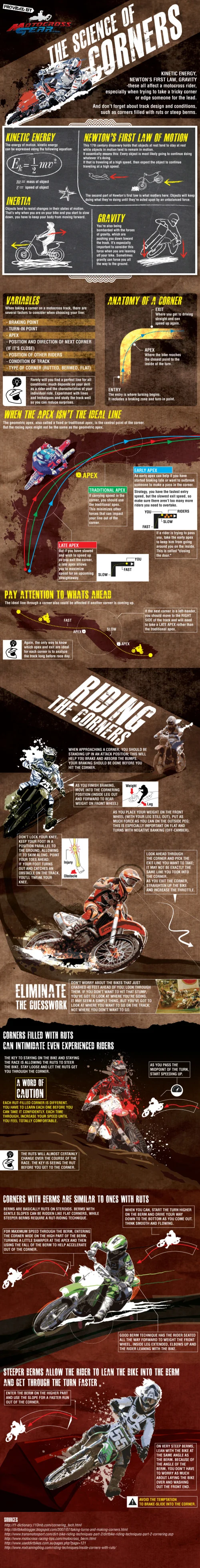
Choosing the Right Line - The Science of Corners
Randy Krum
Nov
9
Nov 9
Car Sizes Through the Years
Randy Krum
Oct
1
Oct 1
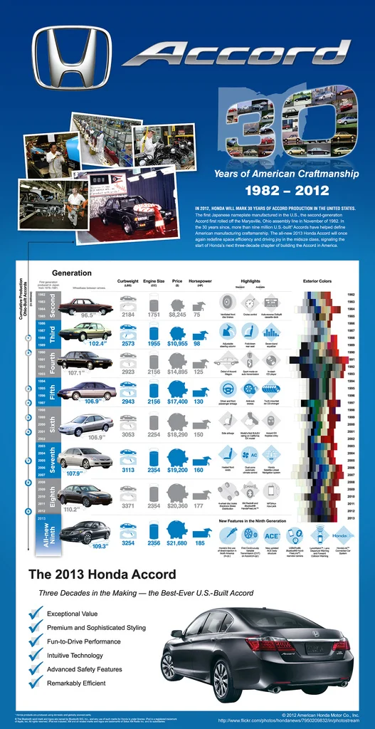
Honda Accord: 30 Years of U.S. Production
Randy Krum
Sep
4
Sep 4
2011 Wisconsin Crash Calendar & Interview
Randy Krum
Jul
31
Jul 31
Evolution of the F1 Car: Video & Infographic
Randy Krum
Jun
18
Jun 18
Client Infographic: U.S. Motorcycle Helmet Laws
Randy Krum
Jun
6
Jun 6
Gymkhana: The Infographic
Randy Krum
Jun
4
Jun 4
Digital Technology in Your Car
Randy Krum
May
25
May 25
NASCAR 101: The Beginner’s Guide to NASCAR
Randy Krum
Apr
9
Apr 9
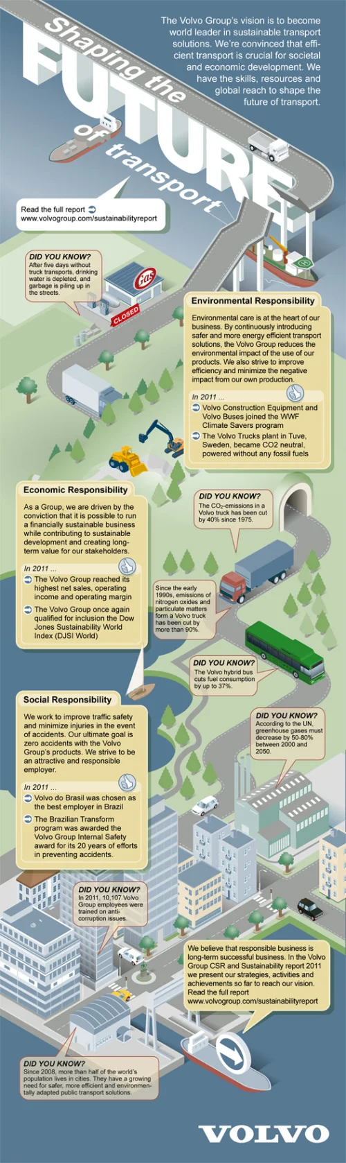
CSR and Sustainability Report: Volvo Shaping the Future of Transport
Randy Krum
Load More