Home
Infographics
Book
Tools
Tools Directory
DataViz Guides
DataViz Shows
Word Clouds
Sankey Diagrams
Online Infographics Design
Online DataViz
Analytics Platforms
Infographic Resumes
Vector Graphics
Icon Libraries
Color Pickers
Presentation Design
JavaScript Charts
Free Stock Images
Jobs
Posters
Links
Appearances
About
Contact
Follow Cool Infographics
Need Infographics?
Randy Krum
Designer | Author | Instructor | Speaker
FREE Sample Chapter
Read More
All tagged
shopping
Apr
7
Apr 7
Women and Fashion In the Digital Age
Randy Krum
Nov
20
Nov 20
The Online Shopping Cart Experience
Randy Krum
Feb
22
Feb 22
Top 250 Internet Retailers Q3 2012 Update
Randy Krum
Oct
31
Oct 31
60th Anniversary of the Bar Code
Randy Krum
Jun
13
Jun 13
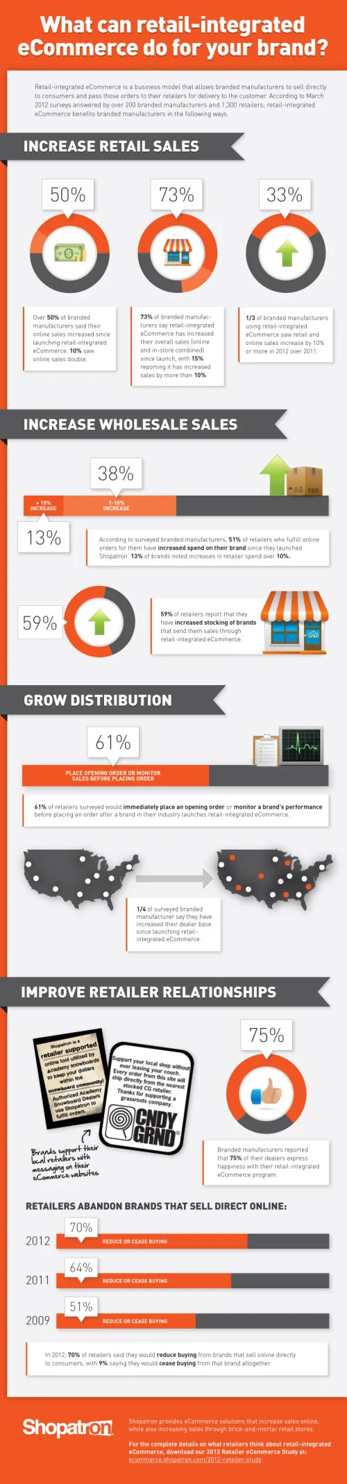
The Value of Retail-Integrated eCommerce
Randy Krum
Nov
22
Nov 22
Crazy for Black Friday Deals
Randy Krum