Home
Infographics
Book
Tools
Tools Directory
DataViz Guides
DataViz Shows
Word Clouds
Sankey Diagrams
Online Infographics Design
Online DataViz
Analytics Platforms
Infographic Resumes
Vector Graphics
Icon Libraries
Color Pickers
Presentation Design
JavaScript Charts
Free Stock Images
Jobs
Posters
Links
Appearances
About
Contact
Follow Cool Infographics
Need Infographics?
Randy Krum
Designer | Author | Instructor | Speaker
FREE Sample Chapter
Read More
All tagged
color
Mar
16
Mar 16
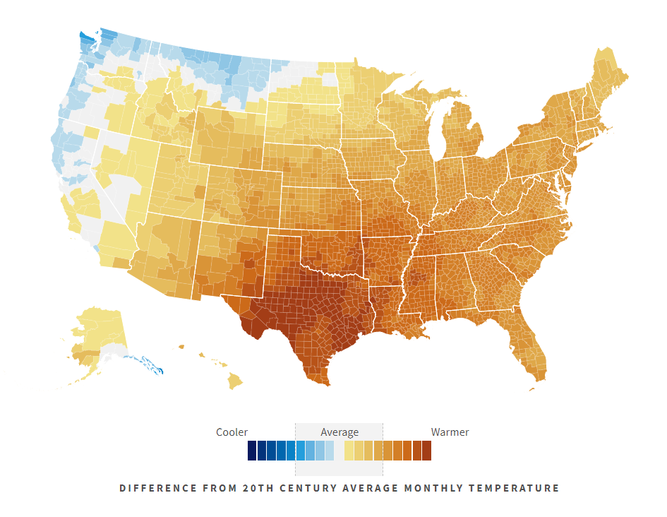
Climate in the United States
Randy Krum
Feb
18
Feb 18
Picular: Google Search for Colors
Randy Krum
Sep
19
Sep 19
40 Facts About the Psychology of Color
Randy Krum
Apr
26
Apr 26
Visualizing Climate Change
Randy Krum
Jan
4
Jan 4
2016 The Year In Colour
Randy Krum
Oct
20
Oct 20
Electrocardiography Basics
Randy Krum
Oct
5
Oct 5
The Top Colors of the Internet
Randy Krum
Jan
27
Jan 27
Color Trends from 2015
Randy Krum
Oct
5
Oct 5
The Power of Visual Branding
Randy Krum
Sep
21
Sep 21
The Art of Color Coordination
Randy Krum
Sep
11
Sep 11
RGB vs CMYK
Randy Krum
Sep
3
Sep 3
The Psychology of Colors in Marketing
Randy Krum
Mar
20
Mar 20
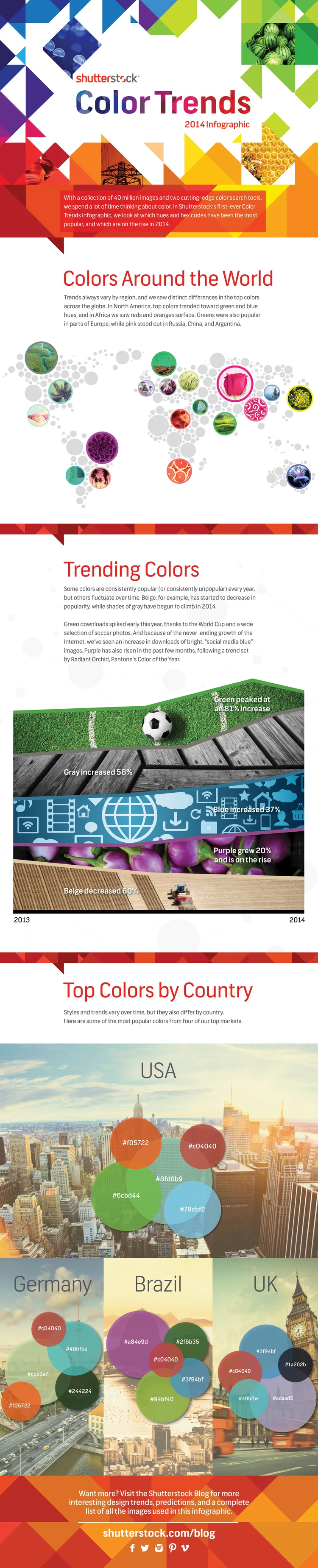
The Top Color Trends of 2014
Randy Krum
Sep
16
Sep 16
Beer Colors
Randy Krum
Jun
27
Jun 27
The Basic Wine Guide
Randy Krum
Apr
11
Apr 11
Color, Value, and Evolution of Logos
Randy Krum
Apr
9
Apr 9
Color: Profiles & Printing Explained
Randy Krum
Jan
13
Jan 13
What Does the Colour of Your Car Say About You?
Randy Krum
Oct
15
Oct 15
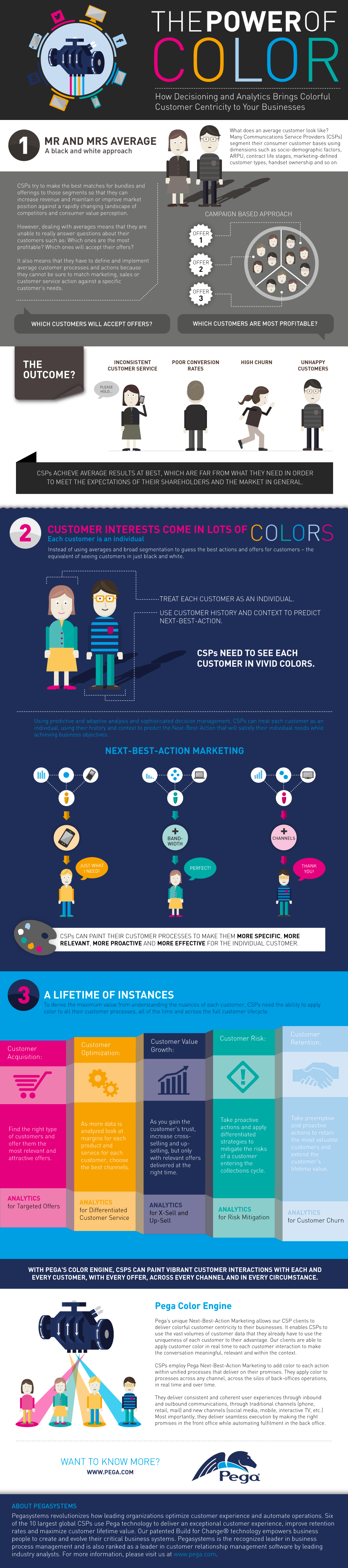
The Power of Colorful Customers
Randy Krum
Oct
7
Oct 7
The Color Emotion Guide
Randy Krum
Load More