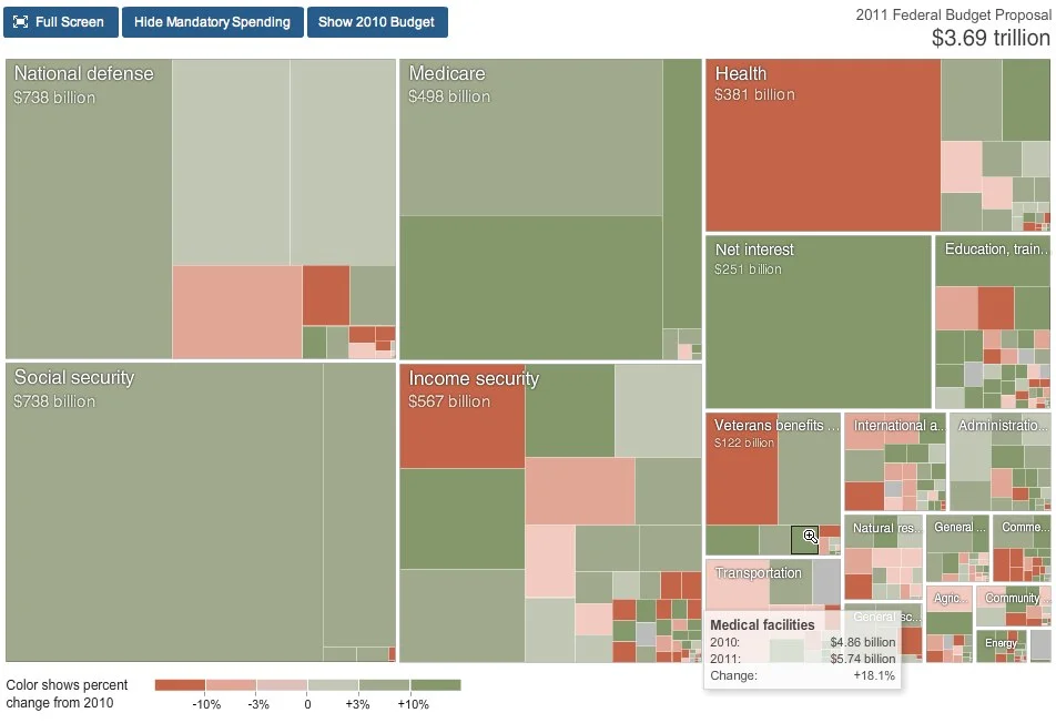
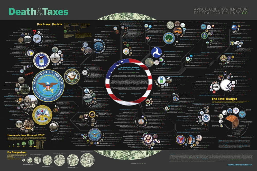
About

Randy Krum infographic designerRandy Krum

President of InfoNewt.
Data Visualization, Infographic Design, Visual Thinking, Product Development and Marketing professional fascinated by good infographics.  Always looking for better ways to get the point across.

Infographic Design


InfoNewt Infographic Design

Search the Cool Infographics site

Custom Search


Subscriptions:


Feedburner

The Cool Infographics Gallery:

How to add the
Cool Infographics button to your:

Cool Infographics iOS icon

- iPhone
- iPad
- iPod Touch


Read on Flipboard for iPad and iPhone

Featured in the Tech & Science category

Flipboard icon

Twitter Feed
Caffeine Poster

The Caffeine Poster infographic

Google Insights

Entries in budget (35)

Monday
Apr082013

Digital Marketing Budgets

Digital Marketing Budgets infographic

The Digital Marketing Budgets infographic from 6smarketing.com is a digital marketing calculator to help businesses determine what they should be allocating marketing in 2012.

Below are statistics 6S Marketing uncovered during research to determine what percentage of marketing budgets organizations are currently allocating towards digital marketing, and what we can expect to see digital marketing budgets to look like in 2012. We’ve also created an infographic to illustrate these, and a digital marketing calculator to help businesses determine what they should be allocating to digital marketing in 2012.

SEO and social media marketing currently make up 70% of online marketing budgets. Overall, 24% of budgets were spent on digital marketing in 2011. Although the percentage of budgets that include online marketing tactics increase every year, 28% of organizations are in the process of moving their marketing budgets to digital channels.

There are some great charts, a great color scheme and really valuable information in this infographic, and I love that they included a number of different chart styles.  However, it stumbles with a number of the data visualizations that don’t match the data.  Accuracy is the most important aspect of infographic design, because when you mess up visualizing the data your overall design loses credibility.

The circular bar chart in the first section has text values of 64%, but the visualization is showing a value close to 85%.  In the Ad Spending grid of 100 Circles, the data shown in text is 20%, but only 8% is colored red in the data visualization.  In the final Mobile Ad Spending circular bar chart at the end of the infographic, I can’t see any correlation between the numbers and the chart.

Found on imediaconnections.com!

Friday
Nov042011

Death & Taxes 2012 (Q&A with Jess Bachman) - Poster Giveaway! #deathandtaxes

The new 2012 Death & Taxes poster has been released, and this year it’s better than ever.  Designed by Jess Bachman (ByJess.net) this poster visualizes the 2012 proposed U.S. Federal Budget.  The Death & Taxes poster is one of the best infographics I’ve ever seen, and it gets better every year.

Death and Taxes” is a large representational graph and poster of the federal budget. It contains over 500 programs and departments and almost every program that receives over 200 million dollars annually. The data is straight from the president’s 2012 budget request and will be debated, amended, and approved by Congress to begin the fiscal year. All of the item circles are proportional in size to their funding levels for visual comparison and the percentage change from both 2012 and 2002 is included so you can spot trends.

PURCHASE: This year, Jess also had the opportunity to partner with Seth Godin and his Domino Project to make the full-size 24” x 36” poster available for purchase through Amazon.  Currently, you can purchase a copy of the poster for $19.99.  Also, check out Jess’s video introduction on the Amazon page.

POSTER GIVEAWAY: Cool Infographics is giving away one FREE copy of the poster.  The free poster will go to one randomly chosen person that tweets a link to this blog post on Twitter and includes the hashtag: #deathandtaxes.  I included the hashtag in the post title, so any retweets will be automatically eligible.  NOTE: you must also be following me on Twitter (@rtkrum) so that I can send you a direct message if you have won!

I will choose the winner at 12 noon (Central Time) on Friday, November 11, 2011 (11/11/11).  I will contact the winner, and order the poster from Amazon to be delivered to the winner.

INTERVIEW: Similar to last year, Jess was willing to answer some behind-the-scenes questions about this year’s poster:

Cool Infographics: What’s the most interesting thing you learned from the 2012 data?

Jess Bachman: Lots of reductions in the military side.  It’s mostly from the OCO war funding, but its interesting to see what actually is getting cut the most.  Mostly Army funding and RDT&E across the board.  I would think the OCO was mostly Operations and Procurement.

Cool Infographics:  Has you design process changed at all this year?  What software did you use to help dig through the data and create the design?

Jess Bachman:  Well this year I tried to work exclusively within the official spreadsheets, rather than pick out the numbers from the paper (PDF) budget.  I think it’s more accurate and easier to get totals.  Mainly just used excel and photoshop as always.

Cool Infographics:  When did the 2012 data become available, and how long did it take you create this year’s poster?

Jess Bachman:  It was supposed to be released in February but it was a month late.  I started moving on it at a full clip then got involved with Amazon/Godin and the timelines shifted quite a bit, so while I usually get the post out in April, it was released in September this year.

Cool Infographics:  How did working with Seth Godin and the Domino project come about?

Jess Bachman:  Seth just emailed me out of the blue.  We talked and it seemed like a no-brainer.

Cool Infographics:  How does working with Amazon and the Domino project change how you print and distribute the poster?

Jess Bachman:  Well previously my Mom did most of the shipper and I also had a 3rd party do fulfillment and shipping.  It’s a rather time consuming and frustrating process.  Sending out orders, doing customer support, paying vendors, etc.  Now it’s all in Amazon’s hands.  They got it printed and of course are warehousing and shipping it too.  I’m quite glad as they do a much better job of shipping than I do.  Of course they also take their cut of the profits.  As for Domino, they have their own distribution channels and lists and also work closely with Amazon to make sure the product page is well presented too.  This year it reached #18 on the best sellers list.  I guess that makes me a best selling author.  I don’t think I could have accomplished that without Domino/Amazon.

Cool Infographics:  I see you made a video to include on the Amazon page, how was that experience?

Jess Bachman:  Seth told me they needed a video ASAP so I just made one that afternoon.  I suppose I would put more effort into it next year but videos help sell products and i think it does a good job of that.

Cool Infographics:  Any new design features added to the poster this year?

Jess Bachman:  I wanted to include some non-governmental items in the poster this year for reference.  They are in the bottom left and include things like the size of the video game industry, bill gate’s net worth and other such things.  When talking about billions of dollars all the time, sometimes you need to get out of government-mode to put those figures into further context.

Cool Infographics:  The past posters have been shared very heavily in social media, which social sharing sites have you found most successful?

Jess Bachman:  Well, Digg has traditionally been a big asset, but then Digg fell apart so I no longer pay attention to it.  In general, I have abandoned the traditional accelerants like Digg, reddit, etc. and instead focus on my network of bloggers and influencers. Combine that with Facebook liking and you can really spread something.

Cool Infographics:  Last year we talked about some favorite places that have the poster on display.  Any new ones this year?

Jess Bachman:  Well, with a larger audience and hopefully more sales, the poster will be everywhere.  Unfortunately, I get lots of requests for discounts for schools with tight budgets, but I have no control over price anymore.  I can say that an iOS app is in development so that will be interesting.  My ultimate goal is to get on the Daily Show to talk about the poster in April.  People constantly tell me I need to be on there, and I’m a huge fan, so I figure I have a good shot, just need to nag the right people.

You can follow Jess on Twitter (@mibi)

Here you can see the poster up close with the Closr.it zooming viewer.  I believe this is Flash based, so it may not work on iDevices.


Monday
Aug082011

Visualizing the U.S. Debt

The U.S. Debt Visualized is a great visualization of scale, and can be found at usdebt.kleptocracy.us, where you start with a single $100 bill, and start stacking them in orders of magnitude.  Stack them on pallets, start stacking the pallets and show them in comparison to other real-world items.

$114,500,000,000,000. - US unfunded liabilities
To the right you can see the pillar of cold hard $100 bills that dwarfs the
WTC & Empire State Building - both at one point world’s tallest buildings.
If you look carefully you can see the Statue of Liberty.

Numbers this large become too big to truly comprehend to many people, and I love visualizations like this one that put the unbelievable high numbers into context and scale.  Here’s one trillion dollars:

A visualization like this has a natural bias.  Whatever object the designer chooses to show in relation to the stack of bills can make the pile appear large or small in comparison.  In this example, the piles of money are truly staggering, but that’s all the reader can walk away with.  In it’s defense, this visualization isn’t trying to propose a solution, it’s just trying to make the viewer understand how big the number is.

Found on SeeWhatYouMean, VizWorld, Business Insider and Information Aesthetics.

Friday
Feb182011

The 2011 Massachusetts Budget infographic poster

Jess Bachman, from ByJess.net,  has designed this new government budget poster of the 2011 Massachusetts Budget for The Pioneer Institute.

The most largest and most detailed visualization of a state budget ever, this 864 sq in poster (not for sale) compares hundreds of programs and expenditures from the billions down to the thousands of dollars.  If you really want to see how a state (like Massachusetts) spends it’s tax payers money, this is it.

The above graphic is a massive visual guide to the Massachsettes state budget. It presents hundreds of government departments, agencies, and programs in a visual format, proportionate in size to their funding level. The largest item is $15 billion, the smallest is $65 thousand.

Similar to his Death & Taxes poster of the Federal budget, the Massachusetts Budget poster is highly detailed, showing how spending for every department is broken down.


Although it’s not clear if The Pioneer Institute will make posters available for purchase, you can see the full detail online in this high-definition zoomable image.  (Check it out full-screen too!)


Wednesday
Apr282010

Jess Bachman Interview (Death & Taxes 2011 Poster Giveaway!!)  #deathandtaxes

Last week, Jess Bachman (@mibi) from WallStats.com released the new 2011 Death & Taxes poster.  I caught up with Jess (by email) to ask some questions about his huge infographic undertaking.  The high-resolution image of the poster is available now online, and the printed version will start shipping on May 7th.  You can pre-order for $24, and the shipping cost is only $0.75 TODAY (April 28th)

WIN a copy of the poster!  Jess has been kind enough to offer a free poster to a reader of Cool Infographics.  To be eligible, you must tweet (or retweet) a link to this post on Twitter before May 7th, and include the #deathandtaxes hashtag.  I included the hashtag in the post title, so any retweets will be automatically eligible.  NOTE: you must also be following me on Twitter (@rtkrum) so that I can send you a DM if you have won!

Death and Taxes” is a large representational graph and poster of the federal budget. It contains over 500 programs and departments and almost every program that receives over 200 million dollars annually. The data is straight from the president’s 2011 budget request and will be debated, amended, and approved by Congress to begin the fiscal year. All of the item circles are proportional in size to their funding levels for visual comparison and the percentage change from both 2010 and 2001 is included so you can spot trends.

The detail in this poster is stunning, and in this small shot you can see how the total budget request breaks out. Only the “Military/Nat. Security Discretionary” and “Non-Military/Nat. Security Discretionary” portions of the budget request details are displayed in the poster.


Jess was also nice enough to answer a few interview questions I sent him:

Cool Infographics: What software applications do you use for the Death & Taxes posters?

Jess Bachman: The only applications I use are Photoshop and Excel.  Excel is where I in put all the data and it crunches the numbers, adjusts for inflation and calculates diameters.  Photoshop is where I put it all together and the PSD file occasionally exceeds 1 gig so it can be a beast to work with.  Saving takes about 5 minutes.

Cool Infographics: What’s your design process?

Jess Bachman: Normally I start from scratch and layout the images and make them fit; however, this year the budget didn’t change all that much, likely being from the same President, so I was able to keep the 2010 format and change the size of circles.  Of course some things had to be added and removed.  So this year I saved myself about 3 weeks of work just getting right into it, but the design process is grueling.  it’s small tasks, repeated 500 times.

Cool Infographics: What’s the most interesting thing you learned from the data?

Jess Bachman: I can definitely see the differences in Presidents from Bush to Obama.  Lots of reductions on the military side this year and the whole security climate as a whole isn’t as fiscally robust as it was a few years ago.  Much more progressive funding with Obama too.  Every year Bush would cut climate change research, now its back, along with other green tech.  For some reason, public proadcasting gets the hack saw every year no matter who’s in office.

Cool Infographics: Where are some of your favorite places that have the Death & Taxes poster on display?

Jess Bachman: Well it’s always good to see it on display in schools and classrooms.  But I really enjoy hearing from military members who have in their offices or even in station.  I have sent several to Afghanistan.  Critics often say the poster is anti-military, but the military is quite receptive to it, even the former Dept. of Defense Comptroller, Tina Jonas, loved the poster.  Some people from the Dept of Energy’s Oak Ridge Lab displayed the poster on their 30’ Everest computer screen… that was cool too.

Cool Infographics: What’s the hardest part when developing the poster?

Jess Bachman: The hardest part is just getting through all the rote data processing and mindless photoshopping.  The research side is quite fun, and going through the military budgets is a trip with all their classified and hi-tech programs. However, copying and pasting 5,000 times really takes a toll on my creativity and motivation.

Cool Infographics: You said you do a lot of copy & paste work, in what format do you get the data?

Jess Bachman: Some of the government data is in Excel already, but there is no context so I am dubious about working solely with their data sets.  Mostly I pull the numbers from the actual printed budget, which is in PDF form.  So I end up copying and pasting the program name and its funding level for 3 years into Excel, then I copy and paste the program name, funding level, and percentages back into photoshop as a text layer.  Rinse and repeat 500 times.  Many people ask if there was an automated way to create the poster each year and I wish there was, but the confines of the paper make size and fit a manual process.

Cool Infographics: Where do you have them printed, what are the printing specs and why?

Jess Bachman: I get my posters printed from a company called PrintPelican in Florida.  There really are no cheaper prices out there but I opt for a thicker cut of paper than usual.  I get 100# gloss cover which is a few shades from a business card in thickness.  To be honest, they have screwed up my order a few times over the years but we have always managed to work it out.  I usually print runs of 1000-2500 and always 24” x 36”.

Cool Infographics: How do you handle all of the printing and shipping of the posters?  Do you tube them yourself?

Jess Bachman: I used to do it all myself.  I had a 400lb brick of posters next to my bed, and 12 giant boxes of tubes all over the house, and I would roll pack and ship them all.  Now I use two shippers who do fulfillment of the orders for me.  For a while I would send them the orders and addresses weekly but I have offloaded that duty as well.  I think the self shipping method is a good lesson in customer service and its good to know your product inside and out, but after while my time became more valuable than stuffing tubes could afford.

Cool Infographics: You’ve used a few different online zoomable image services in the last few years, what have you learned?

Jess Bachman: There are lots of zooming options out there and new ones seem to pop up all the time.   I used Zoomify until it felt too clunky and slow, then Zoomorama which I really loved for its performance and options.  This year I experimented with an self hosted open source app called Open Zoom and it certainly was a slick and great user experience, unfortunately the demands it placed on my server from huge inflows of traffic proved too much, taking down the whole site.  So I had to switch to my backup, which was Closr.it, and let them deal with server demands.  Closr.it has been very attentive to my needs and I have found that most developers will work with me to tailor a custom solution if I ask.  The zooming apps keep getting better so I expect to keep changing apps as long as the space keeps innovating.

Cool Infographics: You mentioned the 30’ display, have you printed it out in larger sizes?

Jess Bachman: No, I have not printed it out any larger.  The file being Photoshop, and the images being mostly rastered do not allow quality printing beyond the poster size.  The file is 300 dpi so I could get away with a slightly larger size, but oversize printing is expensive and who wants a poster that big anyways. 

Cool Infographics: Where do the images come from?

Jess Bachman: Most of the military images come from defenseLINK, which is a great repository for hi-res military photos.  Other images come from stock photography sites for the most part.  It does help that most government logos are round.  I suppose it’s just an old school way of doing things, government seals and all.  The design aesthetic amongst government logos is really all over the map though, and its quite interesting.  Some look like that are from the 1700’s, and some from the 2700’s.

 There was one correction to the online version that Jess has posted:

So I totally had the wrong data for NASA on the visual. Here is the corrected image, which reflects what you have been reading in the news. Science up, space down. I fixed it before it was printed, don’t worry.

You can view the image, buy the poster and more at the new site DeathandTaxesPoster.com.

SPECIAL: If you pre-order the poster TODAY (April 28th) shipping is only $0.75!

Tuesday
Mar092010

BBC Budget Treemap Infographic

David McCandless, from Information Is Beautiful created this treemap of selected highlights from the BBC budget for the Guardian Datablog.

Recent controversy about the budget of the BBC here in the UK made me curious about its spending. Here’s the BBC-o-Gram, a visualization I created for the Guardian Datablog, exploring the costs of running one of the biggest broadcasters in the world.

David has also posted the underlying data in a GoogleDocs spreadsheet.

Wednesday
Feb242010

NASA's budget timeline [infographic]


Another great timeline of NASA’s budget every year from 1958 through 2015 in Obama’s new budget proposal that cuts NASA funding.  This one designed by Robin Richards (ripetungi) for an article in U.S. Infrastructure magazine.

Looking at every budget throughout the history of NASA, comparing this with its space missions for that year.

You can see Robin’s site and follow him on Twitter.

Friday
Feb192010

NASA's New Budget [infographic]

GOOD has a good timeline of NASA’s budget over the last 50 years.

The Obama administration announced a new budget for NASA, which despite a nominal increase, cuts future programs and the prospect of more space exploration. This is a look at NASA’s budget over time, and the major missions it accomplished with that budget.

A collaboration between GOOD and 
Karlssonwilker.

Although, since the timeline wraps like text to keep it on one page, I think the bars that represent the different programs should stay in the same order.  And what’s with the flashing images when you view the large infographic?

Monday
Feb082010

Obama's 2011 Budget Proposal Infographic

From NYTines.com, a treemap of Obama’s Budget Proposal color coded for increases and decreases from the prior year.

Rectangles in the chart are sized according to the amount of spending for that category. Color shows the change in spending from 2010.

Red indicates budget cuts, and green indicates increases in spending.  It’s a little bit interactive, allowing you to zoom into specific parts of the budget, and see detials by hovering the mouse over squares.

Designed by Shan Carter and Amanda Cox.

Found on FlowingData.

Monday
Oct052009

The Billion Dollar Gram


This is one of those simple, but great infographics.  Once the news starts talking about "billions" of dollars, the brain goes numb and it all runs together because the numbers are too big for us to comprehend.

David McCandless, from Information Is Beautiful, created this tree map to show the relative size of the different billion dollar spending and budgets in the news.

Great job David, keep them coming!