About

Randy Krum

Product Development, Marketing, Visual Thinking and Data Visualization professional fascinated by good infographics.  Always looking for better ways to get the point across.


RandyKrum.com

Infographic Design


Subscriptions:


How to add the
Cool Infographics button to your:

- iPhone
- iPad
- iPod Touch


Subscribe on your Amazon Kindle:

Follow Me!


Follow Randy (@rtkrum) 

Blog posts ONLY on Twitter

Twitter List: Cool Infographics People

Search Cool Infographics
From the Bookstore

American Presidency Poster

Caffeine Poster

Gadget Map

Cool Ads

Your Pictures Into Posters, Overnight


WallStats Poster

Infographics Carousel
Thanks to...
Powered by Squarespace


« Infographic Airplane! from Kulula Airlines | Main | The Scale of the Universe »
Monday
Feb082010

Obama's 2011 Budget Proposal Infographic

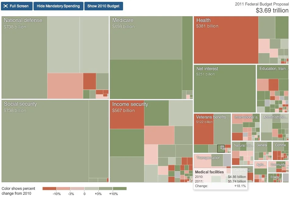
From NYTines.com, a treemap of Obama’s Budget Proposal color coded for increases and decreases from the prior year.

Rectangles in the chart are sized according to the amount of spending for that category. Color shows the change in spending from 2010.

Red indicates budget cuts, and green indicates increases in spending.  It’s a little bit interactive, allowing you to zoom into specific parts of the budget, and see detials by hovering the mouse over squares.

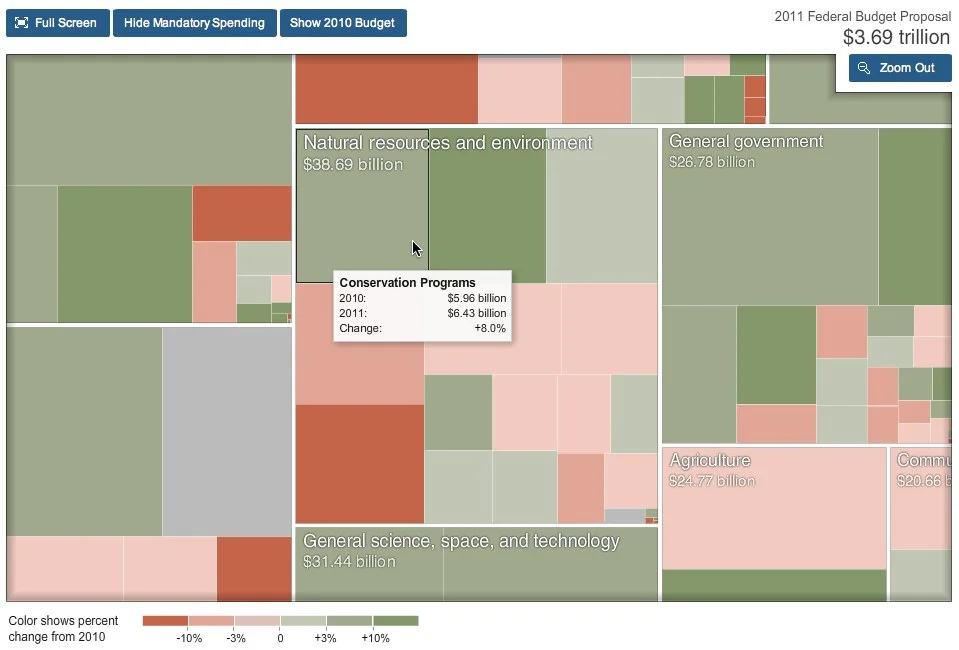
Designed by Shan Carter and Amanda Cox.

Found on FlowingData.

PrintView Printer Friendly Version

EmailEmail Article to Friend

Reader Comments

There are no comments for this journal entry. To create a new comment, use the form below.

PostPost a New Comment

Enter your information below to add a new comment.

My response is on my own website »
Author Email (optional):
Author URL (optional):
Post:
 
Some HTML allowed: <a href="" title=""> <abbr title=""> <acronym title=""> <b> <blockquote cite=""> <code> <em> <i> <strike> <strong>