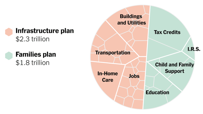
President Biden’s $4 Trillion Economic Plan, in One Chart
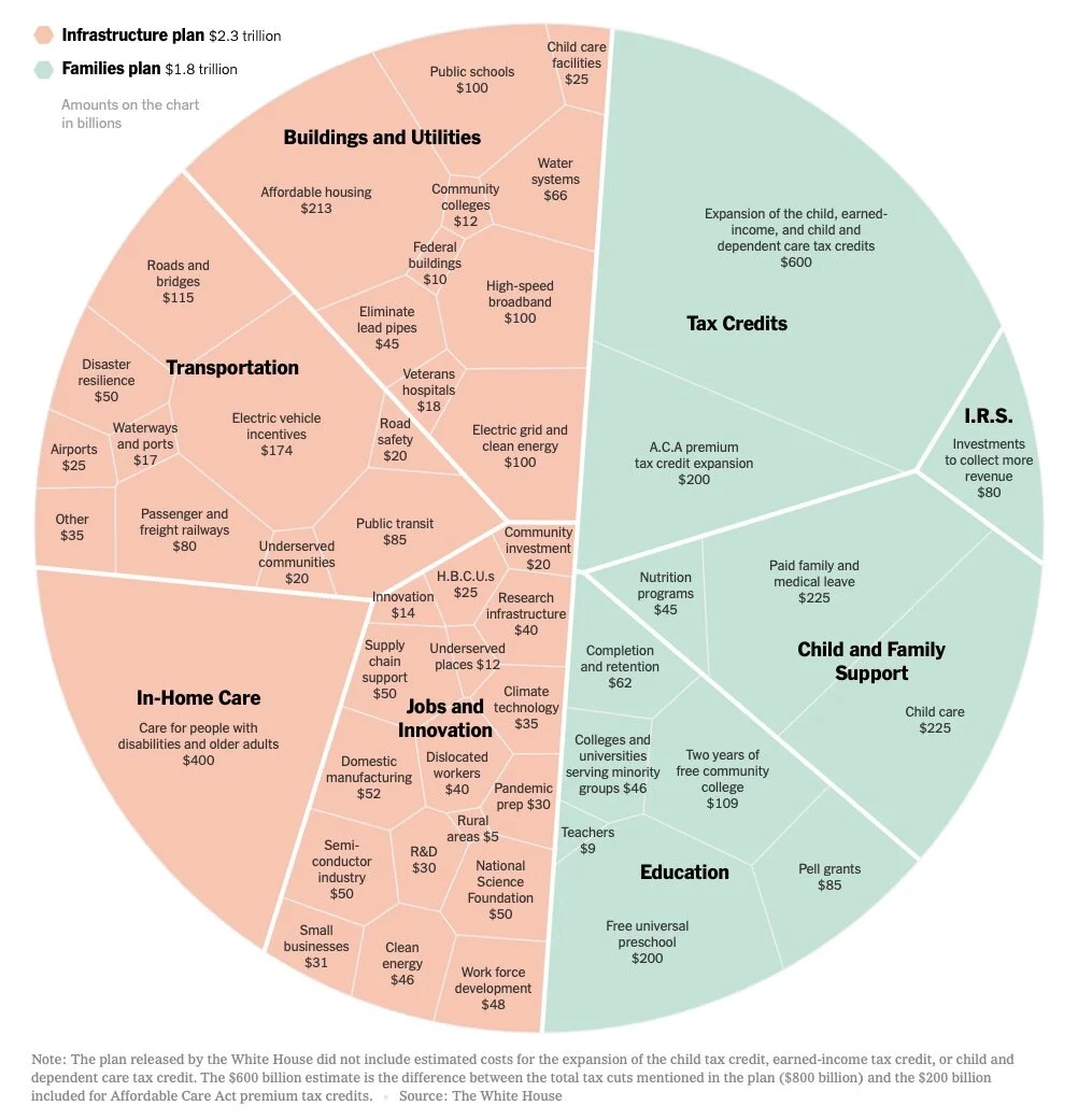
The Upshot team at the NY Times designed this data visualization of President Biden’s $4 Trillion Economic Plan, in One Chart.
On one hand, I love this. This is called a Voronoi Treemap, which we don’t see used very often.
The area of each segment is proportionally sized to match the dollar amount, and the total circle adds up to the total of $4 Billion.
It’s a hierarchical structure: Total Circle > 2 major portions > Major categories > Minor segments
The size of each level of the hierarchy conveys meaning, and they are further broken down into smaller segments
On the other hand, this type of data visualization may be too advanced for many readers.
This is NOT a pie chart. Many of the less data-savvy readers will immediately try to read this like a pie chart.
The odd shapes of each section can be confusing
It’s very hard to compare any two segments that are not adjacent. Which is bigger, Transportation or Child and Family Support?
The two major portions are close to 50/50, but aren’t. They are 56/44, so the major dividing line is slightly off center, but many will assume it’s a center split.
One of the nice things about this design, is that they were able to simplify the data that was being displayed to create a thumbnail version for sharing on social media. This version is still true to the data, but doesn’t show the data values for the lowest level of the hierarchy.