About

Randy Krum

President of InfoNewt.
Data Visualization, Infographic Design, Visual Thinking, Product Development and Marketing professional fascinated by good infographics.  Always looking for better ways to get the point across.


Like us on Facebook to help spread the word!

Click +1 to give us your stamp of approval or just to say “this is pretty cool.”

Infographic Design


Search the Cool Infographics site

Custom Search

Subscriptions:


How to add the
Cool Infographics button to your:

- iPhone
- iPad
- iPod Touch


Read on Flipboard for iPad and iPhone

Featured in the Tech & Science category

The Cool Infographics Gallery on Pinterest

Follow Me!


Follow Randy (@rtkrum) 

Blog posts ONLY on Twitter

Twitter List: Cool Infographics People

Follow Me on Pinterest

Twitter Feed
Caffeine Poster

Gadget Map

Google Insights

« The Visual History of the Political Parties (infographic posters) | Main | Hop On, Hop Off The Jefferson Airplane »
Monday
Feb142011

The (visual) Anatomy of an Apple Email


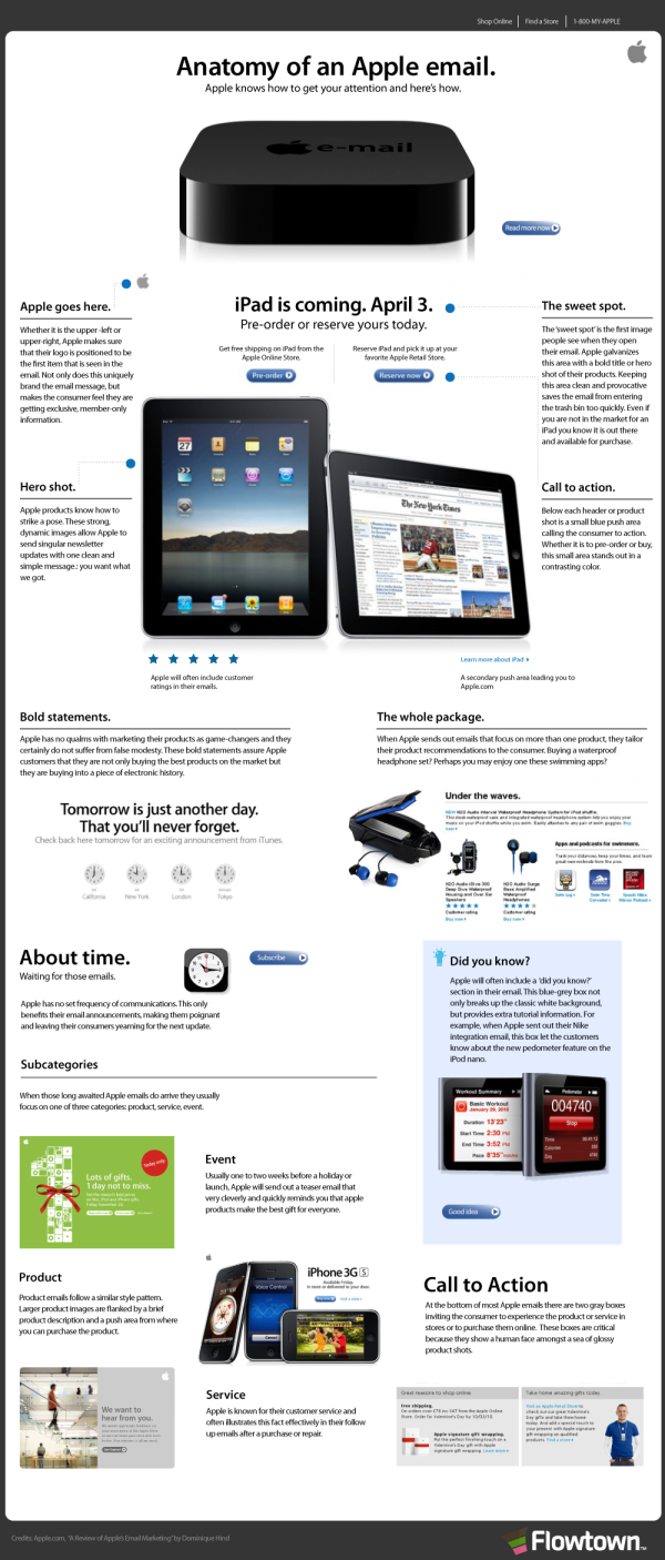
You know how unique Apple emails are when they show up in your Inbox.  The Anatomy of an Apple Email, from Flowtown, does a great job of visually explaining the layout and elements in an infographic with the look and feel of an Apple email.

The emails sent by Apple to consumers are riddled with trademark characteristics, including multiple ‘Calls To Action,’ as well as the beloved ‘Hero Shot.’ Here is a breakdown of each of these characteristics and a summary of their general purpose.

Found on Social Media Graphics

PrintView Printer Friendly Version

EmailEmail Article to Friend