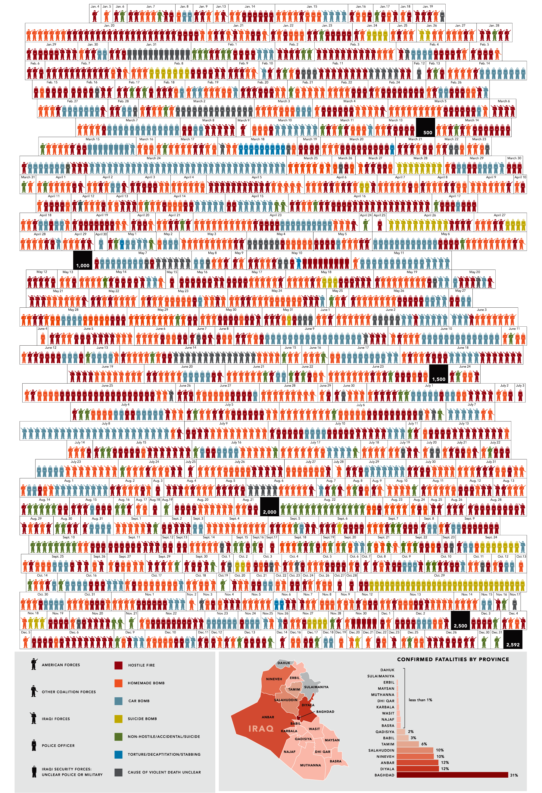
31 Days in Iraq
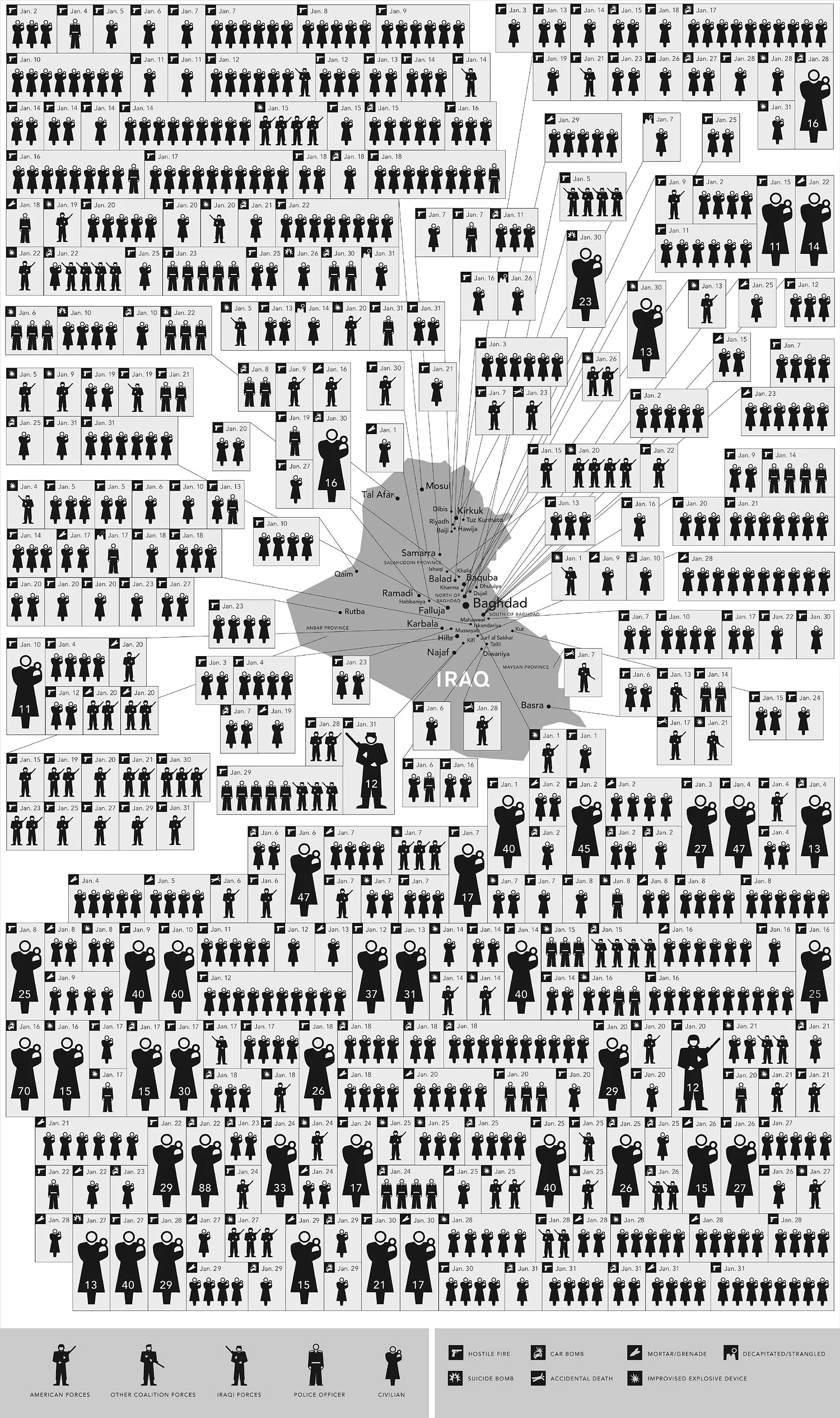
This map of Iraq from the NYTimes.com visually shows the over 1,900 people killed in Iraq during the month of January 2007.
"The map, based on data from the American, British and Iraqi governments and from news reports, shows the dates, locations and circumstances of deaths."
The number has doubled since they did this for January 2006 which had around 800 deaths. Each figure represents an individual of the American forces, coalition forces, Iraqi forces, police officers or civilian death. The larger figures have numbers showing how many people they represent (which I think diminishes the visual impact). A smaller icon shows the cause of death. All the figures are connected to a location in the country.
I would have added some color coding too, but I'm guessing the NY Times had to keep it in black & white to print it in the newspaper.