Home
Infographics
Book
Tools
Tools Directory
DataViz Guides
DataViz Shows
Word Clouds
Sankey Diagrams
Online Infographics Design
Online DataViz
Analytics Platforms
Infographic Resumes
Vector Graphics
Icon Libraries
Color Pickers
Presentation Design
JavaScript Charts
Free Stock Images
Jobs
Posters
Links
Appearances
About
Contact
Follow Cool Infographics
Need Infographics?
Randy Krum
Designer | Author | Instructor | Speaker
FREE Sample Chapter
Read More
All tagged
war
May
27
May 27
The Fallen of World War II
Randy Krum
May
30
May 30
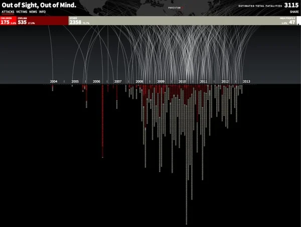
Drones Kill - Animated, Interactive Visualization
Randy Krum
Sep
12
Sep 12
Client Infographic: Sudan, Bombing Everything That Moves
Randy Krum
Jun
23
Jun 23
Stuxnet: Anatomy of a Computer Virus [video]
Randy Krum
May
30
May 30
The History of Memorial Day #infographic
Randy Krum
Feb
15
Feb 15
The Browser Wars Infographic
Randy Krum
Dec
12
Dec 12
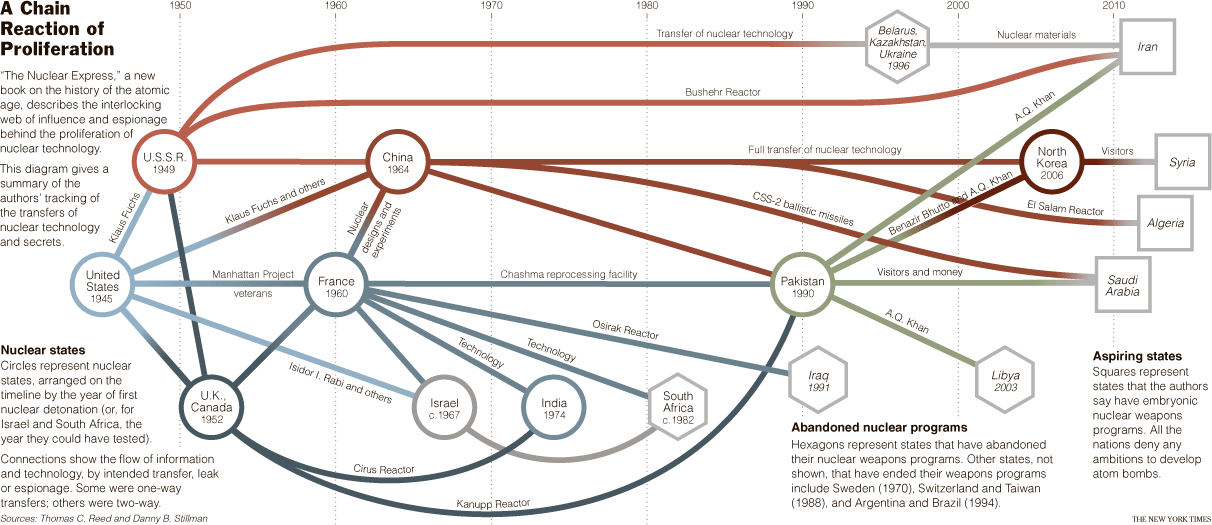
The Nuclear Express
Randy Krum
Dec
8
Dec 8
The Hidden Cost of War
Randy Krum
Jul
4
Jul 4
U.S. Flag Infographic
Randy Krum
Apr
2
Apr 2
Star Wars Toy Collection
Randy Krum
Mar
19
Mar 19
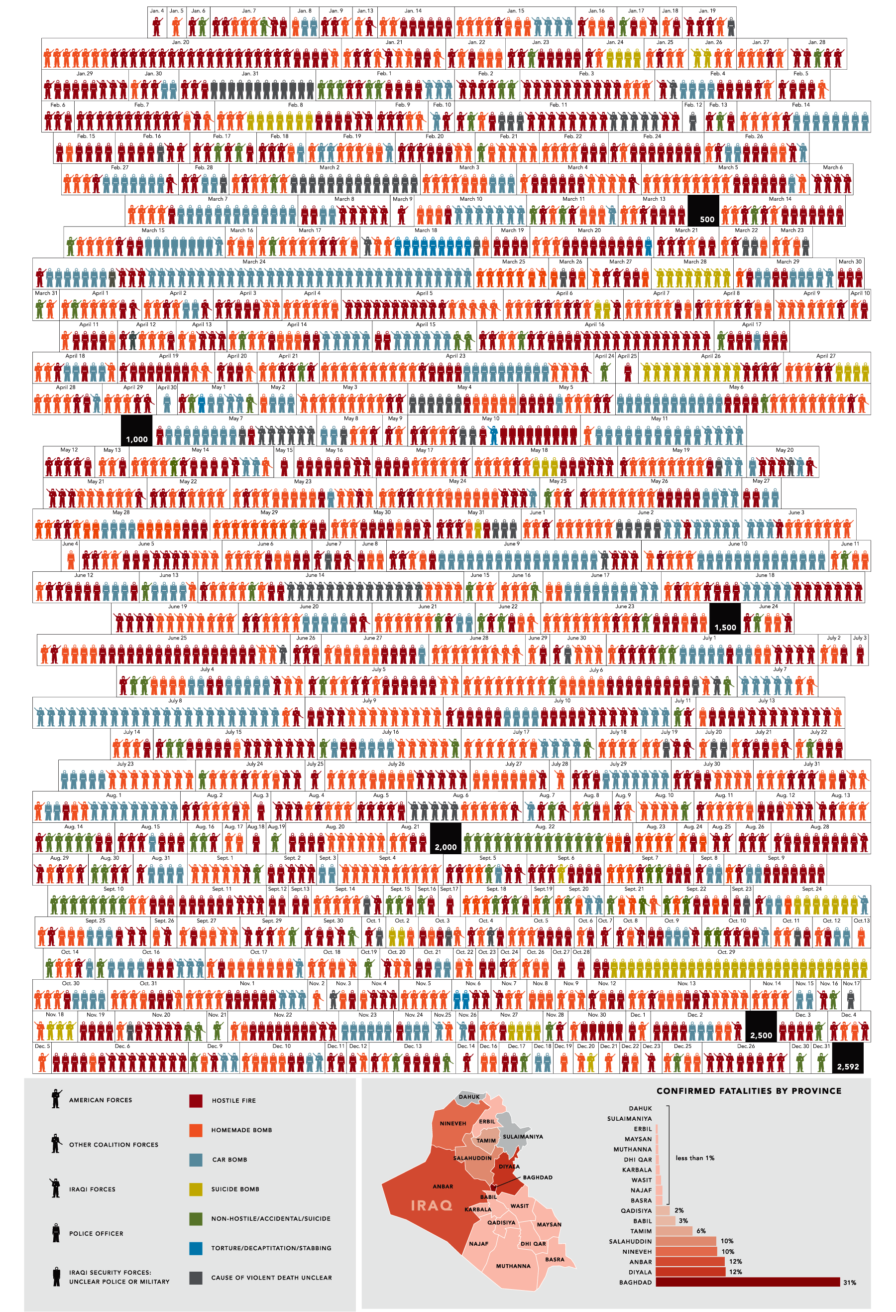
Iraq by the Numbers
Randy Krum
Feb
26
Feb 26
Infographics for Advocacy
Randy Krum
Feb
15
Feb 15
5,000 years of Faith
Randy Krum
Feb
4
Feb 4
Who has the Nuclear Weapons?
Randy Krum
Jan
8
Jan 8
One Year in Iraq
Randy Krum
Jan
7
Jan 7
The Software Wars
Randy Krum
Sep
24
Sep 24
31 Days in Iraq
Randy Krum


![Stuxnet: Anatomy of a Computer Virus [video]](https://images.squarespace-cdn.com/content/v1/5bfc8dbab40b9d7dd9054f41/1552606954192-3PTOIS6H0BIUPGTXH4S5/Screen+Shot+2019-03-14+at+5.41.03+PM.png)