Home
Infographics
Book
Tools
Tools Directory
DataViz Guides
DataViz Shows
Word Clouds
Sankey Diagrams
Online Infographics Design
Online DataViz
Analytics Platforms
Infographic Resumes
Vector Graphics
Icon Libraries
Color Pickers
Presentation Design
JavaScript Charts
Free Stock Images
Jobs
Posters
Links
Appearances
About
Contact
Follow Cool Infographics
Need Infographics?
Randy Krum
Designer | Author | Instructor | Speaker
FREE Sample Chapter
Read More
All tagged
visual
Oct
24
Oct 24
Annular Eclipse
Randy Krum
Apr
19
Apr 19
Electrifying Rhythms in Plant Cells
Randy Krum
Mar
23
Mar 23
12 Running Shoe Lacing Techniques
Randy Krum
Feb
17
Feb 17
Seven Summits
Randy Krum
Aug
31
Aug 31
The Best Way to Ice Drinks in a Cooler
Randy Krum
Aug
19
Aug 19
Figures in the Sky: Constellations Around the World
Randy Krum
Mar
3
Mar 3
Beards and Face Masks from the CDC
Randy Krum
Nov
25
Nov 25
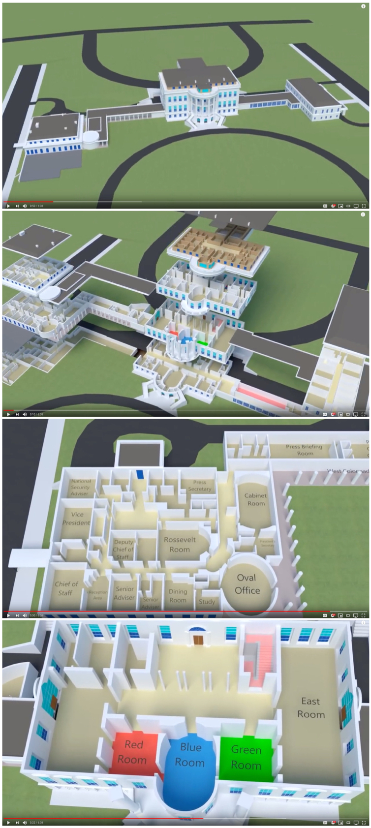
What's Inside the White House?
Randy Krum
Feb
25
Feb 25
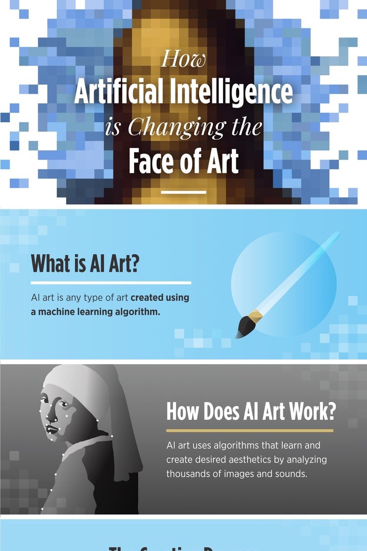
How Artificial Intelligence Is Changing Art
Randy Krum
Feb
13
Feb 13
Can I Use that Picture?
Randy Krum
Jul
6
Jul 6
The Ultimate Hot Dog Style Guide
Randy Krum
Feb
27
Feb 27
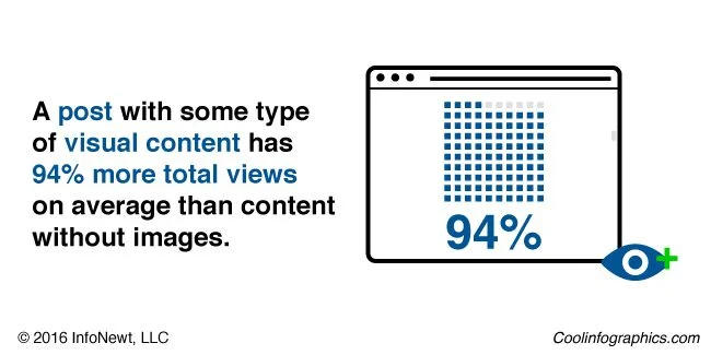
Using Visuals to Enhance Your Credibility
Randy Krum
Feb
17
Feb 17
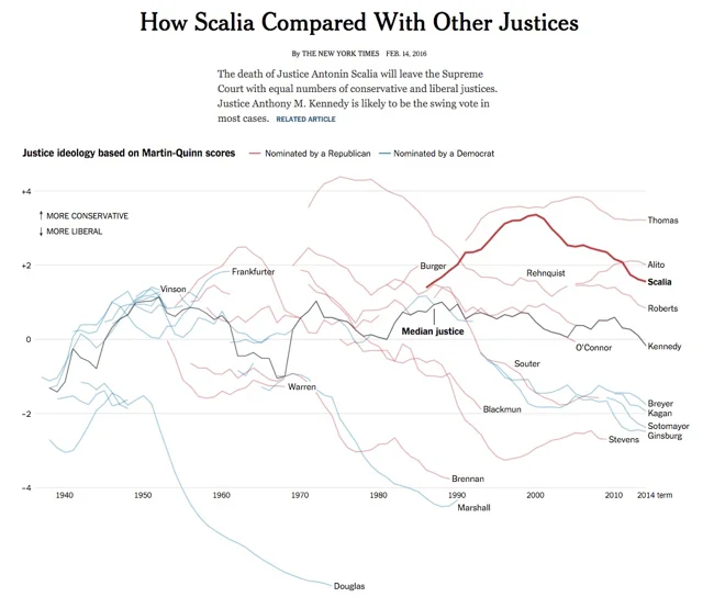
Great DataViz Design: Justice Scalia's Ideology
Randy Krum
Sep
2
Sep 2
The Science of Instagram
Randy Krum
Sep
1
Sep 1
How to Think Visually
Randy Krum
Aug
21
Aug 21
Visual Storytelling: The Big Trend for SXSW 2016
Randy Krum
Jul
14
Jul 14
Pro Tips to Track Results from Infographics
Randy Krum
Feb
3
Feb 3
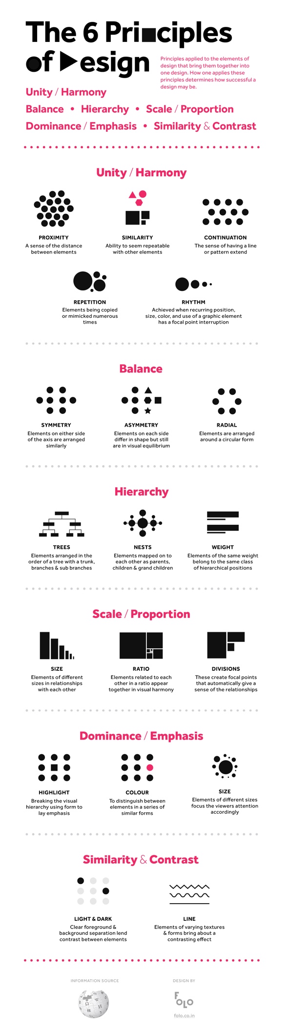
The 6 Principles of Design
Randy Krum
Dec
22
Dec 22
5 Ways to Market Yourself Visually
Randy Krum
Sep
17
Sep 17
The Evolution of iOS from iOS 1 - iOS 8
Randy Krum
Load More