Home
Infographics
Book
Tools
Tools Directory
DataViz Guides
DataViz Shows
Word Clouds
Sankey Diagrams
Online Infographics Design
Online DataViz
Analytics Platforms
Infographic Resumes
Vector Graphics
Icon Libraries
Color Pickers
Presentation Design
JavaScript Charts
Free Stock Images
Jobs
Posters
Links
Appearances
About
Contact
Follow Cool Infographics
Need Infographics?
Randy Krum
Designer | Author | Instructor | Speaker
FREE Sample Chapter
Read More
All tagged
politics
Jan
16
Jan 16
2024 US Presidential Election Eclipse
Randy Krum
Feb
19
Feb 19
America’s Immigration Crisis sankey diagram
Randy Krum
Jan
25
Jan 25
What Redistricting Looks Like in Every State
Randy Krum
Feb
22
Feb 22
Making America Smarter, Stronger, and Younger
Randy Krum
Sep
4
Sep 4
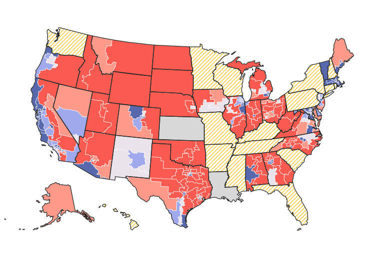
Extremely Detailed 2016 Election Map
Randy Krum
Jul
20
Jul 20
The UK's Brexit Options in the EuroZone Visualized
Randy Krum
Aug
9
Aug 9
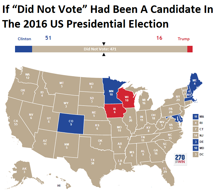
Landslide for the "Did Not Vote" Candidate in the 2016 Election!
Randy Krum
Oct
14
Oct 14
A House Divided: The Rise of Political Partisanship
Randy Krum
Aug
25
Aug 25
Examining the Real Cost of Donald Trump's Wall
Randy Krum
Jun
20
Jun 20
How to Create a Winning Email Marketing Campaign
Randy Krum
Oct
26
Oct 26
A Visual History of the US House poster and interview
Randy Krum
Oct
11
Oct 11
Obamacare: The Price of Socialized Medicine
Randy Krum
Sep
12
Sep 12
Client Infographic: Sudan, Bombing Everything That Moves
Randy Krum
Feb
16
Feb 16
The Visual History of the Political Parties (infographic posters)
Randy Krum
Jun
10
Jun 10
A Visual History of the American Presidency - new infographic poster
Randy Krum
Jan
15
Jan 15
World Progress Report poster - Available for one week ONLY
Randy Krum
Jan
14
Jan 14
The British History Visual Timeline
Randy Krum
Jan
6
Jan 6
Chart Wars: The Political Power of Data Visualization
Randy Krum
Dec
10
Dec 10
The Carbon Economy - Infographic Video
Randy Krum
Dec
7
Dec 7
A Visual History of the Supreme Court - New Infographic Poster!
Randy Krum
Load More