About

Randy Krum

Product Development, Marketing, Visual Thinking and Data Visualization professional fascinated by good infographics.  Always looking for better ways to get the point across.


RandyKrum.com

Infographic Design


Subscriptions:


How to add the
Cool Infographics button to your:

- iPhone
- iPad
- iPod Touch


Subscribe on your Amazon Kindle:

Follow Me!


Follow Randy (@rtkrum) 

Blog posts ONLY on Twitter

Twitter List: Cool Infographics People

Search Cool Infographics
From the Bookstore

American Presidency Poster

Caffeine Poster

Gadget Map

Cool Ads

Your Pictures Into Posters, Overnight


WallStats Poster

Infographics Carousel
Thanks to...
Powered by Squarespace


« The Visual Miscellaneum - Win a Signed Copy! | Main | Pink Floyd Timeline of Band Members »
Thursday
Jan142010

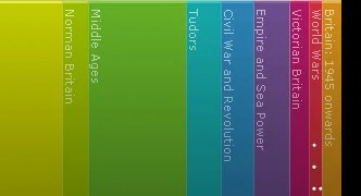
The British History Visual Timeline


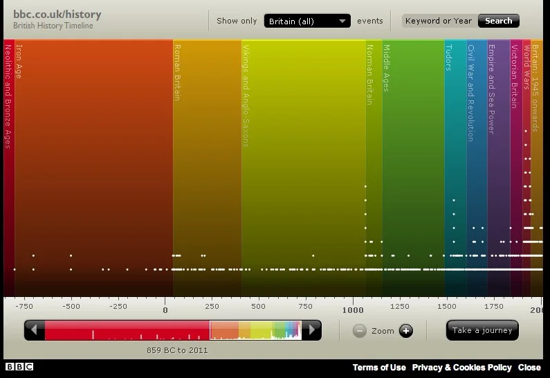
The BBC has put up a great interactive, visual British History Timeline.  Each dot represents a signnificant event.  Clicking a color “era” zooms the timeline to just that time period.

Mousing over the individual dots shows the specific event details and timing.


You can also select a particular region of the UK, or search for a specific year or keyword.

PrintView Printer Friendly Version

EmailEmail Article to Friend

Reader Comments (2)

Is there anything like this for US or world history? This is great, but now I want more!

January 14, 2010 | Unregistered CommenterGlen McKnight

Cool graphs, we expect this for more states :>

July 31, 2010 | Unregistered CommenterSantaClaws

PostPost a New Comment

Enter your information below to add a new comment.

My response is on my own website »
Author Email (optional):
Author URL (optional):
Post:
 
Some HTML allowed: <a href="" title=""> <abbr title=""> <acronym title=""> <b> <blockquote cite=""> <code> <em> <i> <strike> <strong>