Home
Infographics
Book
Tools
Tools Directory
DataViz Guides
DataViz Shows
Word Clouds
Sankey Diagrams
Online Infographics Design
Online DataViz
Analytics Platforms
Infographic Resumes
Vector Graphics
Icon Libraries
Color Pickers
Presentation Design
JavaScript Charts
Free Stock Images
Jobs
Posters
Links
Appearances
About
Contact
Follow Cool Infographics
Need Infographics?
Randy Krum
Designer | Author | Instructor | Speaker
FREE Sample Chapter
Read More
All tagged
illustration
Aug
31
Aug 31
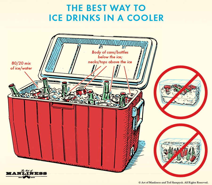
The Best Way to Ice Drinks in a Cooler
Randy Krum
Feb
17
Feb 17
How to Stop Procrastinating (and Become a Joyful Writer)
Randy Krum
Oct
20
Oct 20
Electrocardiography Basics
Randy Krum
Jul
6
Jul 6
The Ultimate Hot Dog Style Guide
Randy Krum
May
19
May 19
Sizing Up Sharks
Randy Krum
Nov
23
Nov 23
Anatomy of Songs
Randy Krum
Jan
8
Jan 8
Iconic Movie Glasses
Randy Krum
Sep
12
Sep 12
Grandma's Apple Pie Infographic Recipe
Randy Krum
Nov
29
Nov 29
Seven Myths of Email Marketing
Randy Krum
Aug
29
Aug 29
Comic Tribute to Bill Watterson (Calvin & Hobbes)
Randy Krum
Mar
8
Mar 8
Shutterstock: Annual Design Trends 2013 Edition
Randy Krum
Dec
24
Dec 24
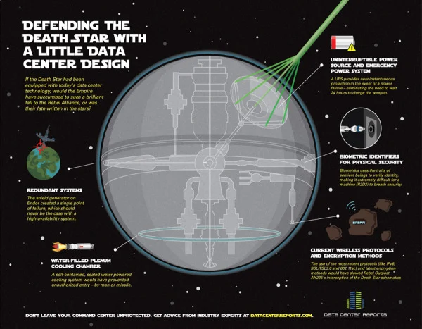
Defending the Death Star
Randy Krum
Oct
10
Oct 10
The Noun Project
Randy Krum
Oct
5
Oct 5
The Supernatural Sprawl of True Blood
Randy Krum
Mar
14
Mar 14
Romance Reboot: Safe Online Dating Tips from ADT
Randy Krum
May
20
May 20
Expert Driving Techniques #infographic
Randy Krum
Apr
19
Apr 19
Monster Trade Show Displays (infographic)
Randy Krum