Annular Eclipse
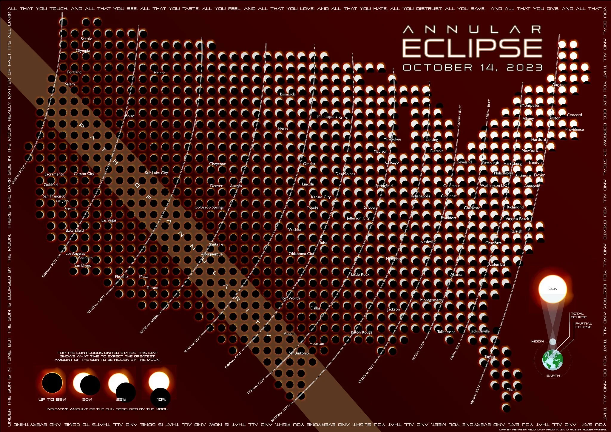
Kennth Field used Nasa’s data to create this Annular Eclipse infographic. The graphic combines the information of where the eclipse had its highest coverage, as well as the time of day it was at its peak. It also shares the direct path of the moon and some basic information on what an eclipse is.
Overall, a beautiful summary with very little verbiage. In only a few seconds, you could tell how obscured the Sun was going to be in your part of the U.S.
Thanks for RJ Andrews for bringing this graphic to our attention!