Home
Infographics
Book
Tools
Tools Directory
DataViz Guides
DataViz Shows
Word Clouds
Sankey Diagrams
Online Infographics Design
Online DataViz
Analytics Platforms
Infographic Resumes
Vector Graphics
Icon Libraries
Color Pickers
Presentation Design
JavaScript Charts
Free Stock Images
Jobs
Posters
Links
Appearances
About
Contact
Follow Cool Infographics
Need Infographics?
Randy Krum
Designer | Author | Instructor | Speaker
FREE Sample Chapter
Read More
All tagged
explanation
Oct
24
Oct 24
Annular Eclipse
Randy Krum
Mar
23
Mar 23
12 Running Shoe Lacing Techniques
Randy Krum
Aug
31
Aug 31
The Best Way to Ice Drinks in a Cooler
Randy Krum
Aug
19
Aug 19
Figures in the Sky: Constellations Around the World
Randy Krum
Mar
3
Mar 3
Beards and Face Masks from the CDC
Randy Krum
Dec
16
Dec 16
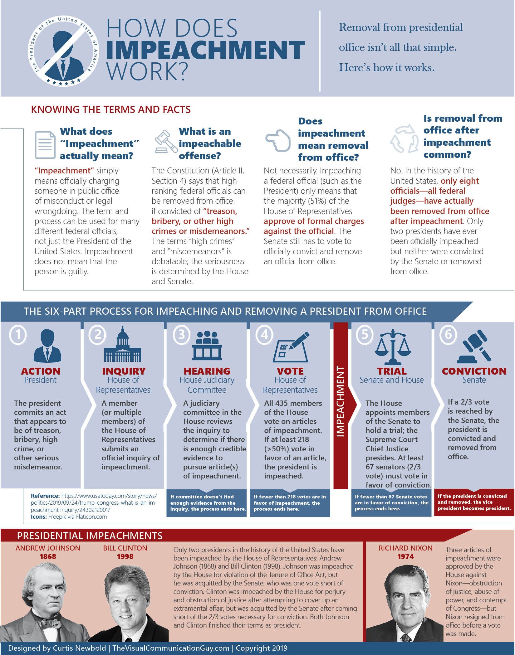
How Does Impeachment Work?
Randy Krum
Feb
25
Feb 25
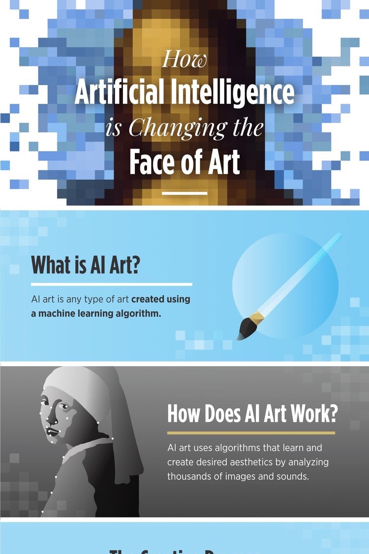
How Artificial Intelligence Is Changing Art
Randy Krum
Aug
6
Aug 6
An Introduction to Hydroponics
Randy Krum
Jun
4
Jun 4
The Family Banners of Westeros
Randy Krum
Jun
13
Jun 13
Choosing the Right Explainer Video
Randy Krum
Sep
1
Sep 1
How to Think Visually
Randy Krum
Jun
3
Jun 3
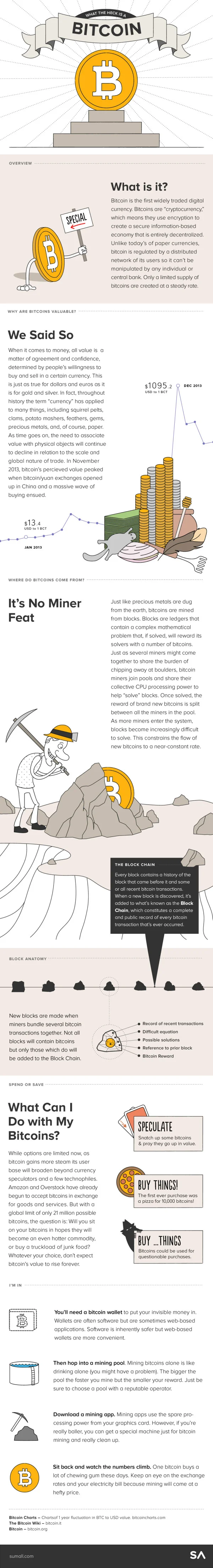
What the Heck is a Bitcoin
Randy Krum
Dec
12
Dec 12
How To Boost Recovery After An Injury
Randy Krum
Oct
1
Oct 1
What Are Anxiety Disorders?
Randy Krum
Aug
30
Aug 30
Infographic Cookbook - Picture Cook
Randy Krum
Aug
22
Aug 22
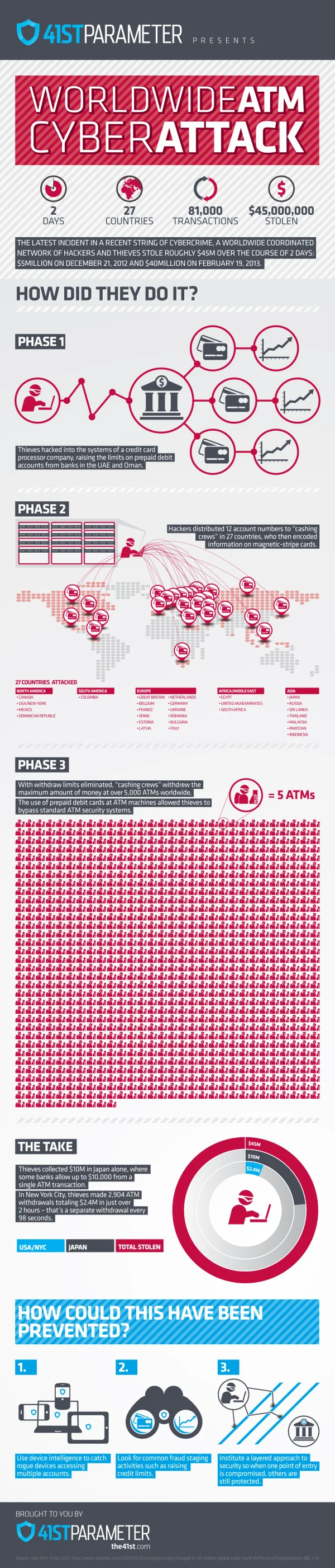
Worldwide ATM Cyber Attack
Randy Krum
Jul
25
Jul 25
Inside the Courtroom
Randy Krum
Jul
9
Jul 9
What Is Autism?
Randy Krum
Jul
8
Jul 8
Paws vs. Claws: Social Media Explained
Randy Krum
Jul
8
Jul 8
How Startup Funding Works
Randy Krum
Load More