False Visualizations: Getting Circles Sizes Wrong

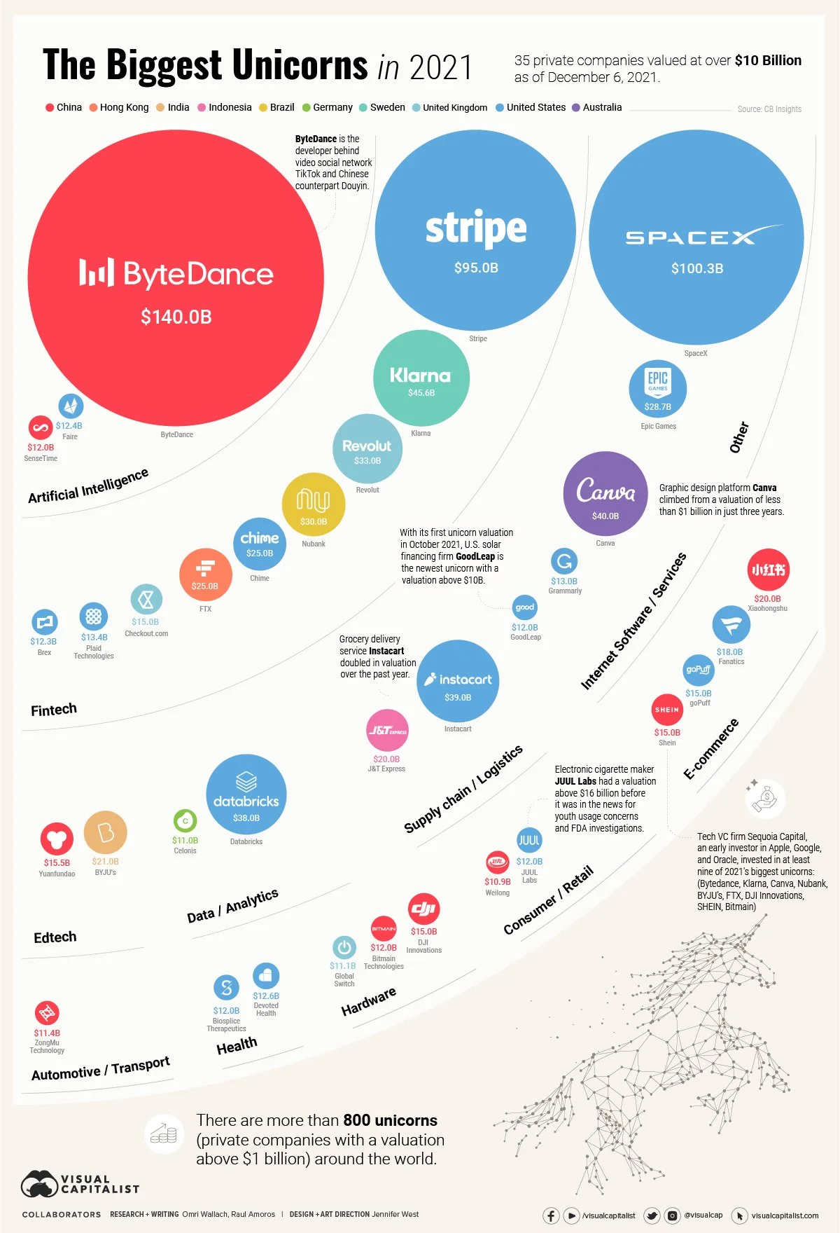
Today’s example of getting it WRONG is The Biggest Unicorns in 2021 infographic from Visual Capitalist. Assuming all of the data is good, all of the circle sizes in this design are wrong and don’t match the data. The circles were sized by changing the diameter instead of changing the area.
Let me show you what I mean:
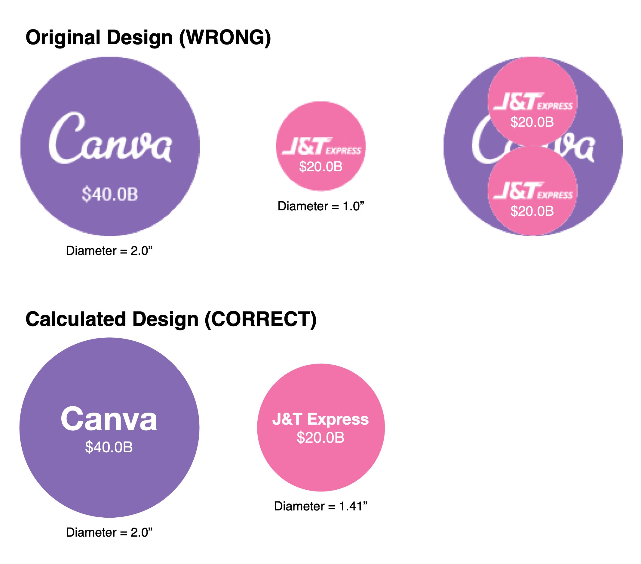
Consider a comparison where the math is easy, Canva at $40.0B is 2x the valuation of J&T Express at $20.B. If I pull those two circles out of the design, you can clearly see that the diameter of two $20.0B circles fits perfectly in the $40.0B circle. This demonstrates that the circles are sized by diameter instead of area. Also, when I adjust the size of the Canva circle in my software to 2” diameter, the J&T Express circle becomes exactly 1” in diameter.
Directly below that I show the correct circles sizes by calculating the correct diameter of the J&T Express circle as 1.414” compared to the same 2” circle for Canva.
I’ve been posting about this problem in data visualization design for 10 years now, but designers still make the mistake of sizing circles by changing the diameter to match the data.
From the Cool Infographics book (2013):
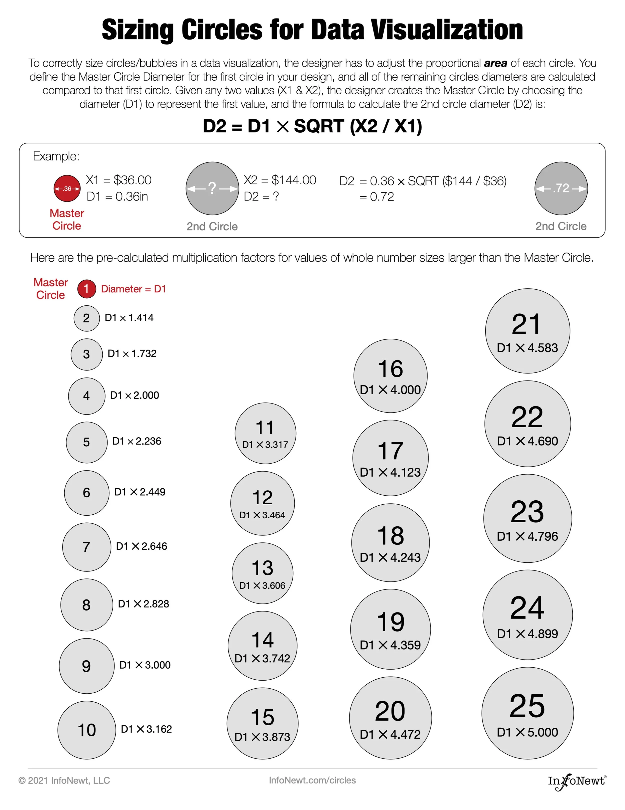
It’s key for data visualization designers to understand that we visually compare the sizes of objects based on their area (not their height).
The problem becomes more difficult when visualizing data by changing the sizes of nonstandard shapes: circles, icons, logos and so on. This is where many designers mistakenly create data visualizations that don’t actually match the data because they don’t do the math required.
This visualization doesn’t match the data at all and becomes a false visual. The reason for this is that you are changing the size of two dimensions to represent one-dimensional data. Unlike rectangles, you can’t keep the width constant and change only the height of a circle. It wouldn’t be a circle anymore.
This is EXACTLY this issue I described in the Bubble Comparison and Nested Bubbles video I contributed to Jon Schwabish’s One Chart at a Time video series.
Sizing Circles for Data Visualization is an easy reference sheet for designers I posted on the InfoNewt website. It’s a free PDF to download so everyone has the information and the formula to calculate the correct circles sizes for using circles in data visualizations and infographics.