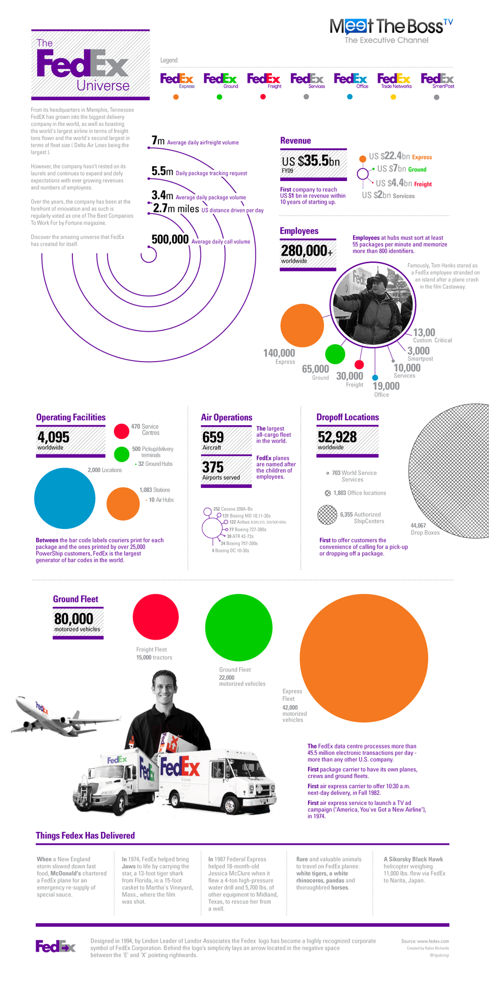
The FedEx Universe

Revised Infographic
Robin Richards (ripetungi) created this infographic about the FedEx Universe for MeetTheBoss.com. The version above is slightly modified to correct the size of some of the bubbles, add some mind-map style connection lines and add some photo images.
Created for MeetTheBoss.tv, it is a celebration of Fedex as a company and its size. Working thought creating this, I was amazed at the huge numbers involved in running a global company and getting packages around the earth. This is what I have tried to show.
I have updated this infographic. I received some great feedback from Randy Krum over at Coolinfographics.com (Great Site) and on reflection decided that it could be improved with greater use of the bubble mind map graphics. So that is what I have done. Also added some more eye candy with images inside of the main bubble totals. Let me know what any thoughts on the old vs the new.
You can see the original version below, and Robin has posted some comment about creating it on his blog, ripetungi.com. There’s a lesson here for infographic designers everywhere; the viewer sees the area of objects as representative of scale. So in the original version, the diameter of the bubbles changed with the value, but in the corrected version, the area of the bubbles changes. When the diameter increased by 2x, that meant that the area increased by 3.5x and the bubbles didn’t accurately represent the values.
Also worth noting that Robin created this infographic in ONE day. Great work under tight timelines!

Original Version
![What Does Your Email Provider Say About You? [infographic]](https://images.squarespace-cdn.com/content/v1/5bfc8dbab40b9d7dd9054f41/1554261297286-0P6LNL3IH1CMZLILPADV/email-provider.jpg)