About

Randy Krum

Product Development, Marketing, Visual Thinking and Data Visualization professional fascinated by good infographics.  Always looking for better ways to get the point across.


RandyKrum.com

Infographic Design


Subscriptions:


How to add the
Cool Infographics button to your:

- iPhone
- iPad
- iPod Touch


Subscribe on your Amazon Kindle:

Follow Me!


Follow Randy (@rtkrum) 

Blog posts ONLY on Twitter

Twitter List: Cool Infographics People

Search Cool Infographics
From the Bookstore

American Presidency Poster

Caffeine Poster

Gadget Map

Cool Ads

Your Pictures Into Posters, Overnight


WallStats Poster

Infographics Carousel
Thanks to...
Powered by Squarespace


« Brand Ad Agencies infographic | Main | My Digital Life 2.0: A Consumer Gadget Map »
Wednesday
Feb172010

CD Laddering Investment infographic

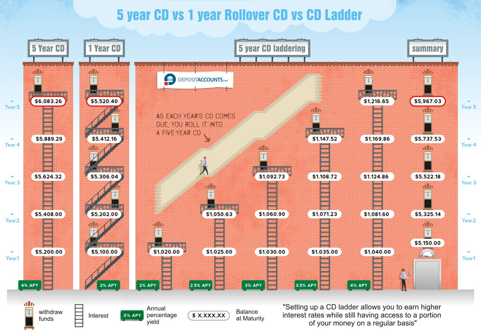
Designed by Derri Hasmi for DepositAccounts.com, this CD Laddering infographic does a great job helping to explain the investment theory of CD laddering as compared to investing in standard CDs.

CD laddering is a strategy that allows you to take advantage of the higher cash rates offered by CDs, while at the same time ensuring that you have access to your money regularly. The most common type of CD ladder is the five year ladder. In this scenario, you open five different CDs. Let’s say that you check your savings account, and you have $15,000. You want to keep $5,000 for emergency purposes (move it to a high-yield savings account if it isn’t in one already), but use the remaining $10,000 to get your CD ladder started.

Thanks Jeremy!

PrintView Printer Friendly Version

EmailEmail Article to Friend

Reader Comments (2)

You need to look at the variability of returns compared with their mean returns over various time scales.
If you look at the distribution of day-to-day returns for the S&P 500, it’s very wide compared to it’s mean. If you look at year-to-year returns, it’s much, much narrower. If you stretch the period to 3 or 4 years, it looks fairly safe to me. And for retirement savings, you’re usually looking at decades.
If you fix the standard deviation of the final result, the mean return rises with the time horizon.
How far you push towards that 12% depends completely on your time horizon.
http://investmentsupport.co.uk
Investment Support

July 2, 2010 | Unregistered CommenterSmart Brains

Cool infographic! Here's another one I really liked. Hope you like it too!

July 14, 2010 | Unregistered CommenterCredit Girl

PostPost a New Comment

Enter your information below to add a new comment.

My response is on my own website »
Author Email (optional):
Author URL (optional):
Post:
 
Some HTML allowed: <a href="" title=""> <abbr title=""> <acronym title=""> <b> <blockquote cite=""> <code> <em> <i> <strike> <strong>