About

Randy Krum

Product Development, Marketing, Visual Thinking and Data Visualization professional fascinated by good infographics.  Always looking for better ways to get the point across.


RandyKrum.com

Infographic Design


Subscriptions:


How to add the
Cool Infographics button to your:

- iPhone
- iPad
- iPod Touch


Subscribe on your Amazon Kindle:

Follow Me!


Follow Randy (@rtkrum) 

Blog posts ONLY on Twitter

Twitter List: Cool Infographics People

Search Cool Infographics
From the Bookstore

American Presidency Poster

Caffeine Poster

Gadget Map

Cool Ads

Your Pictures Into Posters, Overnight


WallStats Poster

Infographics Carousel
Thanks to...
Powered by Squarespace


« Visual Mapping Blogroll - Subway Map of Infographic Websites | Main | Welcome to the New & Improved "Cool Infographics" »
Wednesday
Dec302009

The Last 10 Years...Visually


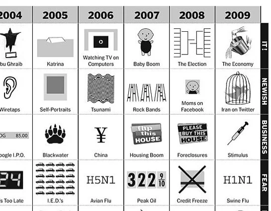
Great chart by Phillip Niemeyer over on NYTimes.com, Picturing the Past 10 Years.  Using icons and unique pictures, Phillip captures the key event of each year in 12 different categories.

Found on FlowingData, WeLoveDataVis, and it was tweeted but a few people on my Twitter list, Cool Infographics People.

PrintView Printer Friendly Version

EmailEmail Article to Friend

References (1)

References allow you to track sources for this article, as well as articles that were written in response to this article.
  • Response
    Response: Story added
    Your story was featured in TheWebBlend.com! Here is the link to vote it up and promote it: http://thewebblend.com/Design/The_Last_10_Years_Visually

Reader Comments (1)

A great review of the decade. Thanks.
Jeff

December 31, 2009 | Unregistered CommenterJeff

PostPost a New Comment

Enter your information below to add a new comment.

My response is on my own website »
Author Email (optional):
Author URL (optional):
Post:
 
All HTML will be escaped. Hyperlinks will be created for URLs automatically.