


16 Infographic Resumes, A Visual Trend
(It’s actually up to 18 now.)
A number of designers have attempted to design a visual, infographic resume, and while this is certainly not mainstream (yet), it is gaining some momentum. I wanted to highlight some of the great examples available on the web, but the line between an infographic resume and a designer resume is tough not to cross. I’ve tried to stay true to only infographic versions here, and didn’t include many good illustrated resumes that didn’t include any visualizations.
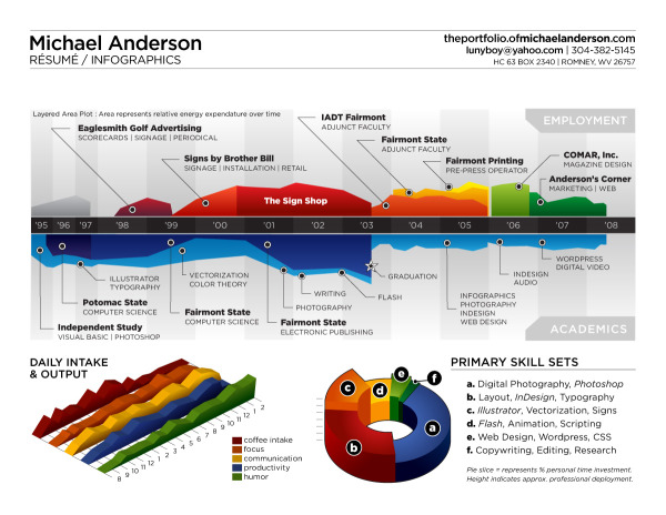
Michael Anderson’s 2008 concept on an infographic resume (above) is probably the most well known. It’s been tweeted, dugg, reddit-ed and featured on FastCompany.com.
I decided to update my résumé with a different perspective on the typical time-line theme. This is just concept art, as there are almost no real metrics represented except for time. There is no energy expenditure unit of measure, nor tics to delineate percentage or otherwise.

Christopher Perkins’ resume, using the subway map metaphor.
I do agree it’s more of an overview and less of a project-experience-oriented resume, but I’ve been thinking a lot about (and looking at) resumes lately, and I feel like what you really need to do is grasp someone’s attention first. This is why http://www.percious.com is listed at the top, and that’s about all listed (no address, phone number, etc.) The other thing I was thinking about doing was to add an image map with links to provide more information about the things I have worked on.

Also using the subway map metaphor, Kevin Wang plots out his activities during his school years.
Curriculum Vitae, by Uito2 in 2007, shows his experience level in different software packages as progress bars.

Chester, Lau Cheuk Hang, does a great job utilizing a timeline at the top of his resume with spanning arcs to highlight time spent in different activities.

Greg Dizzia also creates a Curriculum Vitae showing vertical bars spanning a timeline for each company, and adds an additional element of icons to represent different experiences during each project.
This lists my history in the design world (some lesser clients have been left out) - Designed using univers exclusively. This is an appendage to a traditional resume, to be included as a forward page in my portfolio.

Jonathan Kaczynski, also tries a subway map style using the different lines as categories instead of attempting a timeline. I actually think this approach works a little bit better, the timeline versions appear difficult to translate into a subway map.
I am currently in the process of remaking my portfolio. It will have the appearance of a mass transit system’s website. This is the resumé that I’m working on to go along with the portfolio. It still needs a bit of clean-up and and logo needs some work.
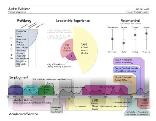
Justin Evilsizor’s version incorporates a timeline, a level-of-skill chart and I personally love the addition of the Meyer’s-Briggs Type Indicator.
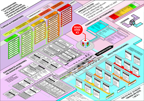
Arnaud Velten, Cartographer of Complexity, created this isometric resume. At its heart is a timeline, but he has added an incredible amount of detail to each of his skills. Seems like too much detail for me, but that may be what he wants to convey.

Maybe not technically a resume, Ritwik Dey’sLife Map is an impressive timeline of his education and activities.
This information design piece maps out my interests between ages 6 and 24 and the context in which they were born and nurtured. It also brings to surface how these interests influenced and were in turn influenced by milestones in my personal journey.
Stephen Gates’ resume is very clean a take on the timeline.
Why did no one try something new? Why wasn’t there one designer who took on their resume as design challenge to do something visual and different? I also realized that I was just as guilty as everyone else so I set out to design something different. So after some work in my spare time I have the design shown above (click on it to see it full sized). It is just a start and it feels like it is heading in an interesting direction but let me know what you think.

Bob van Vliet also created a very clean timeline resume.
I thought I’d try something different from the standard A4 with a dull summary of positions. Four timelines represent the most important parts of my life so far: Work, Education, Activism and Fun. The years get wider towards the present as those say more about who I am now than when I just started university.

Christopher Brown’s colorful infographic timeline inspired by Michael Anderson’s concept.
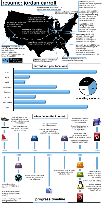
Jordan Carroll’s resume includes a few different elements. Timeline, map and charts combine into one overall resume.
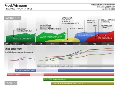
Another colorful timeline resume, this one by Pruek Wiyaporn, also appears inspired by Michael Anderson’s concept.

Jesse Burton also has a very nice stylized timeline resume.
Which ones do you like? Have I missed any other good ones out there?
Thanks to links found on VisualThinkMap, FastCompany, Patrick Debois
EDIT: Here are a few more that I missed when I originally wrote the post:

Mike Wirth is a freelance infographic designer. His colorful timeline has experiences above the X-axis, education is below and his geographic locations are the shaded bars in the background. When he learned specific software packages is also identified in the colored area, which shows how long he has been using the different software packages.

Gabriele Bozzi designed this resume concept that focuses totally on skills and experience. Education is identified in the small bubbles, and the skills are connected to specific examples of her experience. She is working on a separate timeline graphic.
Update
on 2012-05-25 21:01 by Randy
There are so many new examples of visual infographic resumes, I have started a dedicated board on Pinterest to share all of the cool designs I come across: http://pinterest.com/rtkrum/infographic-visual-resumes/
![The Caffeine Poster, How Much Caffeine Are You Drinking? [new infographic]](https://images.squarespace-cdn.com/content/v1/5bfc8dbab40b9d7dd9054f41/1554519866504-B8F8JFXDZQC3X531QJ37/5474039-5332450-thumbnail.jpg)


