About

Randy Krum

Product Development, Marketing, Visual Thinking and Data Visualization professional fascinated by good infographics.  Always looking for better ways to get the point across.


RandyKrum.com

Search Cool Infographics
Caffeine Poster

Follow Me!


Follow Randy (Twitter @rtkrum) 

Blog posts ONLY on Twitter

Twitter List: Cool Infographics People

Cool Ads
Supreme Court Poster

WallStats Poster

Subscribe

Subscribe on your Amazon Kindle:

RSS Feed:

Subscribe in a reader

Subscribe via email:

Enter your email address:

Delivered by FeedBurner


Add to Technorati Favorites


View blog authority

Infographics Carousel
Marketing Profs

MarketingProfs reviewed more than 200 sources and selected 64 of the best to create the Digital Marketing Factbook—a compilation of data covering the critical topics of digital marketing.

Thanks to...
Powered by Squarespace


« Infographic Posters for Data Lovers | Main | The Simpsons 20th: Comedy [Family] Tree »
Friday
18Dec2009

Word Spectrums! The Online Infographic Battleground


On Chris Harrison's site, there are a number of graphics that he calls Word Spectrums.  More like a battleground, Chris is using the enormous amount of data from websites that has been made public by Google.  This is an advanced form of a word cloud that visualizes related words and their relative connections to the two topics.  (FYI, since this is based on raw Google data, foul language does appear in some of them).


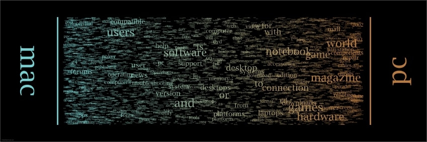
Using Google's enormous bigram dataset, I produced a series of visualizations that explore word associations. Each visualization pits two primary terms against each other. Then, the use frequency of words that follow these two terms are analyzed. For example, "war memorial" occurs 531,205 times, while "peace memorial" occurs only 25,699. A position for each word is generated by looking at the ratio of the two frequencies. If they are equal, the word is placed in the middle of the scale. However, if there is a imbalance in the uses, the word is drawn towards the more frequently related term. This process is repeated for thousands of other word combinations, creating a spectrum of word associations. Font size is based on a inverse power function (uniquely set for each visualization, so you can't compare across pieces). Vertical positioning is random.


Chris has created and shared a number of different versions on the Word Spectrum page of his website, and you can see high-resolutions PDFs of each there.

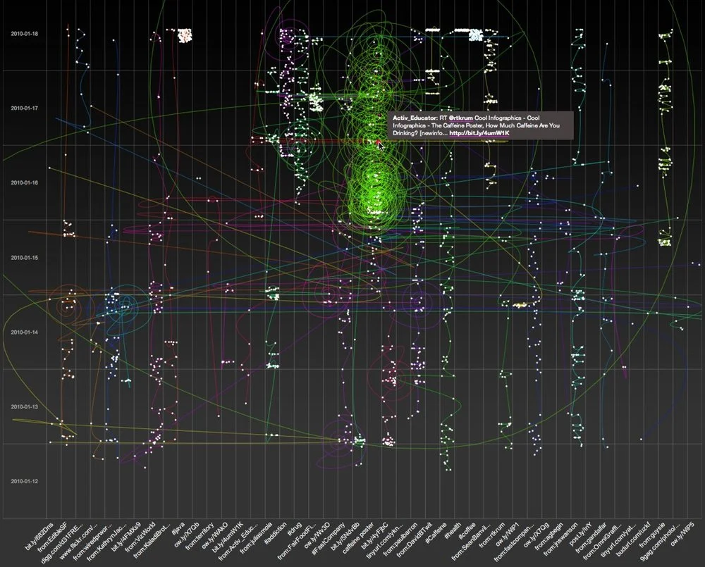
Want to try your own?  Building on Chris' idea, Jeff Clark from Neoformix has created interactive Word Spectrums using either Twitter or News as the source that lets you enter your own terms to compete.  I especially like the idea of pitting two competing brands against one another.


PrintView Printer Friendly Version

EmailEmail Article to Friend

Reader Comments (1)

I like these! I think the power of words and their frequency is a great way to quickly display information in a visually appealing way.

I'm working on a little pet project that I hope to go live with in the next few weeks that convey news stories in a similar (but much less sophistated!) way.

Thanks for sharing this - I particularly like the word spectrum.

Jeff

December 18, 2009 | Unregistered CommenterDuffer

PostPost a New Comment

Enter your information below to add a new comment.

My response is on my own website »
Author Email (optional):
Author URL (optional):
Post:
 
Some HTML allowed: <a href="" title=""> <abbr title=""> <acronym title=""> <b> <blockquote cite=""> <code> <em> <i> <strike> <strong>