About

Randy Krum

Product Development, Marketing, Visual Thinking and Data Visualization professional fascinated by good infographics.  Always looking for better ways to get the point across.


RandyKrum.com

Search Cool Infographics
Caffeine Poster

Follow Me!


Follow Randy (Twitter @rtkrum) 

Blog posts ONLY on Twitter

Twitter List: Cool Infographics People

Cool Ads
Supreme Court Poster

WallStats Poster

Subscribe

Subscribe on your Amazon Kindle:

RSS Feed:

Subscribe in a reader

Subscribe via email:

Enter your email address:

Delivered by FeedBurner


Add to Technorati Favorites


View blog authority

Infographics Carousel
Marketing Profs

MarketingProfs reviewed more than 200 sources and selected 64 of the best to create the Digital Marketing Factbook—a compilation of data covering the critical topics of digital marketing.

Thanks to...
Powered by Squarespace


« Collaborative, Online Mind Map about Mind Mapping Software | Main | Circular Periodic Table of the Elements »
Thursday
22Oct2009

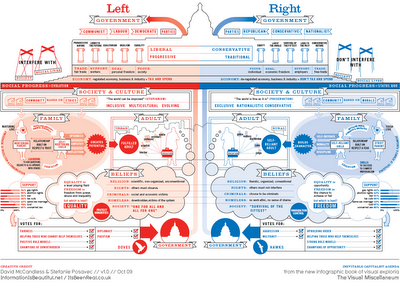
Left vs. Right Ideology Concept Map


David McCandless and Stefanie Posavec from Information Is Beautiful have created this Left vs. Right concept map to help explain the differences in political opinions.
Of course, the political spectrum is not quite so polarised. Actually, it’s more of a diamond shape, apparently. But this is how it’s mostly presented via the media – left wing vs. right wing, liberal vs. conservative, Labour vs Tory. And perhaps in our minds too… 
This kind of visual approach to mapping concepts really excites me. I like the way it coaxes me to entertain two apparently contradictory value systems at the same time. Or, in other words, I like the way it f**ks with my head.


Using this blank template, David and Stefanie created two versions  One for the U.S. (top) and one for the World (below).
There are two versions with different colours: a US and a World version. This is because the US and Switzerland are the only countries in the world where red = right wing and blue = left wing. Grrr!


Found on VizWorld and Information Is Beautiful.

PrintView Printer Friendly Version

EmailEmail Article to Friend

Reader Comments (1)

Excellent example of structured visual thinking and well done. As evidenced by the comment at the site this is a great illustration of how the craft of thoughtful visual and structured thinking can create the fierce and critical debates for the 21st Century...well done and brave the onslaughts of those struggling to rethink meaning...John

October 23, 2009 | Unregistered CommenterJohn Caswell

PostPost a New Comment

Enter your information below to add a new comment.

My response is on my own website »
Author Email (optional):
Author URL (optional):
Post:
 
Some HTML allowed: <a href="" title=""> <abbr title=""> <acronym title=""> <b> <blockquote cite=""> <code> <em> <i> <strike> <strong>