About

Randy Krum

Product Development, Marketing, Visual Thinking and Data Visualization professional fascinated by good infographics.  Always looking for better ways to get the point across.


RandyKrum.com

Infographic Design


Subscriptions:


How to add the
Cool Infographics button to your:

- iPhone
- iPad
- iPod Touch


Subscribe on your Amazon Kindle:

Follow Me!


Follow Randy (@rtkrum) 

Blog posts ONLY on Twitter

Twitter List: Cool Infographics People

Search Cool Infographics
From the Bookstore

American Presidency Poster

Caffeine Poster

Gadget Map

Cool Ads

Your Pictures Into Posters, Overnight


WallStats Poster

Infographics Carousel
Thanks to...
Powered by Squarespace


« Welcome to the world baby...Processing | Main | A Visual Guide to the Financial Crisis »
Wednesday
Nov192008

The history of olympic medals

 
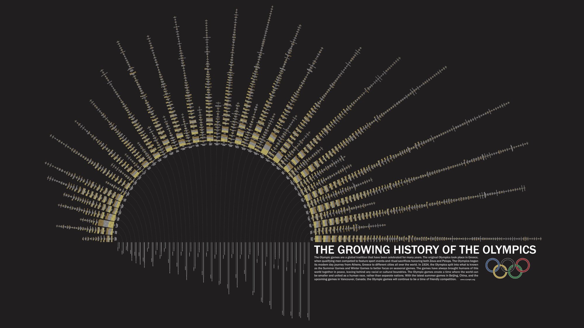
Grace Lee is a Junior at Parsons, the New School for Design in New York City.  She went back and visually laid out all of the medals won be every country in every Olympics since Athens in 1896.  Across the bottom it also shows how many nations participated each year and how many athletes were involved.  This was a project in her Information Design class, and she did a fabulous job!
The games have always brought of this world together in peace, leaving behind any racial or cultural boundaries.  The Olympic games create a time when the world can be smaller and united as a human race, rather than separate nations.  With the summer games in Beijing, China, and the upcoming games in Vancouver, Canada, the Olympic games will continue to be a time of friendly competition.

Thanks Grace.  I love how this project turned out.

By popular request I have uploaded the full PDF version here.

PrintView Printer Friendly Version

EmailEmail Article to Friend

Reader Comments (5)

Is it possible to have the link to the original jpg please ?

Wonderful work, I thin, but it is a pity we can't "read" it all.

November 19, 2008 | Unregistered CommenterAnonymous

Should I worry that our schools are teaching that it is good to create graphics that make comparison harder?

This is quite simple, straightforward data. What does the sunrise (or sunset) shape tell us? It simple makes it tougher to compare 1936 with 1998.

Of course it "looks great." But it misses the point of the "info" in "infographics"

November 20, 2008 | Unregistered CommenterDavid Whitehill

I would appreciate to access the original image too...
Thanks !

November 23, 2008 | Unregistered CommenterAnonymous

I like it your blog!!!!

Sorry for my vocabulary, i'm from spain.
I am Pedro Jiménez (inphographics at El Mundo Valencia).

My web-blog is: www.pedro-jimenez.es, visit me, thanks!!!

November 24, 2008 | Unregistered CommenterPedro Jiménez

david whitehill should really look at what "infographics" are and what that beautifully done graphic reflects. that took about 50 000 pages of excel data and made it extremely visual and comprehensive to the lamen.

September 3, 2009 | Unregistered CommenterAnonymous

PostPost a New Comment

Enter your information below to add a new comment.

My response is on my own website »
Author Email (optional):
Author URL (optional):
Post:
 
All HTML will be escaped. Hyperlinks will be created for URLs automatically.