Home
Infographics
Book
Tools
Tools Directory
DataViz Guides
DataViz Shows
Word Clouds
Sankey Diagrams
Online Infographics Design
Online DataViz
Analytics Platforms
Infographic Resumes
Vector Graphics
Icon Libraries
Color Pickers
Presentation Design
JavaScript Charts
Free Stock Images
Jobs
Posters
Links
Appearances
About
Contact
Follow Cool Infographics
Need Infographics?
Randy Krum
Designer | Author | Instructor | Speaker
FREE Sample Chapter
Read More
All tagged
world
May
13
May 13
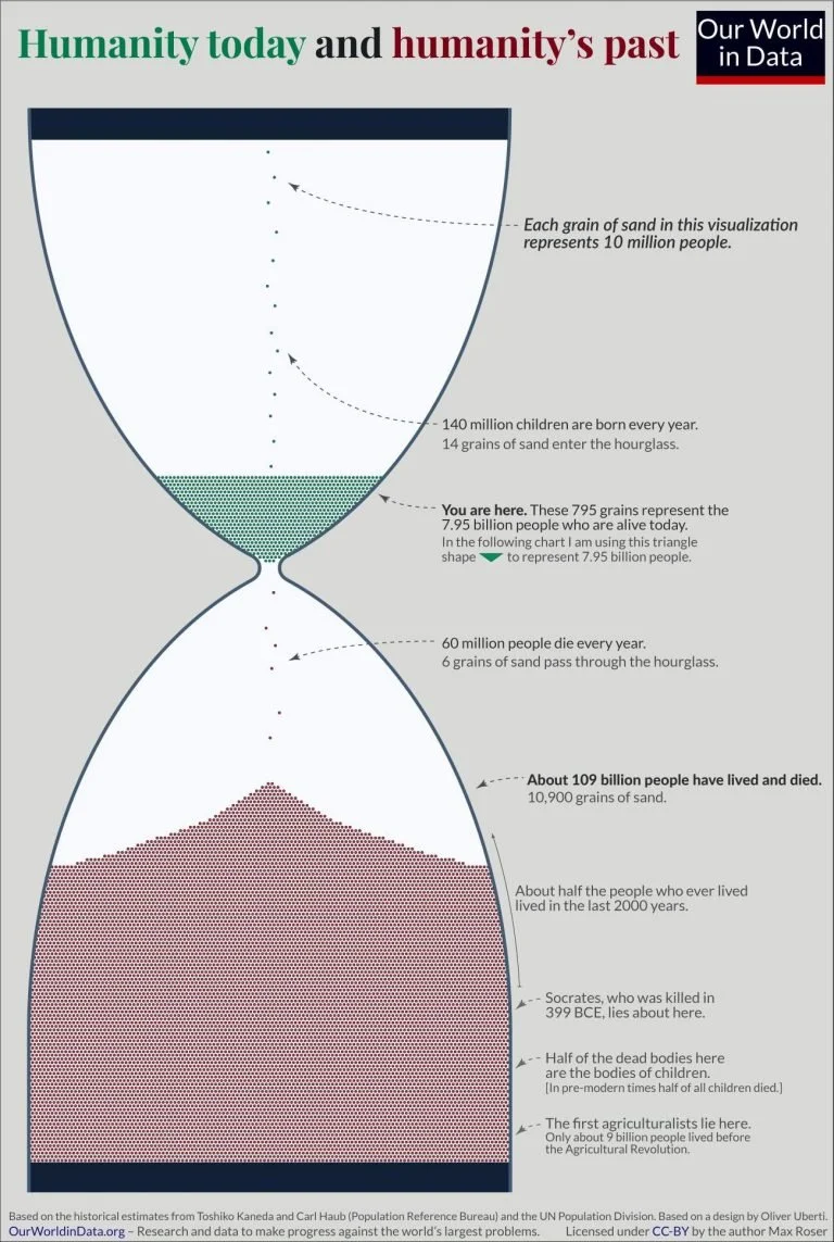
Visualizing Everyone that has Ever Lived
Randy Krum
Sep
24
Sep 24
Drone Privacy Laws Around the World
Randy Krum
Oct
18
Oct 18
Top Construction Projects in the World
Randy Krum
Feb
4
Feb 4
How The World is Getting Better in 6 Charts
Randy Krum
Jul
20
Jul 20
The UK's Brexit Options in the EuroZone Visualized
Randy Krum
Jul
31
Jul 31
EARTH, a visualization project
Randy Krum
Oct
6
Oct 6
7 Times Technology Almost Destroyed The World
Randy Krum
Aug
26
Aug 26
Animal Migrations In Motion
Randy Krum
Aug
16
Aug 16
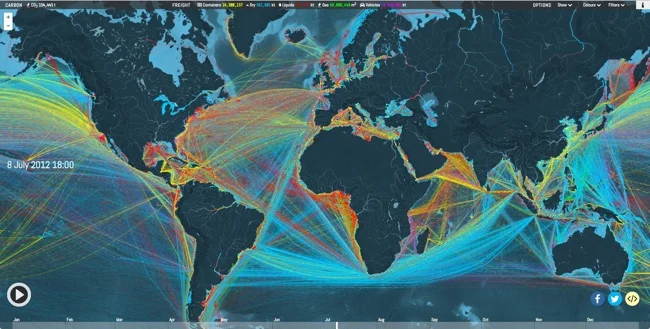
Animated and Interactive Global Shipping Visualization
Randy Krum
Jul
13
Jul 13
Global Connectivity Ranking
Randy Krum
Jul
12
Jul 12
Made in France
Randy Krum
Jun
24
Jun 24
How Britain Voted in the E.U. Referendum
Randy Krum
Jun
3
Jun 3
The Global Air Transportation Network
Randy Krum
Jun
2
Jun 2
Diabetes: The Silent Scourge
Randy Krum
Dec
29
Dec 29
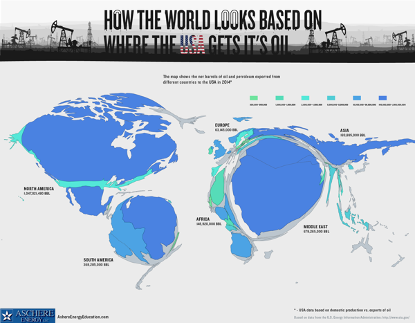
Where The USA Gets Its Oil
Randy Krum
Dec
8
Dec 8
The Global Carbon Budget 2015
Randy Krum
Jul
20
Jul 20
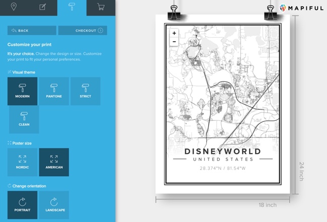
Beautiful Map Posters of Anywhere
Randy Krum
Jun
25
Jun 25
Business Etiquette Around the World
Randy Krum
Jun
1
Jun 1
A World of Languages
Randy Krum
Apr
3
Apr 3
Best Film Awards From Around the World
Randy Krum
Load More