Animated and Interactive Global Shipping Visualization
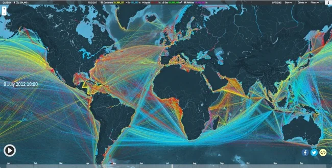
This is a fantastic detailed animated and interactive data visualization of the world's Global Shipping Traffic.
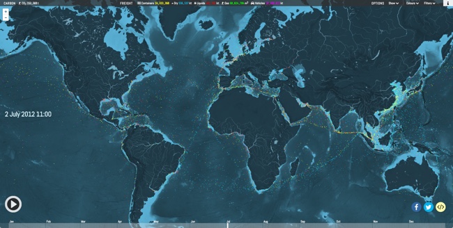
You can see movements of the global merchant fleet over the course of 2012, overlaid on a bathymetric map. You can also see a few statistics such as a counter for emitted CO2 (in thousand tonnes) and maximum freight carried by represented vessels (varying units).
The merchant fleet is divided into five categories, each of which has a filter and a CO2 and freight counter for the hour shown on the clock. The ship types and units are as follows:
Container (e.g. manufactured goods): number of container slots equivalent to 20 feet (i.e. a 40-foot container takes two slots)Dry bulk (e.g. coal, aggregates): combined weight of cargo, fuel, water, provisions, passengers and crew a vessel can carry, measured in thousand tonnesTanker (e.g. oil, chemicals): same as dry bulkGas bulk (e.g. liquified natural gas): capacity for gases, measured in cubic metresVehicles (e.g. cars): same as dry bulk
The map was created by Kiln based on data from the UCL Energy Institute (UCL EI)
You can hide the route lines and just watch the ship dots move over time. It's mezmerizing!
Thanks to Jim Hopkinson and Bill Gates for sharing on Twitter!
You can see the interactive version embedded here, or click here to take you to the full-size original site: