Home
Infographics
Book
Tools
Tools Directory
DataViz Guides
DataViz Shows
Word Clouds
Sankey Diagrams
Online Infographics Design
Online DataViz
Analytics Platforms
Infographic Resumes
Vector Graphics
Icon Libraries
Color Pickers
Presentation Design
JavaScript Charts
Free Stock Images
Jobs
Posters
Links
Appearances
About
Contact
Follow Cool Infographics
Need Infographics?
Randy Krum
Designer | Author | Instructor | Speaker
FREE Sample Chapter
Read More
All tagged
stock
May
17
May 17
How 5 Tech Giants Make Their Billions
Randy Krum
Feb
6
Feb 6
Shutterstock's Global Design Trends 2014
Randy Krum
Jul
25
Jul 25
PepsiCo Q2 2013 Performance Infographics
Randy Krum
Jun
26
Jun 26
Client: Avoid the Dip from IPO Lockups
Randy Krum
Oct
25
Oct 25
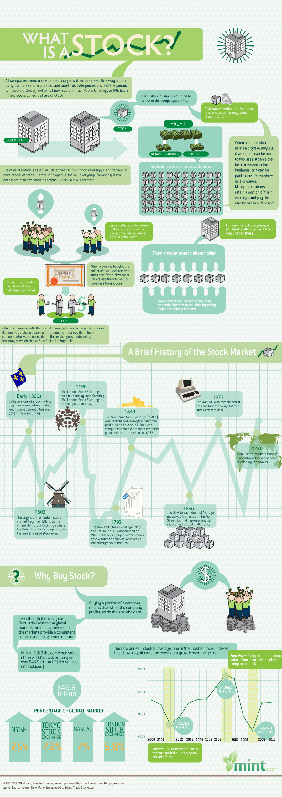
What is a Stock?
Randy Krum
Sep
29
Sep 29
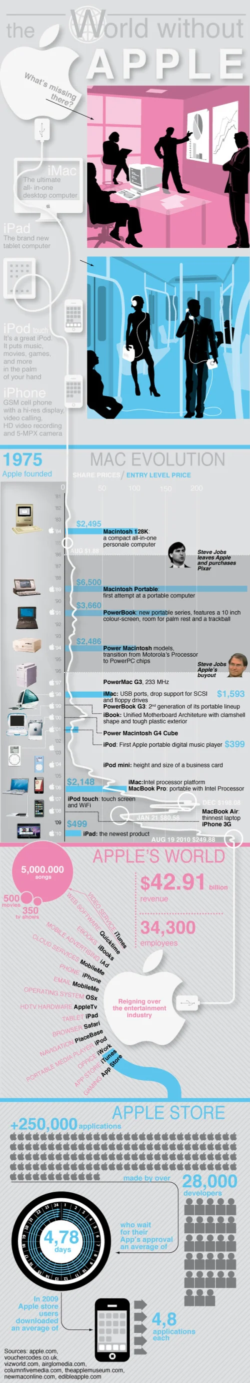
The World Without Apple
Randy Krum