Home
Infographics
Book
Tools
Tools Directory
DataViz Guides
DataViz Shows
Word Clouds
Sankey Diagrams
Online Infographics Design
Online DataViz
Analytics Platforms
Infographic Resumes
Vector Graphics
Icon Libraries
Color Pickers
Presentation Design
JavaScript Charts
Free Stock Images
Jobs
Posters
Links
Appearances
About
Contact
Follow Cool Infographics
Need Infographics?
Randy Krum
Designer | Author | Instructor | Speaker
FREE Sample Chapter
Read More
All tagged
starship
Feb
9
Feb 9
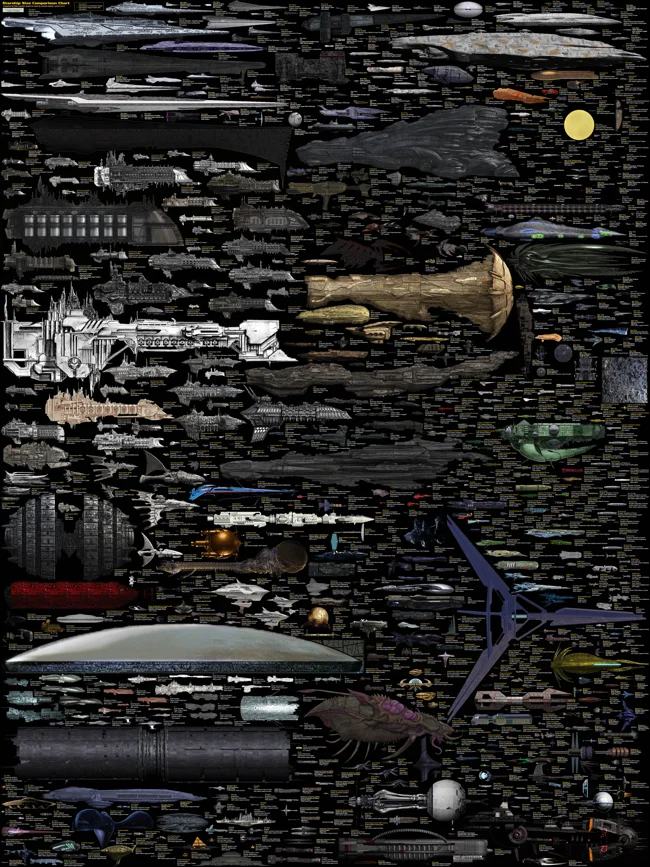
The Massive SciFi Starship Size Comparison Chart
Randy Krum
Sep
27
Sep 27
SciFi Starship Comparison Chart
Randy Krum
Feb
19
Feb 19
NASA's New Budget [infographic]
Randy Krum
Feb
2
Feb 2
Big Brothers: Satellites Orbiting Earth
Randy Krum
Oct
13
Oct 13
50 Years of Space Exploration - Visual Flight Map
Randy Krum
Feb
24
Feb 24
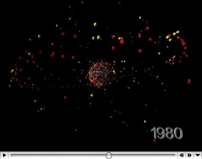
Space Debris video
Randy Krum
Feb
23
Feb 23
Space Debris image
Randy Krum
Dec
1
Dec 1
Voyager Infographic video
Randy Krum
Nov
29
Nov 29
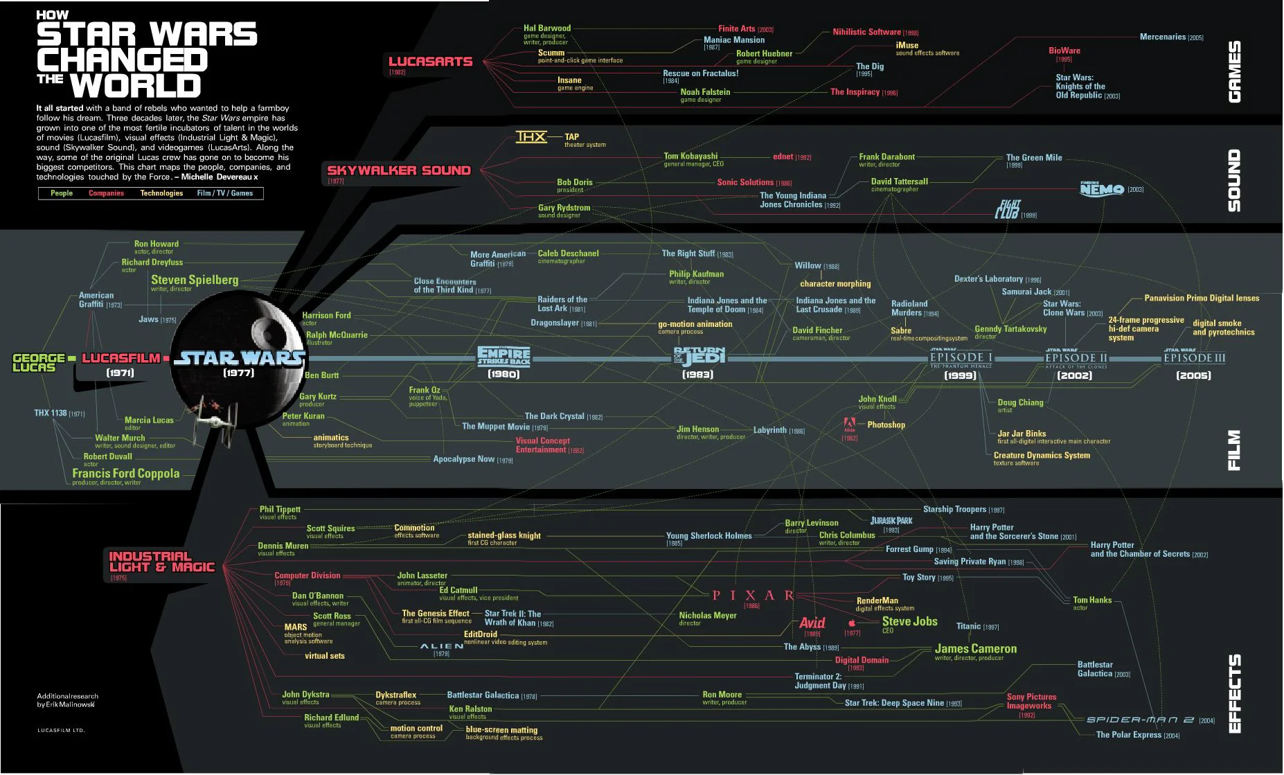
How Star Wars Changed the World
Randy Krum
Jul
30
Jul 30
Bio-Suit EVA Infographic Poster
Randy Krum
Jan
20
Jan 20
Race to the Moon
Randy Krum
Dec
29
Dec 29
How to Spot a Cylon
Randy Krum
Sep
10
Sep 10
Analytics according to Captain Kirk
Randy Krum
Aug
12
Aug 12
Starship Dimensions
Randy Krum
Jul
15
Jul 15
Starship Comparison
Randy Krum


![NASA's New Budget [infographic]](https://images.squarespace-cdn.com/content/v1/5bfc8dbab40b9d7dd9054f41/1554262402671-E9I70CBJR0MOX48XS95L/space-budget-transparency.jpg)