Home
Infographics
Book
Tools
Tools Directory
DataViz Guides
DataViz Shows
Word Clouds
Sankey Diagrams
Online Infographics Design
Online DataViz
Analytics Platforms
Infographic Resumes
Vector Graphics
Icon Libraries
Color Pickers
Presentation Design
JavaScript Charts
Free Stock Images
Jobs
Posters
Links
Appearances
About
Contact
Follow Cool Infographics
Need Infographics?
Randy Krum
Designer | Author | Instructor | Speaker
FREE Sample Chapter
Read More
All tagged
software
Jun
22
Jun 22
Bluetooth in Indoor Positioning Systems
Randy Krum
Oct
22
Oct 22
2014 Higher Education Technology Landscape
Randy Krum
Oct
10
Oct 10
5 Great Online Tools for Creating Infographics
Randy Krum
Apr
2
Apr 2
The Enterprise Mobility Ecosystem Map
Randy Krum
Jul
1
Jul 1
How Apple Are You?
Randy Krum
May
28
May 28
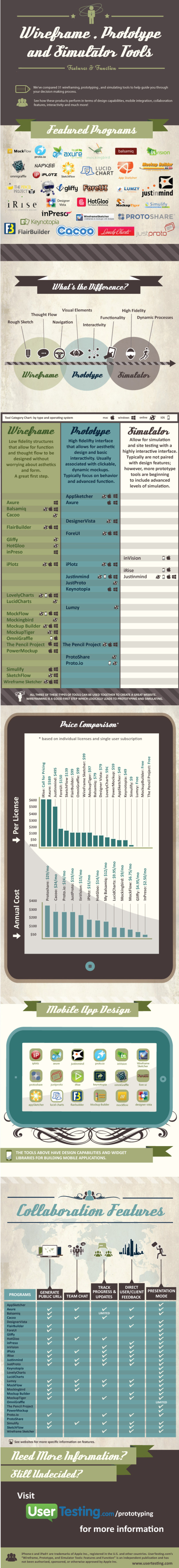
Wireframe, Prototype and Simulator Tools
Randy Krum
Jan
31
Jan 31
The History of Microsoft Office
Randy Krum
Dec
26
Dec 26
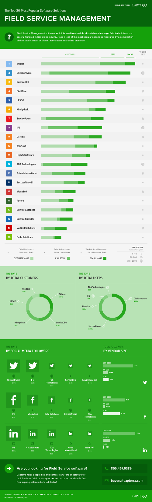
Top 20 Field Service Management Software Solutions
Randy Krum
Mar
26
Mar 26
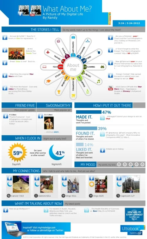
What About Me? - Intel's Infographic Generator
Randy Krum
Jan
30
Jan 30
Client Infographic: Top 20 Medical Records Software Solutions
Randy Krum
Jan
17
Jan 17
Tablet Adoption at Work
Randy Krum
Dec
12
Dec 12
Client Infographic: Top 20 Marketing Automation Software Solutions
Randy Krum
Dec
1
Dec 1
The Designer's Toolkit: The Most Popular Design Tools
Randy Krum
Sep
22
Sep 22
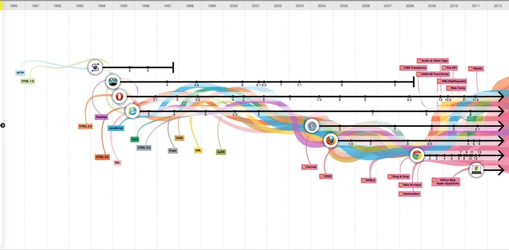
The Evolution of the Web
Randy Krum
Sep
7
Sep 7
10 Infographics and Visualization Apps for iOS
Randy Krum
Jan
19
Jan 19
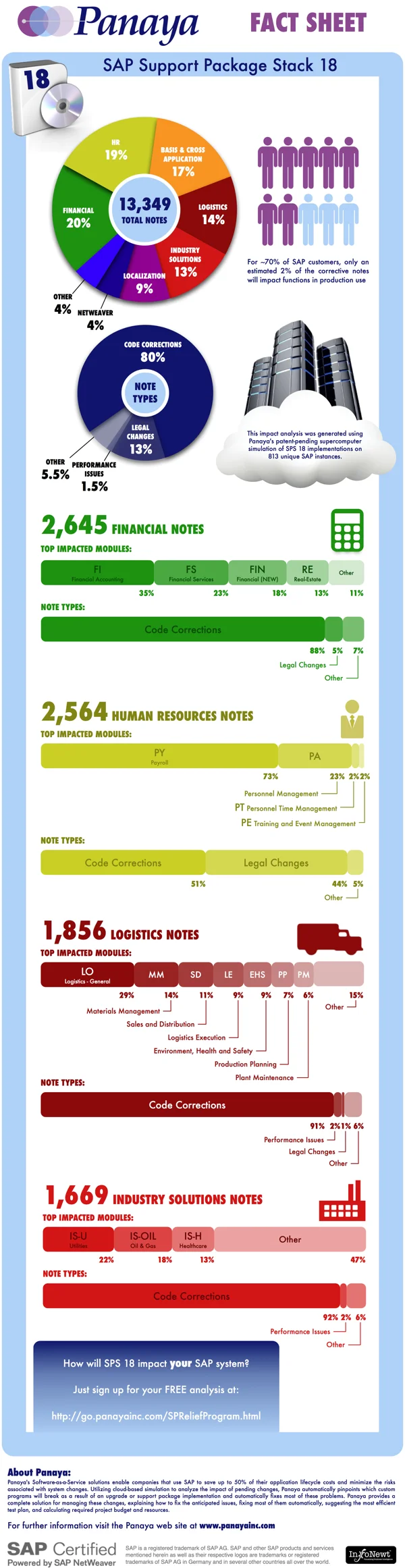
Client Infographic: An Illustrated View of SAP SPS 18
Randy Krum
Oct
5
Oct 5
The Darwinian Evolution of Microsoft Windows
Randy Krum
Jun
24
Jun 24
Adobe Actionscript 3.0 Poster Viewer
Randy Krum
May
19
May 19
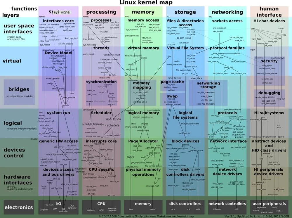
Linux Kernel Zoomable Map
Randy Krum
Feb
18
Feb 18
Early-Bird Taxpayers Get the Refund - infographic
Randy Krum
Load More