Home
Infographics
Book
Tools
Tools Directory
DataViz Guides
DataViz Shows
Word Clouds
Sankey Diagrams
Online Infographics Design
Online DataViz
Analytics Platforms
Infographic Resumes
Vector Graphics
Icon Libraries
Color Pickers
Presentation Design
JavaScript Charts
Free Stock Images
Jobs
Posters
Links
Appearances
About
Contact
Follow Cool Infographics
Need Infographics?
Randy Krum
Designer | Author | Instructor | Speaker
FREE Sample Chapter
Read More
All tagged
oil
Dec
29
Dec 29
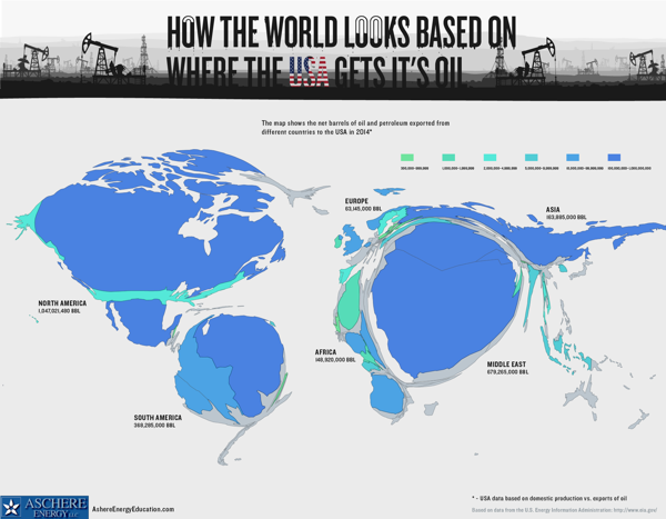
Where The USA Gets Its Oil
Randy Krum
May
20
May 20
The Obama Energy Agenda: Gas Prices 2013
Randy Krum
May
2
May 2
The United States of Energy
Randy Krum
Apr
13
Apr 13
Lakes & Oceans: A Deep Infographic
Randy Krum
Oct
19
Oct 19
U.S. Oil Consumption infographic
Randy Krum
Jul
21
Jul 21
What BP Could Have Bought With All the Money They Lost [infographic]
Randy Krum
May
18
May 18
Crude Awakening - Gulf Spill Infographic
Randy Krum
May
10
May 10
BP Oil Relief Plan Infographic
Randy Krum
Sep
15
Sep 15
Is the U.S. Too Dependent on Foreign Oil? (infographic)
Randy Krum
Feb
9
Feb 9
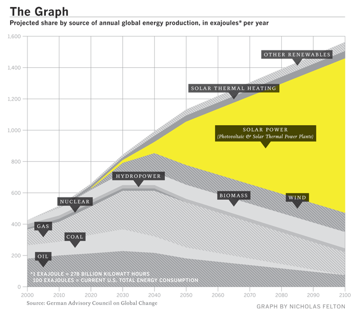
"The Graph" - The Future of Solar Power
Randy Krum
Sep
26
Sep 26
The Rush to Wind Farms!
Randy Krum
Apr
27
Apr 27
Who Owns the Car Companies? (UPDATE)
Randy Krum
Jan
21
Jan 21
Harnessing the Wind
Randy Krum
Jan
16
Jan 16
The Price of Gasoline
Randy Krum
Nov
17
Nov 17
Who has the Oil?
Randy Krum


![What BP Could Have Bought With All the Money They Lost [infographic]](https://images.squarespace-cdn.com/content/v1/5bfc8dbab40b9d7dd9054f41/1553650333996-YG67KU8EHVRVF4A8MSUR/What%2BBP%2BCould%2BHave%2BBought%2BWith%2BAll%2Bthe%2BMoney%2BThey%2BLost%2B.jpg)