Home
Infographics
Book
Tools
Tools Directory
DataViz Guides
DataViz Shows
Word Clouds
Sankey Diagrams
Online Infographics Design
Online DataViz
Analytics Platforms
Infographic Resumes
Vector Graphics
Icon Libraries
Color Pickers
Presentation Design
JavaScript Charts
Free Stock Images
Jobs
Posters
Links
Appearances
About
Contact
Follow Cool Infographics
Need Infographics?
Randy Krum
Designer | Author | Instructor | Speaker
FREE Sample Chapter
Read More
All tagged
government
Aug
25
Aug 25
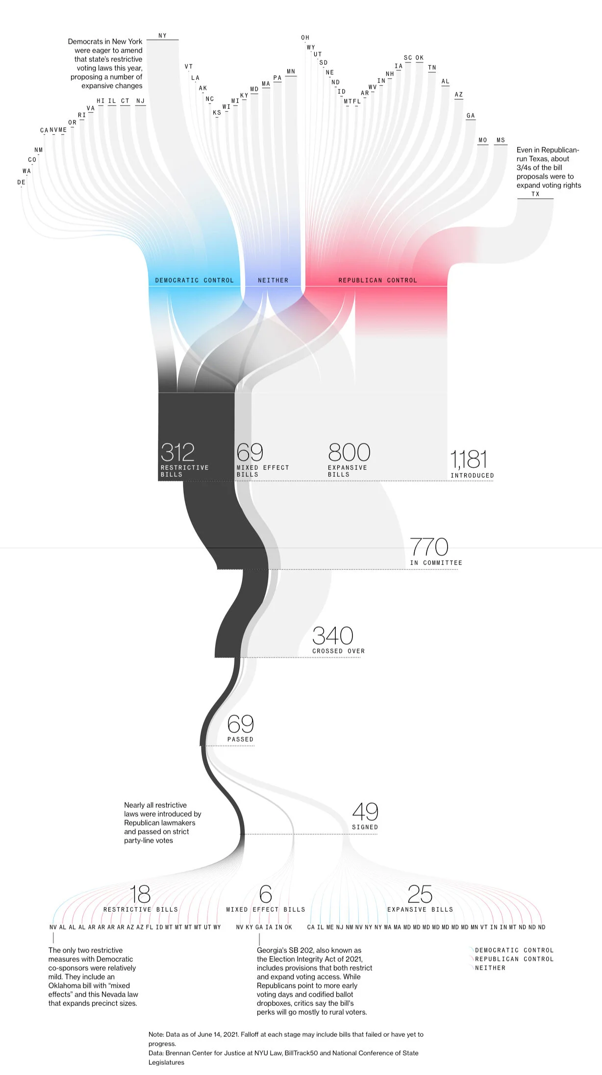
Voting-Rights Restriction Bills Sankey Analysis
Randy Krum
Dec
16
Dec 16
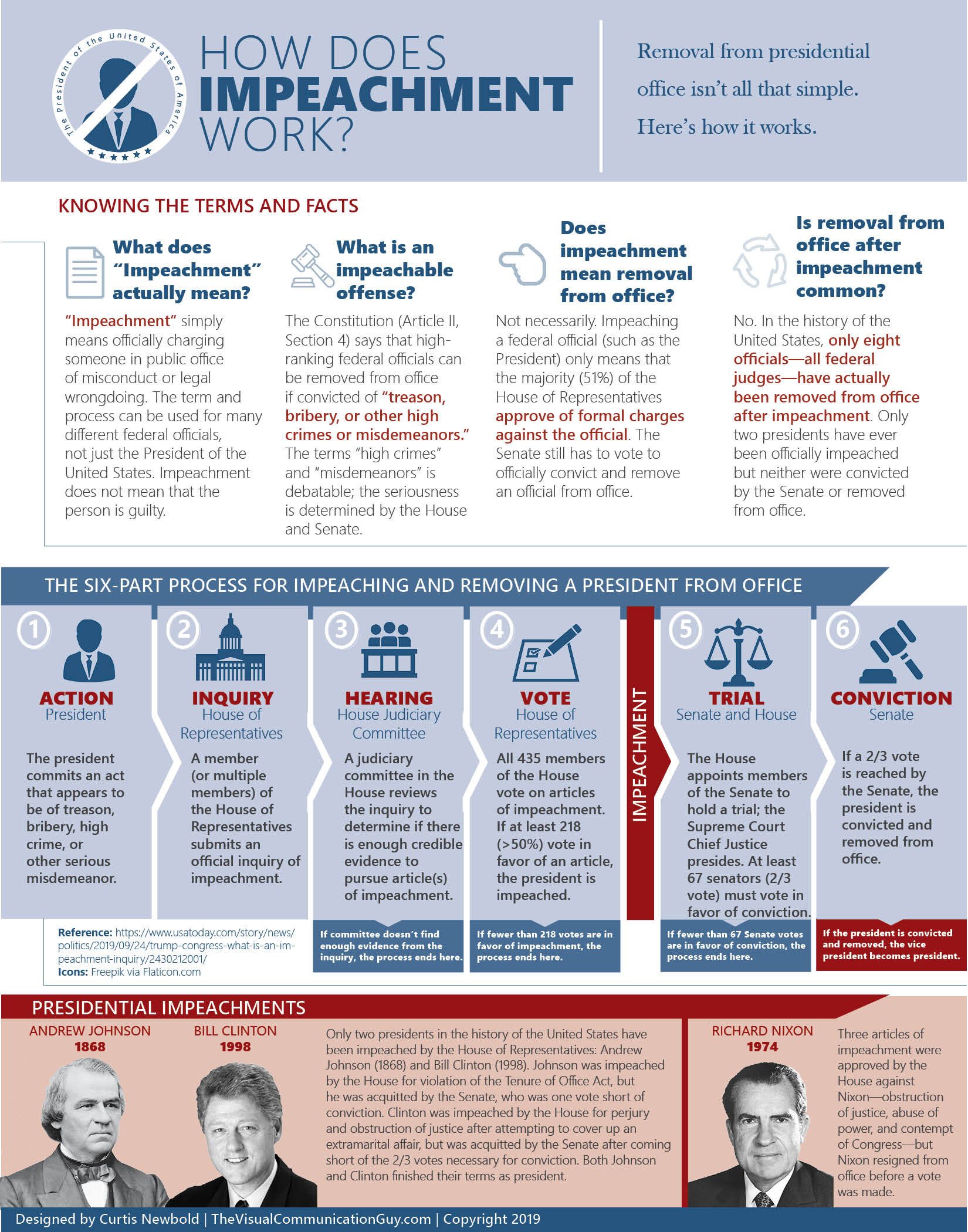
How Does Impeachment Work?
Randy Krum
Feb
22
Feb 22
Making America Smarter, Stronger, and Younger
Randy Krum
Mar
16
Mar 16
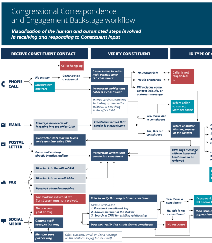
Where Constituent Input Ends Up
Randy Krum
Oct
14
Oct 14
A House Divided: The Rise of Political Partisanship
Randy Krum
Aug
21
Aug 21
Missing Money
Randy Krum
Jun
5
Jun 5
Legislative Explorer: Watch Government In Action
Randy Krum
Dec
3
Dec 3
Understanding Healthcare.gov’s Rocky Rollout
Randy Krum
Oct
17
Oct 17
What is the Debt Ceiling?
Randy Krum
Jul
22
Jul 22
What the Health? Understanding Obamacare's 11 Year Health Plan
Randy Krum
May
20
May 20
The Obama Energy Agenda: Gas Prices 2013
Randy Krum
Feb
5
Feb 5
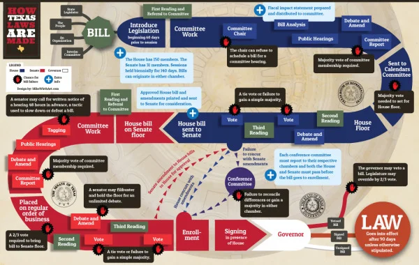
How Texas Laws Are Made
Randy Krum
Dec
20
Dec 20
Fire Code Regulations for Live Christmas Trees in Schools
Randy Krum
Nov
19
Nov 19
The Difference Between the United Kingdom, Great Britain, and England
Randy Krum
Oct
26
Oct 26
A Visual History of the US House poster and interview
Randy Krum
Oct
23
Oct 23
Tracking American Poverty - interactive infographic
Randy Krum
Oct
11
Oct 11
Obamacare: The Price of Socialized Medicine
Randy Krum
Apr
24
Apr 24
Gov 2.0 Infographic: Bringing the Tobacco Control Act to Life
Randy Krum
Sep
30
Sep 30
A Disaster for FEMA
Randy Krum
Aug
8
Aug 8
Visualizing the U.S. Debt
Randy Krum
Load More