Home
Infographics
Book
Tools
Tools Directory
DataViz Guides
DataViz Shows
Word Clouds
Sankey Diagrams
Online Infographics Design
Online DataViz
Analytics Platforms
Infographic Resumes
Vector Graphics
Icon Libraries
Color Pickers
Presentation Design
JavaScript Charts
Free Stock Images
Jobs
Posters
Links
Appearances
About
Contact
Follow Cool Infographics
Need Infographics?
Randy Krum
Designer | Author | Instructor | Speaker
FREE Sample Chapter
Read More
All tagged
environment
Oct
25
Oct 25
Earth's Temperature Timeline
Randy Krum
Aug
26
Aug 26
Animal Migrations In Motion
Randy Krum
Dec
8
Dec 8
The Global Carbon Budget 2015
Randy Krum
May
30
May 30
Water in the Anthropocene
Randy Krum
Apr
26
Apr 26
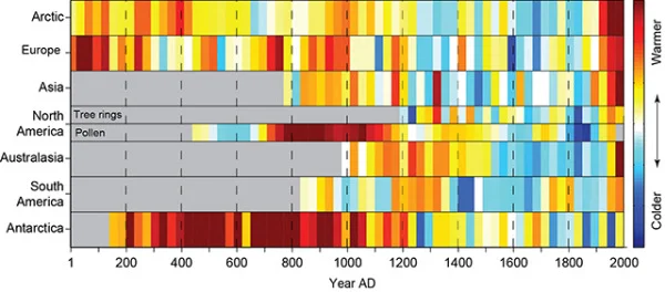
2,000 Years of Continental Climate Changes
Randy Krum
Dec
6
Dec 6
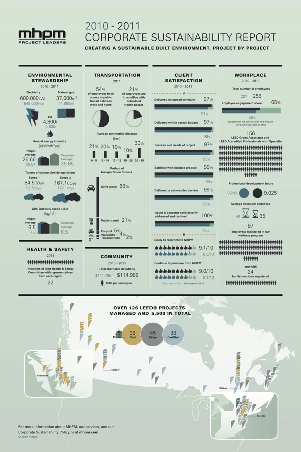
MHPM's Infographic CSR (Corporate Sustainability Report)
Randy Krum
May
8
May 8
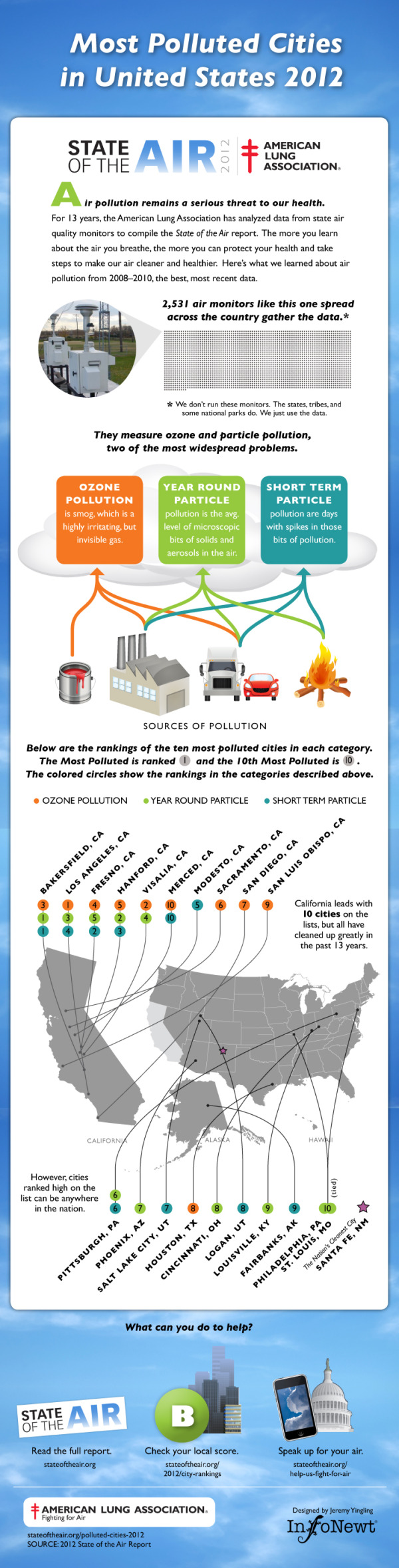
Client Infographic: Most Polluted Cities 2012
Randy Krum
Apr
9
Apr 9
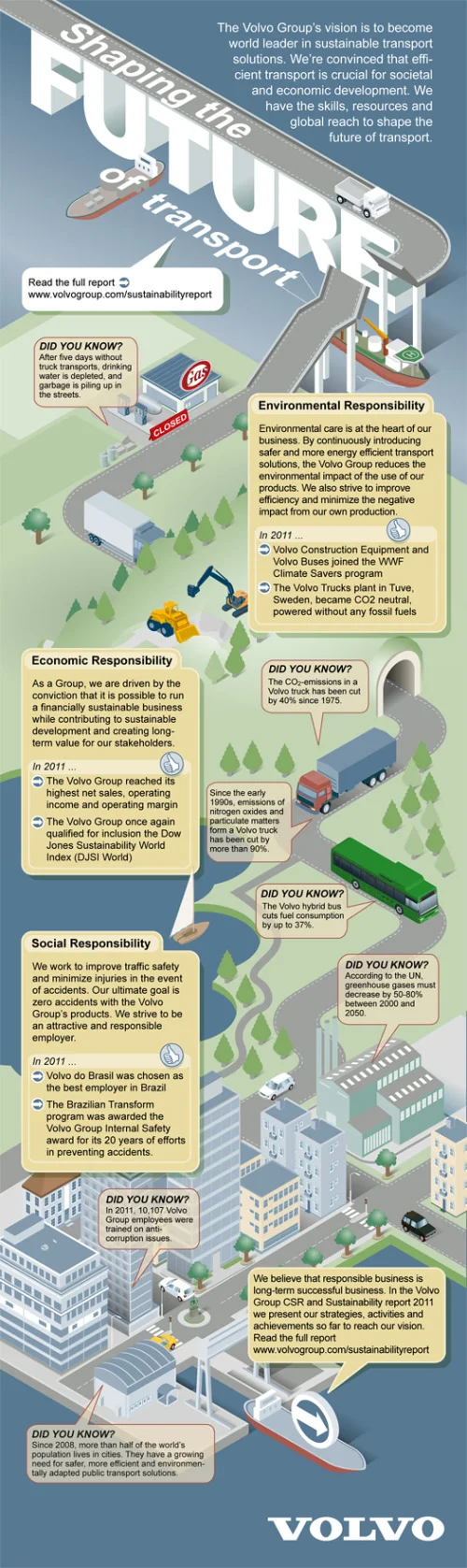
CSR and Sustainability Report: Volvo Shaping the Future of Transport
Randy Krum
Feb
10
Feb 10
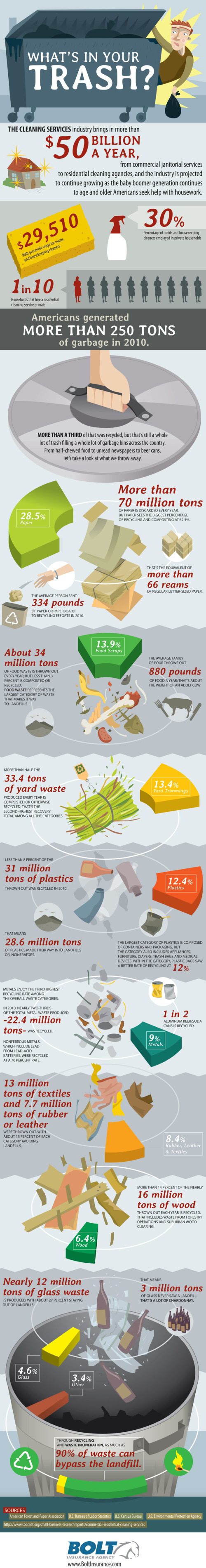
What's In Your Trash?
Randy Krum
Nov
9
Nov 9
SPAM: More than an Annoyance?
Randy Krum
Aug
9
Aug 9
Client Infographic: A Solar Innovation Story
Randy Krum
Jul
15
Jul 15
Our Choice: Interactive, Infographic iPad book
Randy Krum
Sep
30
Sep 30
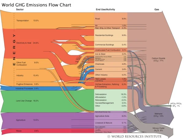
World GHG (Green House Gasses) Emissions Flow Chart
Randy Krum
Sep
7
Sep 7
GE Ecomagination Challenge “Powering the Grid” Visualized
Randy Krum
Jun
29
Jun 29
How Wild is North America? (infographic)
Randy Krum
May
24
May 24
Ecological Footprint from Digital Eskimo
Randy Krum
Jan
15
Jan 15
World Progress Report poster - Available for one week ONLY
Randy Krum
Dec
10
Dec 10
The Carbon Economy - Infographic Video
Randy Krum
Sep
2
Sep 2
Surface Area Required to Power the World with Solar Power
Randy Krum
Jun
2
Jun 2
Déjà Poo: The Living Machine Sewage System
Randy Krum
Load More