Home
Infographics
Book
Tools
Tools Directory
DataViz Guides
DataViz Shows
Word Clouds
Sankey Diagrams
Online Infographics Design
Online DataViz
Analytics Platforms
Infographic Resumes
Vector Graphics
Icon Libraries
Color Pickers
Presentation Design
JavaScript Charts
Free Stock Images
Jobs
Posters
Links
Appearances
About
Contact
Follow Cool Infographics
Need Infographics?
Randy Krum
Designer | Author | Instructor | Speaker
FREE Sample Chapter
Read More
All tagged
campaign
Jun
20
Jun 20
How to Create a Winning Email Marketing Campaign
Randy Krum
Dec
1
Dec 1
Vote With Your Dollars! - Corporate Political Contributions infographic
Randy Krum
Apr
15
Apr 15
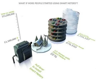
GE: Plug into the Smart Grid
Randy Krum
Feb
25
Feb 25
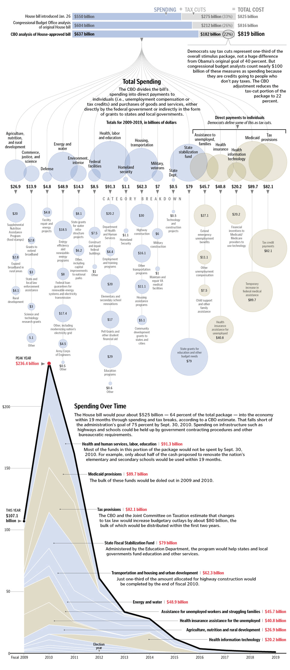
Taking Apart the $819B Stimulus Package
Randy Krum
Jan
21
Jan 21
A New President - Wordle
Randy Krum
Nov
4
Nov 4
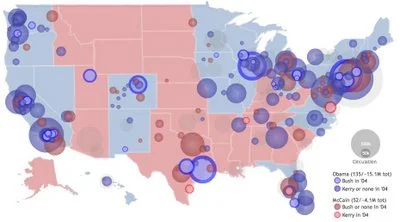
Create Your Own Electoral Map
Randy Krum
Oct
28
Oct 28
Map of Newspaper Presidential Endorsements
Randy Krum
Oct
26
Oct 26
Does Your Vote Matter? YES!
Randy Krum
Jun
23
Jun 23
Obama Funding Graphic
Randy Krum
Jun
11
Jun 11
Democratic Party Voting Margins
Randy Krum
Mar
11
Mar 11
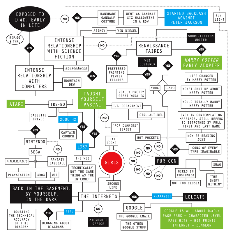
Tribute to Gary Gygax
Randy Krum
Feb
19
Feb 19
Meet The World, Infographic Flags
Randy Krum
Feb
18
Feb 18
GE Ecomagination Blueprint Ads
Randy Krum
Jan
7
Jan 7
The Software Wars
Randy Krum
Aug
8
Aug 8
2008 Presidential Campaign Finances
Randy Krum
Jul
21
Jul 21
Top Presidential Contributions 1Q
Randy Krum