Home
Infographics
Book
Tools
Tools Directory
DataViz Guides
DataViz Shows
Word Clouds
Sankey Diagrams
Online Infographics Design
Online DataViz
Analytics Platforms
Infographic Resumes
Vector Graphics
Icon Libraries
Color Pickers
Presentation Design
JavaScript Charts
Free Stock Images
Jobs
Posters
Links
Appearances
About
Contact
Follow Cool Infographics
Need Infographics?
Randy Krum
Designer | Author | Instructor | Speaker
FREE Sample Chapter
Read More
Jun
2
Jun 2
Cool Infographics on YouTube!
Randy Krum
Mar
17
Mar 17
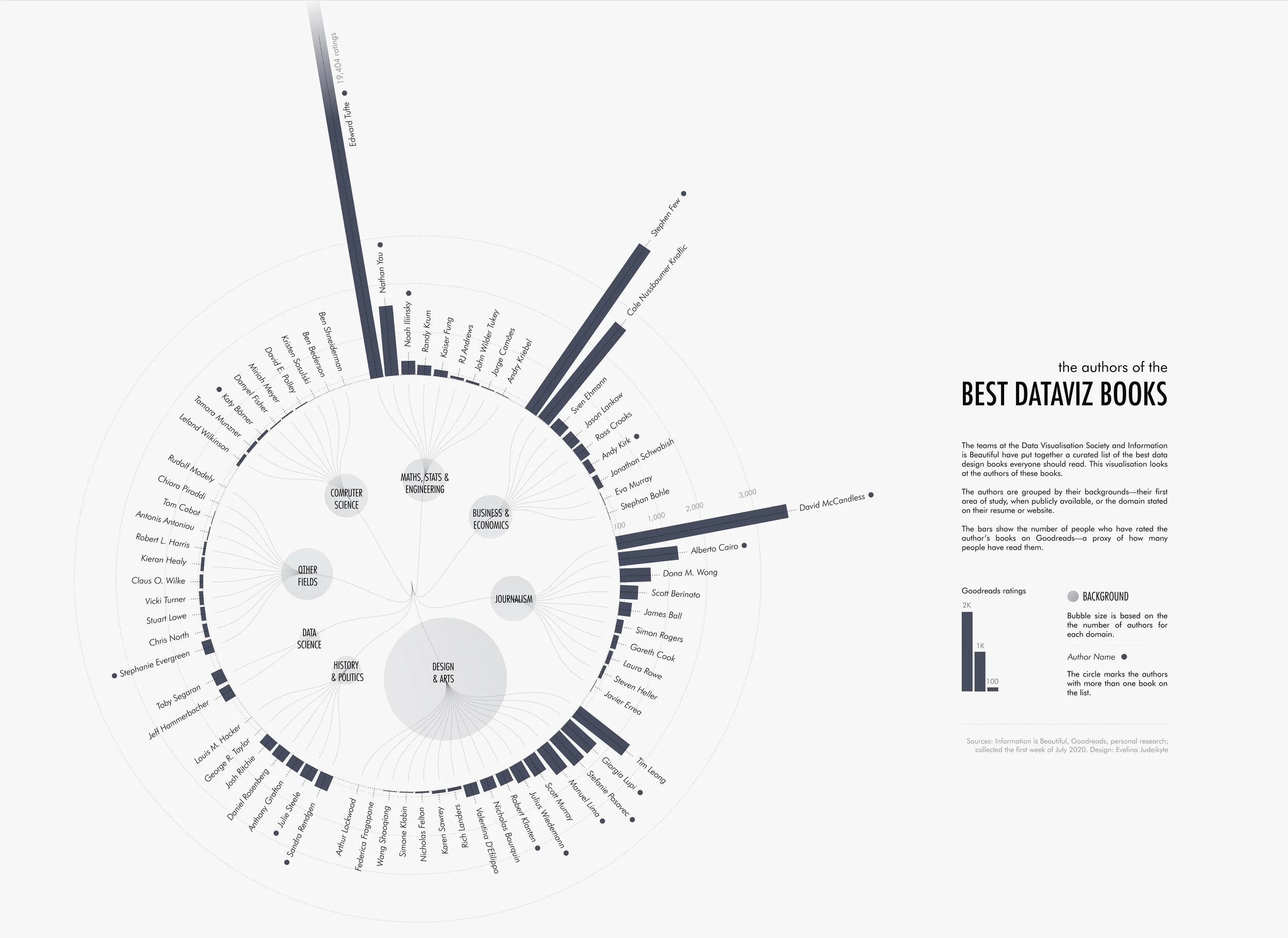
The Authors of the Best Dataviz Books
Randy Krum
Dec
12
Dec 12
Apple Product Release Patterns (2025 Update)
Randy Krum
Oct
29
Oct 29
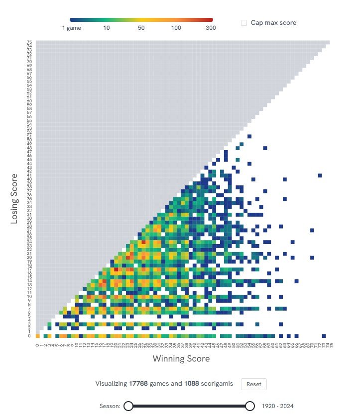
Scorigami: Visualize Every NFL Score Ever
Randy Krum
Oct
14
Oct 14
The State of the Space Program infographics
Randy Krum
Oct
6
Oct 6
Pirated DataViz Books Used to Train AI
Randy Krum
Sep
15
Sep 15
Planets Mean Temperatures
Randy Krum
Aug
21
Aug 21
Photography Cheat Sheet
Randy Krum
May
20
May 20
Power Tool Manufacturers and Who Really Owns Them-2024
Randy Krum
Mar
25
Mar 25
How Long Do Animals Live?
Randy Krum
Jan
16
Jan 16
2024 US Presidential Election Eclipse
Randy Krum
Dec
26
Dec 26
Support these Data Visualization Organizations
Randy Krum
Oct
11
Oct 11
How Long Can People Cover Their Needs Without Income?
Randy Krum
Aug
22
Aug 22
The Generation Gap
Randy Krum
Aug
1
Aug 1
The Most Common 4-digit PIN numbers
Randy Krum
May
1
May 1
The Mammoth Cost of Operating America's Combat Aircraft
Randy Krum
Mar
29
Mar 29
The Evolution of UK Company Logos
Randy Krum
Feb
22
Feb 22
The Quickest Route to Washington DC
Randy Krum
Feb
19
Feb 19
America’s Immigration Crisis sankey diagram
Randy Krum
Jan
9
Jan 9
The Problem with Plastics
Randy Krum
Load More