About

Randy Krum

President of InfoNewt.
Data Visualization, Infographic Design, Visual Thinking, Product Development and Marketing professional fascinated by good infographics.  Always looking for better ways to get the point across.


Like us on Facebook to help spread the word!

Click +1 to give us your stamp of approval or just to say “this is pretty cool.”

Infographic Design


Search the Cool Infographics site

Custom Search

Subscriptions:


How to add the
Cool Infographics button to your:

- iPhone
- iPad
- iPod Touch


Read on Flipboard for iPad and iPhone

Featured in the Tech & Science category

The Cool Infographics Gallery on Pinterest

Follow Me!


Follow Randy (@rtkrum) 

Blog posts ONLY on Twitter

Twitter List: Cool Infographics People

Follow Me on Pinterest

Twitter Feed
Caffeine Poster

Gadget Map

Google Insights

« HBO Recycling Program | Main | The Flipped Classroom infographic »
Wednesday
Sep142011

Google in 2011: Courtroom & Boardroom

Google in 2011: Courtroom & Boardroom is a new infographic from Search Influence.  At it’s heart, this is a timeline history of acquisition and courtroom events through the first nine months of 2011, but there is a lot going on here.

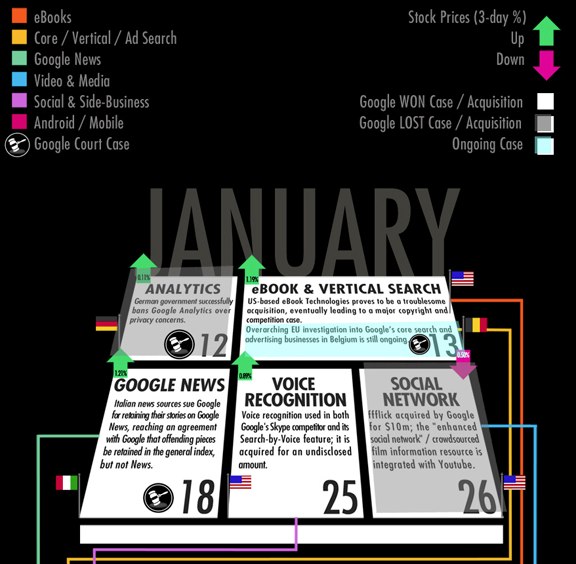
Events are laid out in a psuedo-calendar format for each month, flagged by country and shaded to indicate win or loss.  The change in stock price is also shown for the actual day of each event, but even though this implies the event’s impact to stock price, there are always many more factors driving price changes.  Events are connected by colored lines to indicate on-going events and the related division of Google’s business.

I hope they keep evolving this design.  In it’s current state, it’s a little hard to follow, but I love the multiple layers of data represented.  This design could evolve to be more easily readable, and even be applied to other companies as well.

Thanks to Matt for sending in the link!


PrintView Printer Friendly Version

EmailEmail Article to Friend

Reader Comments (1)

realizing that the data and correlation in-itself is complicated, the graphic compounds the complexity, what a mess.
September 15, 2011 | Unregistered CommenterJeff
Comments for this entry have been disabled. Additional comments may not be added to this entry at this time.