About

Randy Krum

President of InfoNewt.
Data Visualization, Infographic Design, Visual Thinking, Product Development and Marketing professional fascinated by good infographics.  Always looking for better ways to get the point across.


Like us on Facebook to help spread the word!

Click +1 to give us your stamp of approval or just to say “this is pretty cool.”

Infographic Design


Search the Cool Infographics site

Custom Search

Design Contest!

Infographic Design Contest!

Enter to win an iPad 2!

Subscriptions:


How to add the
Cool Infographics button to your:

- iPhone
- iPad
- iPod Touch


Read on Flipboard for iPad and iPhone

Featured in the Tech & Science category

Strata Conference 2012

Follow Me!


Follow Randy (@rtkrum) 

Blog posts ONLY on Twitter

Twitter List: Cool Infographics People

Twitter Feed
Political Party Posters
2012 Death & Taxes Poster

Cool Affiliates

OmniGraffle

OmniGraffle for Mac - The Omni Group


Pixelmator

Pixelmator - Pixelmator Team


MindNode Pro

MindNode Pro - Markus Müller


 Skitch

Skitch - Skitch


GraphicConverter

GraphicConverter - Lemke Software GmbH


Visit Art.com


From the Bookstore

Caffeine Poster

Gadget Map

Google Insights

Infographics Carousel
Thanks to...
Powered by Squarespace


« Long Weekends Calendar | Main | Infographic Video: The Histoy of the Internet »
Monday
Jan122009

Halo 3 HeatMaps


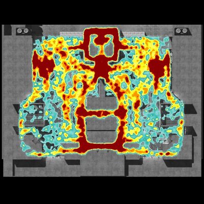
A while back Bungie.net, the makers of the Halo series of games, started tracking data on their servers about how their different online multiplayer maps are preforming.  They converted the data on kills and deaths in the multiplayer games into heatmaps, and then started publishing the maps online for everyone to see.

The advantages to players are that you can see places to avoid (areas with the highest deaths), and the locations from where the most kills come from.  The map above shows the total data for the map called The Pit.  But you can narrow down the information based on the type of weapon used.  For example the map below shows the locations of the kills made with the sniper rifle.  Meaning that shooting from these locations have been the most successful.  (Also helpful if you keep getting killed by snipers and can't find them)


"Heatmaps are the Doppler Radar System of Death in Halo 3. We're tracking encounters, weapons used and their results in a given game, collecting that data and sharing it with players visually. The key here is 'the darker the red, the more frequent the deaths (or kills, depending on the parameters)'," Bungie explains in its weekly update.

PrintView Printer Friendly Version

EmailEmail Article to Friend

Reader Comments (2)

Awesome!!
September 22, 2011 | Unregistered CommenterWindshield Replacement MN
Many thanks for a good time visiting your web blog. I am highly pleased and right now an aficionado. Make sure you update this again soon. Cheers!
September 24, 2011 | Unregistered CommenterRazor Bumps

PostPost a New Comment

Enter your information below to add a new comment.

My response is on my own website »
Author Email (optional):
Author URL (optional):
Post:
 
All HTML will be escaped. Hyperlinks will be created for URLs automatically.