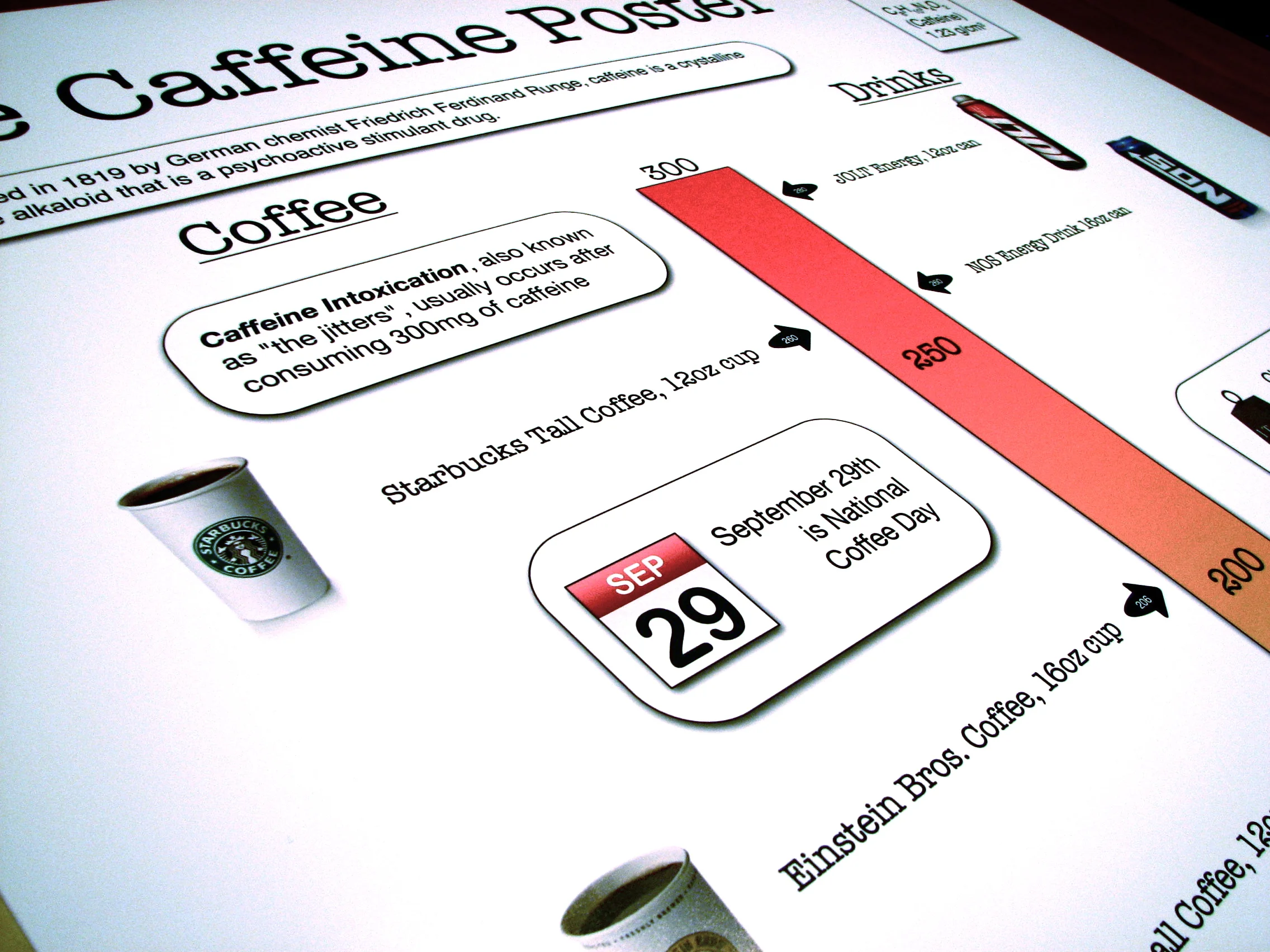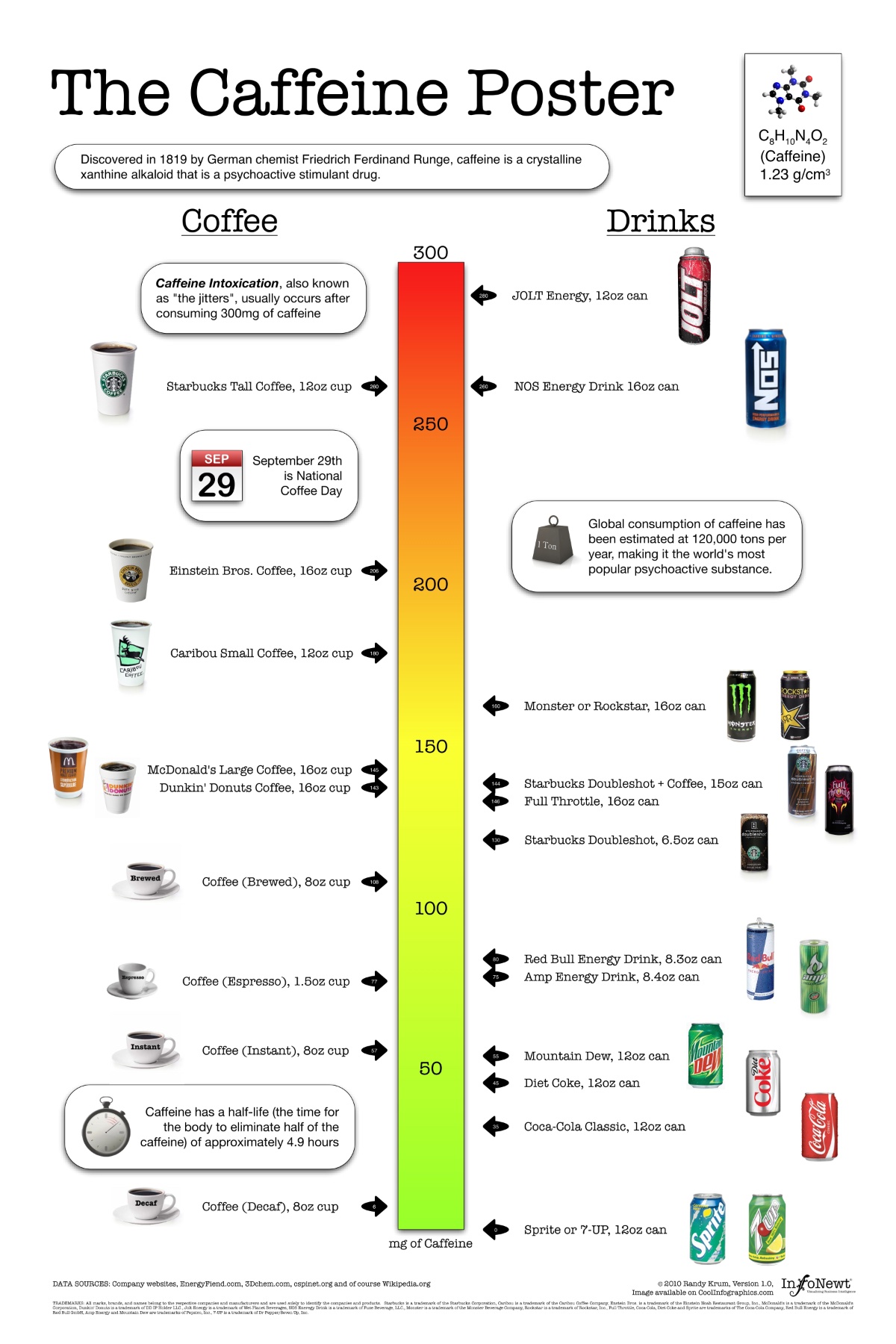
You are what you drink. With so many drinks today claiming to be "energy drinks", I wanted a little visual clarification, so I made The Caffeine Poster. With coffee drinks on one side and canned cold drinks on the other, you can quickly see how much of a caffeine "hit" (in mg) you will get after consuming. What's especially interesting is many of the drinks have a very high caffeine mg/oz ratio, but the drink is so small you don't get that much total caffeine.

I've been working on my own infographic for 6 months now off-and-on when I can make time. I figured that I've been running this infographic blog for a few years now, it's time to start putting up my own work. Most of the data visualization I've designed are confidential to the company I make them for, so I wanted to create some infographics that I can publish on the blog.

The Caffeine Poster is supposed to help with one decision in your life. If you're going to grab a caffeine drink during the day (or evening), which drink should you consume? I tried to stay focused on telling one story really well. I've heard from others that this may make for a really good infographic, but may not make a great poster because a good poster would have a much deeper level of detail. I like it, and we'll see what king of responses I get.

I absolutely want to hear your feedback. Please add your comments below or send me a note. What do you think? I've also got requests to print and offer this as a poster. We'll see if there is enough interest...
Also, I'm planning to post as "Making-of" article on what it took to create this infographic.
THANKS: A big thanks to Fast Company for posting about The Caffeine Poster on the Fast Company blog. The Caffeine Poster was the most popular story of the week on Fast Company!
Glamor shots of the printed poster:
I tried out the poster printing service from PosterBrain.com last week and printed out a couple copies of The Caffeine Poster. I've never posted the full, high-resolution image online, but I used it with PosterBrain to print it out fullsize 24" x 36".
The poster is gorgeous! I'm so impressed by the PosterBrain service, and the quality of their prints.
You really should try their service. I uploaded the file on Sunday, and paid only $24.99 each to have them printed with free shipping. I received the posters on Friday by standard USPS mail. They were beautifully packaged with sheets of tissue separating the posters.

As much as I love infographics, I'm not a graphic designer. I've created a number of graphics for my corporate jobs, but they always deal with confidential information so I can't share those on the blog. Up until now, all of the graphics I've posted about on Cool Infographics are the work of great designers around the world. Recently, I decided to try my hand at creating one of my own to share with everyone.
If you follow me on Twitter (@rtkrum), you may have read that I started on this back in June 2009. I haven't had much time to spend on it, so it definitely took longer than I originally thought. I want to share some of the decisions and solutions I came across during the process, and maybe it will help anyone reading this when they work on their own infographics.
You may say, "This is such a simple graphic, why did it take 6 months? It looks like it should be pretty easy." First, I would say that I wasn't working on it full time, but I think the exercise also highlights how much work really goes into infographic designs. It's not a new sentiment, but let me say that designers don't get enough credit.
What should the infographic be about?
Of course the first question I had to tackle was what should I create an infographic about? I wanted to find something that had a lot of publicly available data, but also a topic that hadn't already been covered by a bunch of other graphics. A topic of interest to a lot of people, so the audience for the infographic would also be large. I liked the idea of caffeine content because although the data is available online, it's not included on the government regulated Nutrition Facts on drinks. Very few companies add it voluntarily, but for the most part you have to go find the data on your own.
Also, the data available online was predominantly text figures, so you have to scroll through pages of information to find the drink you're looking for. This combination of hard to find data, and hard to decipher once you find it made for a good topic.
How to calculate the data?
I created a simple spreadsheet to massage the data, and there were two ways I could have calculated the caffeine content. Either total caffeine content (mg), or caffeine concentration (mg/oz). Although caffeine concentration would be a good common denominator to compare drinks, it doesn't capture how much you consumer when you actually purchase a drink. Most of these drinks don't come from a dispenser where you could choose how much you wanted to drink.
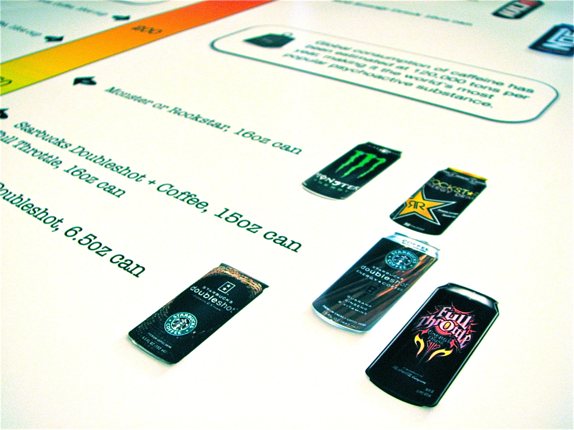
For example, the Starbucks Doubleshot is a very high concentration (20 mg/oz), but it comes in a 6.5oz can. Therefore you only get 130mg of caffeine when you drink a can. Compare that to a McDonald's Large Coffee that has a lower concentration (9 mg/oz), but comes in a 16oz cup for a total of 145 mg.
Ultimately, I decided to visualize the consumer friendly version that would should how much you get when you make a purchase decision, and went with the total caffeine content.
What type of visual should I use?
The scale was the obvious choice to show the relative content of the drinks. Back in June, I started with a very simple sketch in my Moleskine.
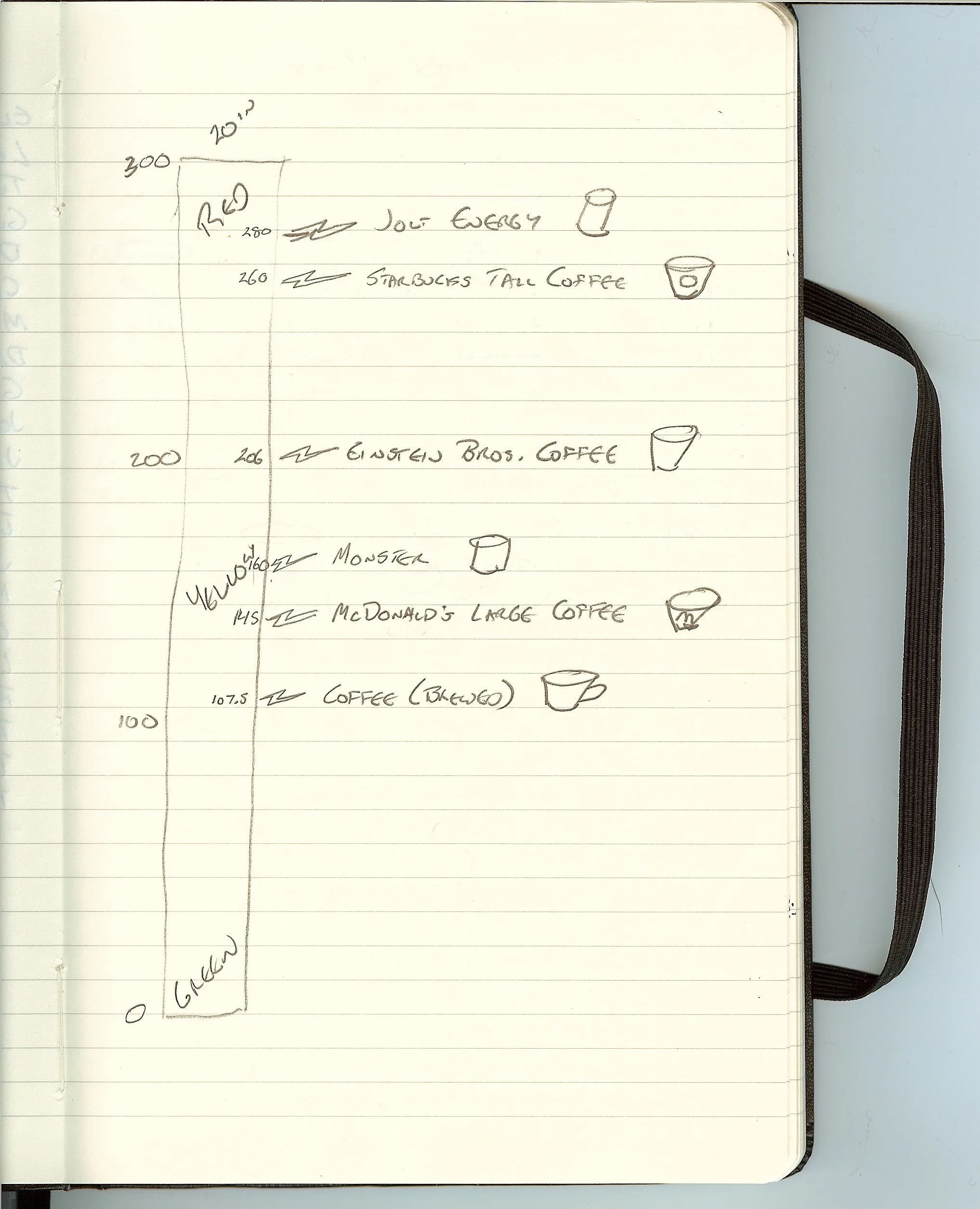
Because there are so many drinks in the lower half, my original design thought had a closeup of the 0-100mg range. Here's an early working version:

I didn't like how this looked, or how much dead space in the post this would create. So ultimately I ended up significantly cutting down the number of drinks I could include, and moving the scale to the center so I could include drinks on both sides.
You'll also notice how muddy brown the yellow in the middle of the scale looks in these old images. I later figured out how to do a 3-color blend instead of just a 2-color blend from red to green.
What software did I use to create the poster?
This is easily the most asked question I hear about any infographic. I use a Mac, and really only used a small number of applications. Here's a list of the software packages I used:
OmniGraffle Pro 4.2.3 - Overall layout and creation of the final image
Pixelmator 1.5 - Image editing
Keynote 5.0.3 - Used for image editing and alpha masks
Numbers 2.0.3 - For the data calculations
I will add that one of my best friends is an art director, and she helped clean up a few of the photos using Photoshop and Illustrator. A huge "Thank You" to Steffani for her help.
This is Part 2 in the continuing the series to share the details behind creating The Caffeine Poster. I am going to create one web page to combine all of these Making-Of notes together, and I'll post a link to that in Part 3.
Where did the data come from?
There was no one, single complete source for the data. A number of the company websites have their caffeine content listed in the Nutrition Facts of product information, so if it was available I used their own information.

EnergyFiend.com has the largest database I found of caffeine contents in drinks and foods. If I found different values for the caffeine content on different websites, I would just use an average.

The Center for Science in the Public Interest also has the caffeine content listed for many drinks.

As a side note, EnergyFiend also has this great Death By Caffeine calculator!

The drinks come is many different sizes. Why didn't you standardize the drinks sizes?
This was probably the feedback I've heard most often since posting the infographic. I posted a short answer in the comments, but here I can provide some additional explanation.
First, the data itself isn't that complicated. I didn't need to use any statistical software to massage the numbers. A simple spreadsheet in Numbers takes care of all the number crunching.

Even in this small piece of the spreadsheet, you can see a number of different drink sizes. My choice was to either visualize column C or D. The mg column represents the amount of caffeine you will consume from the entire drink. The mg/oz column represents the amount of caffeine in each oz of liquid.
From a scientific point-of-view, the mg/oz is a common denominator and is probably a true apples-to-apples comparison. This option would have shown the strength of the caffeine concentration in each formula, and you could see how much stronger the Starbucks coffee is compared to Dunkin' Donuts.
However, my target market for the infographic isn't the scientist that formulates the drinks, but the consumers that drink them. Most of these drinks aren't available in self-serve dispensers, so the consumer will drink whatever quantity they purchase (10oz, 12oz, 16oz, etc.). By visualizing the total caffeine content of each drink, the consumer knows instantly how much caffeine they are putting into their body when they consume a drink.
For people that want to know the concentration, maybe I'll add that as a side note for each drink in the next version. :)
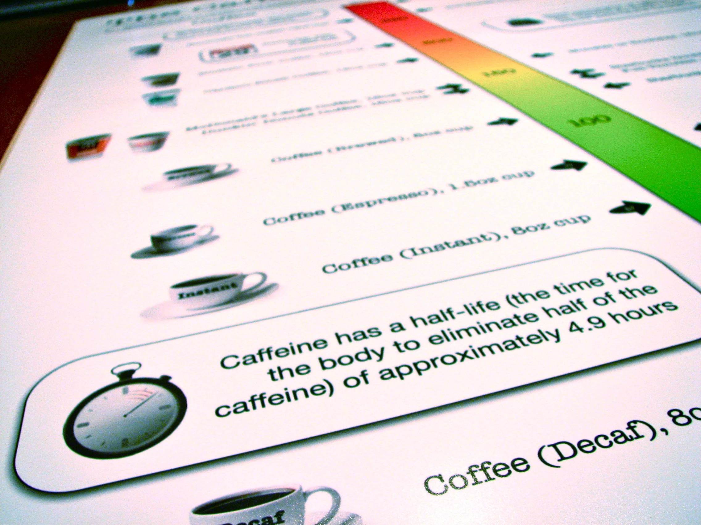
The caffeine content can differ each time you brew coffee, how did you choose only one number for each drink?
Even though caffeine content may vary from one drink to the next, all of the company sites and other websites list one average number for each drink. Because the visual is a scale, the overall intent is to visualize the drinks in comparison to each other. Precision wasn't as important as showing them as higher or lower caffeine content relative to each other.
To be more exact, I could have listed ranges, and that wouldn't have changed the drink locations on the scale. BUT, ranges also weren't available from the data sources, so it really wasn't an option and I didn't worry about it too much.

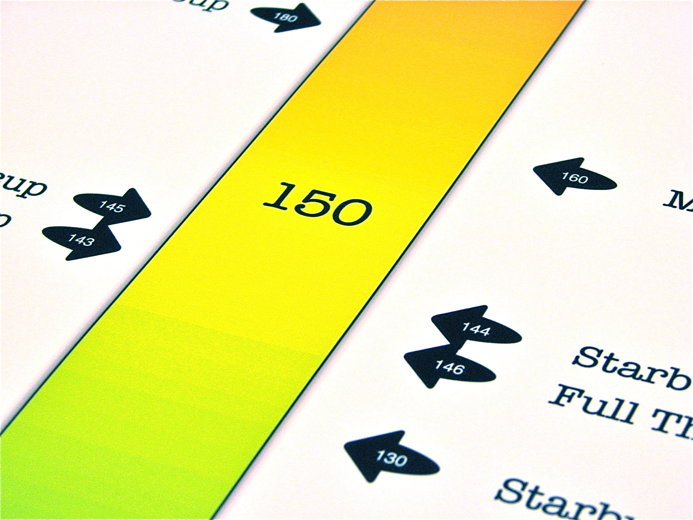
Adding the caffeine content numbers in the indicator arrows was actually a last-minute change. Originally, I had intended not to list a specific number, because the values can vary. Without the numbers, it leaves the actual content a little vague.
I also had some friends and designers look at an early version to get some feedback, and they would ask what the numbers were. In the end, I decided that I personally would want to see the values if I were seeing the poster for the first time, so I added them.
Good thing I did too! I found two drinks that were reversed and in the wrong place, so adding the numbers was a great way to check the accuracy of the design.
What is this thing?
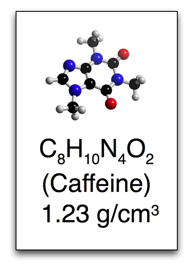
To emphasize the science behind caffeine, I included this rectangle that looks like it comes from the periodic table of elements. Caffeine isn't an element, so I could only use the style of the periodic table with this 3-D rendering of a caffeine molecule, the chemical formula of caffeine and the molecular weight.

How did you pick which drinks to include?
The original spreadsheet with the caffeine calculations had about 100 drinks on it, but that made the image WAY too crowded. Looking back, I could have made the images smaller to fit more drinks onto the poster, so maybe the next version will have more.
For the coffee side, I picked some of the most widely available coffee shops, and I also only picked one drink from each. Starbucks alone had 20-30 different drinks I could have listed.
For the drinks side, I picked the drinks that were most widely available at the grocery stores in the DFW area. It may be different regionally, but the local region was all I had to work with.
Dude, where's the TEA?!?
I posted this in the comments, but I know I left tea out of the graphic (along with thousands of other drinks). It was actually hard to cull down the wide assortment of drinks down to only the ones I included. Not a tea drinker myself, tea didn't make the cut (Kevin Rose would be disappointed, I know). It's very crowded in the under 100mg space, so tea didn't make the cut. Based on the feedback I got, I'll include it if a next versions happens.
FWIW, tea averages between 40-70mg of caffeine in each 8oz cup
Can I buy a copy of The Caffeine Poster?
I haven't setup the poster for sale, but I did keep the high-resolution images offline so I could make it available if there was interest. The images on Flickr are certainly high-resolution enough to read the details, but they won't print very nicely as a 24" x 36" poster. So far, I haven't heard from many people who wanted to buy a copy.
I also got some feedback that The Caffeine Poster makes a good infographic, but maybe not a great poster. To be a great poster, it probably need more details and other additional information to make the viewer curious to step closer and read more.
However, I did have a few copies printed for myself...of course.
Will there be a next version?
Probably. I've got some other projects in the works, so there's no telling how long it will take. You suggestions on what to change or add are very welcome.
The is the end of the Making-Of posts. I got so many questions about the behind-the-scenes stuff that I moved all of The Caffeine Poster posts together on a separate page. Check out the Caffeine Poster link at the top of the page.