Home
Infographics
Book
Tools
Tools Directory
DataViz Guides
DataViz Shows
Word Clouds
Sankey Diagrams
Online Infographics Design
Online DataViz
Analytics Platforms
Infographic Resumes
Vector Graphics
Icon Libraries
Color Pickers
Presentation Design
JavaScript Charts
Free Stock Images
Jobs
Posters
Links
Appearances
About
Contact
Follow Cool Infographics
Need Infographics?
Randy Krum
Designer | Author | Instructor | Speaker
FREE Sample Chapter
Read More
All tagged
weapons
Oct
6
Oct 6
7 Times Technology Almost Destroyed The World
Randy Krum
May
30
May 30
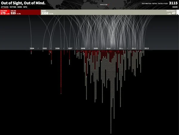
Drones Kill - Animated, Interactive Visualization
Randy Krum
May
24
May 24
The Evolution of the Handgun
Randy Krum
Jun
23
Jun 23
Stuxnet: Anatomy of a Computer Virus [video]
Randy Krum


![Stuxnet: Anatomy of a Computer Virus [video]](https://images.squarespace-cdn.com/content/v1/5bfc8dbab40b9d7dd9054f41/1552606954192-3PTOIS6H0BIUPGTXH4S5/Screen+Shot+2019-03-14+at+5.41.03+PM.png)