Home
Infographics
Book
Tools
Tools Directory
DataViz Guides
DataViz Shows
Word Clouds
Sankey Diagrams
Online Infographics Design
Online DataViz
Analytics Platforms
Infographic Resumes
Vector Graphics
Icon Libraries
Color Pickers
Presentation Design
JavaScript Charts
Free Stock Images
Jobs
Posters
Links
Appearances
About
Contact
Follow Cool Infographics
Need Infographics?
Randy Krum
Designer | Author | Instructor | Speaker
FREE Sample Chapter
Read More
All tagged
startup
Jan
26
Jan 26
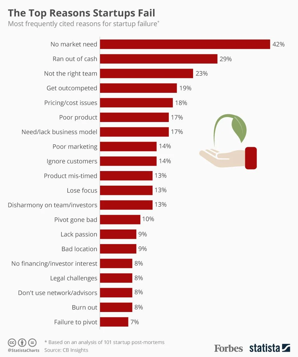
Top Reasons Startups Fail
Randy Krum
Jul
14
Jul 14
Why DFW? 2015
Randy Krum
Nov
2
Nov 2
The Increasingly Crowded Unicorn Club
Randy Krum
May
30
May 30
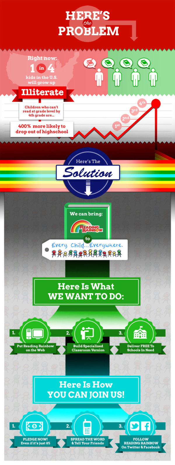
Reading Rainbow's Kickstarter Project
Randy Krum
Jul
15
Jul 15
The Investfographic
Randy Krum
Jul
8
Jul 8
How Startup Funding Works
Randy Krum
Jun
26
Jun 26
Client: Avoid the Dip from IPO Lockups
Randy Krum
May
31
May 31
How Draw Something Blew Up Without Blowing Up
Randy Krum
Apr
18
Apr 18
Where the Startup Jobs are
Randy Krum
Mar
9
Mar 9
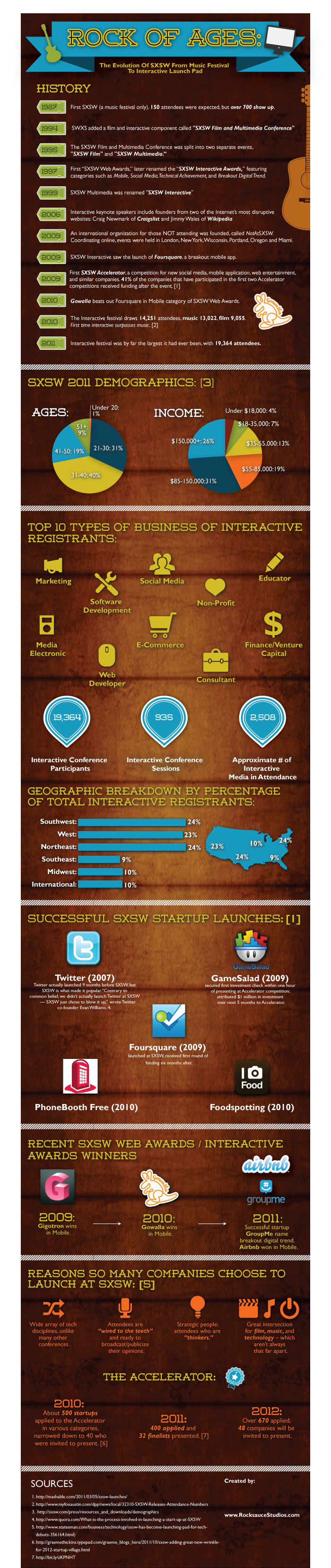
Rock of Ages: The Evolution of SxSW
Randy Krum
Jul
13
Jul 13
The Entrepreneur's Visual Guide to Tech Startups
Randy Krum