Home
Infographics
Book
Tools
Tools Directory
DataViz Guides
DataViz Shows
Word Clouds
Sankey Diagrams
Online Infographics Design
Online DataViz
Analytics Platforms
Infographic Resumes
Vector Graphics
Icon Libraries
Color Pickers
Presentation Design
JavaScript Charts
Free Stock Images
Jobs
Posters
Links
Appearances
About
Contact
Follow Cool Infographics
Need Infographics?
Randy Krum
Designer | Author | Instructor | Speaker
FREE Sample Chapter
Read More
All tagged
search
Oct
8
Oct 8
Google Ranking Factors 2020: Facts and Myths
Randy Krum
Feb
18
Feb 18
Picular: Google Search for Colors
Randy Krum
Feb
21
Feb 21
16 SEO Myths You Should Ignore Completely
Randy Krum
Sep
24
Sep 24
How To Be a Google Power User
Randy Krum
Dec
17
Dec 17
Robots Rule the Internet
Randy Krum
Dec
9
Dec 9
Google’s 200 Ranking Factors
Randy Krum
Oct
2
Oct 2
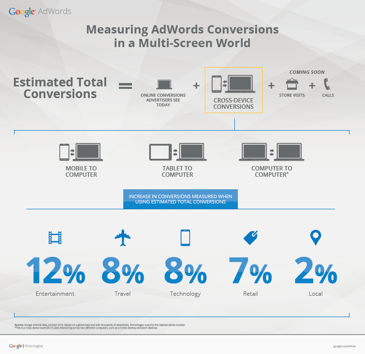
Measuring Google AdWords Conversions
Randy Krum
Mar
14
Mar 14
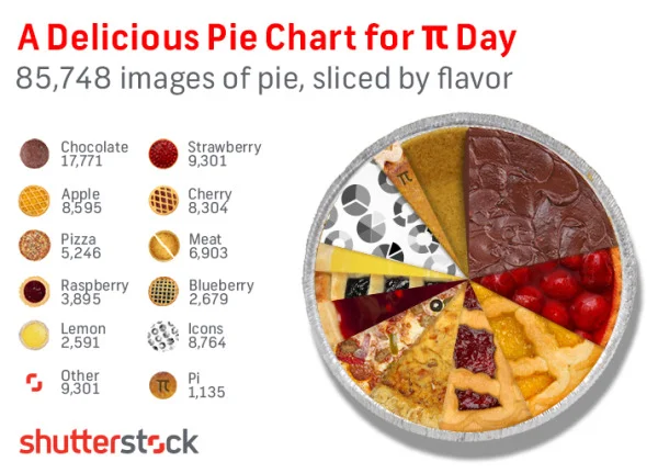
A Delicious Pie Chart for Pi Day!
Randy Krum
Jan
14
Jan 14
SEO & Infographics - an Interview with Eric Enge
Randy Krum
Jun
29
Jun 29
The Massive Challenge of Search Engine Complexity
Randy Krum
May
3
May 3
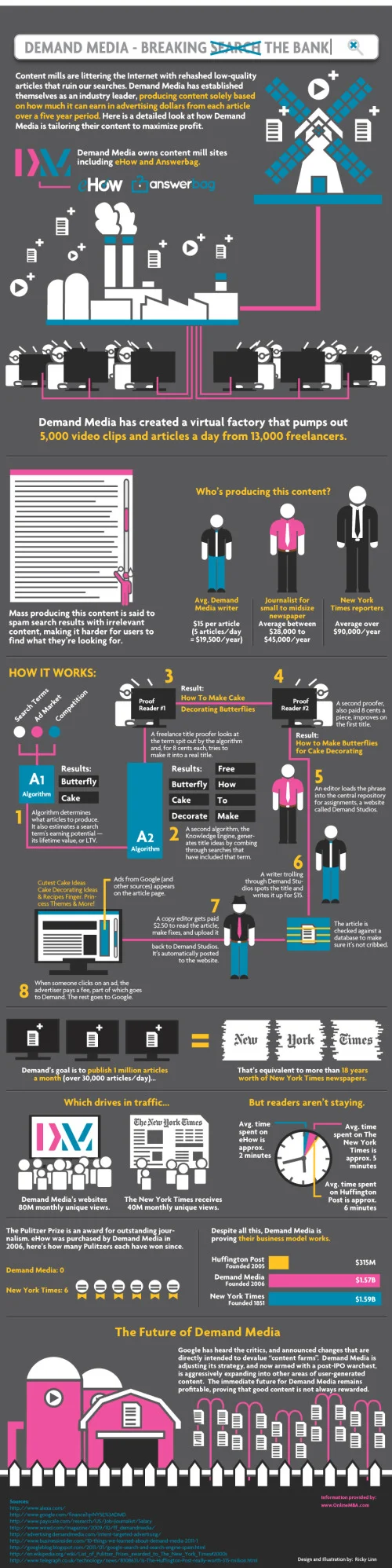
Demand Media - Breaking the Bank
Randy Krum
Nov
12
Nov 12
The Brutal Decline of Yahoo!
Randy Krum
Jun
30
Jun 30
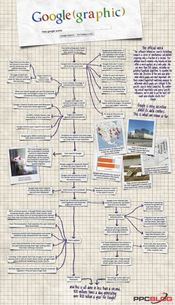
Google(graphic) - How Google Works
Randy Krum
Apr
21
Apr 21
The Social Media Effect
Randy Krum
Apr
20
Apr 20
The Visual FAQ of SEO infographic
Randy Krum
Mar
31
Mar 31
The World Christianity Maps
Randy Krum
Mar
10
Mar 10
What Do You Suggest? A Visual Search Interface
Randy Krum
Jan
19
Jan 19
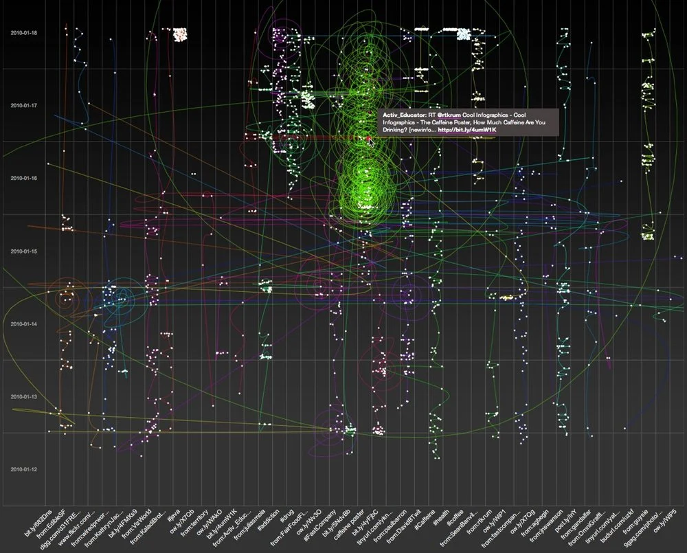
6 Twitter Topic Visualizations for "Caffeine Poster"
Randy Krum
May
21
May 21
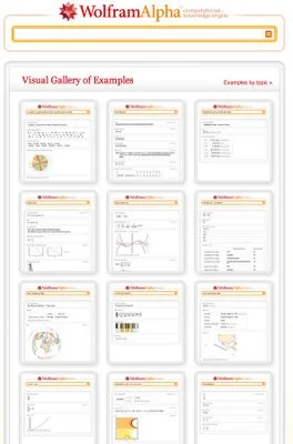
What is Wolfram|Alpha?
Randy Krum
Aug
6
Aug 6
Visual Baby Name Trends site
Randy Krum
Load More