Home
Infographics
Book
Tools
Tools Directory
DataViz Guides
DataViz Shows
Word Clouds
Sankey Diagrams
Online Infographics Design
Online DataViz
Analytics Platforms
Infographic Resumes
Vector Graphics
Icon Libraries
Color Pickers
Presentation Design
JavaScript Charts
Free Stock Images
Jobs
Posters
Links
Appearances
About
Contact
Follow Cool Infographics
Need Infographics?
Randy Krum
Designer | Author | Instructor | Speaker
FREE Sample Chapter
Read More
All tagged
pollution
Dec
8
Dec 8
The Global Carbon Budget 2015
Randy Krum
Nov
19
Nov 19
Go Green to Breathe Clean
Randy Krum
May
8
May 8
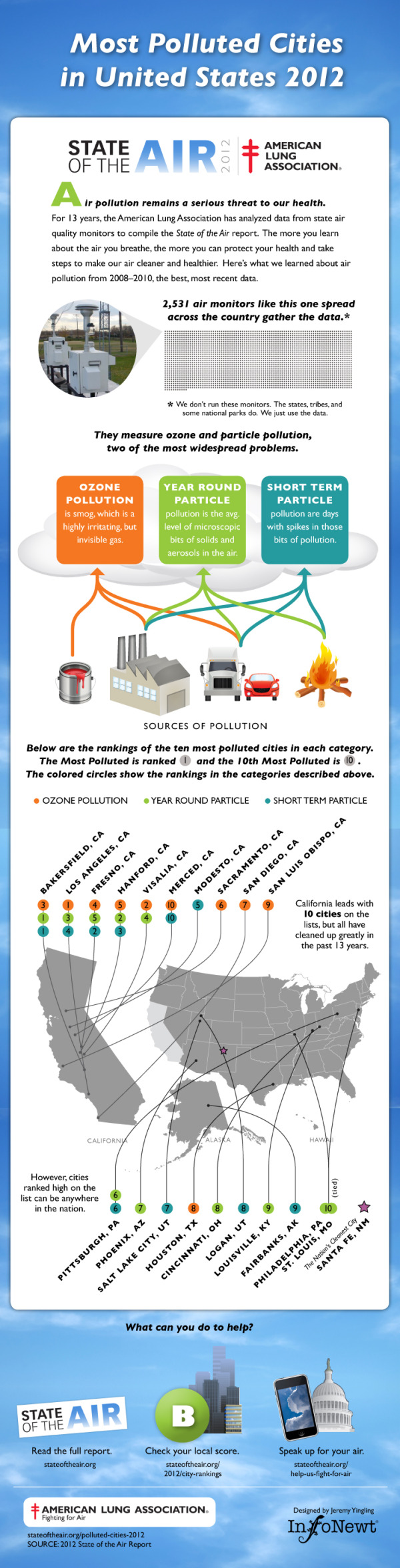
Client Infographic: Most Polluted Cities 2012
Randy Krum
Aug
9
Aug 9
Client Infographic: A Solar Innovation Story
Randy Krum
May
4
May 4
50 Cars or 1 Bus? Infographic Advertising!
Randy Krum
Apr
15
Apr 15
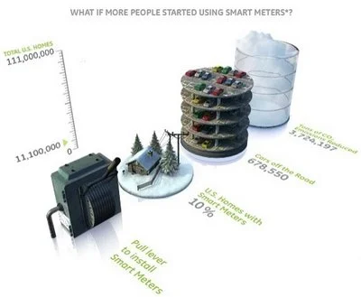
GE: Plug into the Smart Grid
Randy Krum
Mar
6
Mar 6
Ford's New Green HUD Designs
Randy Krum
Feb
9
Feb 9
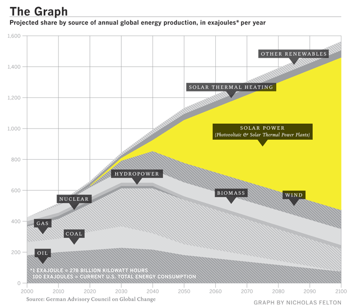
"The Graph" - The Future of Solar Power
Randy Krum
Oct
9
Oct 9
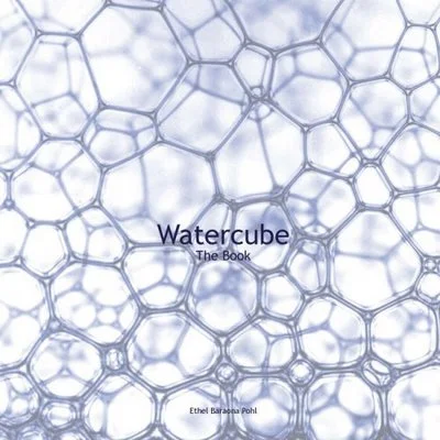
Watercube, The Book
Randy Krum
Sep
26
Sep 26
The Rush to Wind Farms!
Randy Krum
Aug
22
Aug 22
Beijing Air Quality Index
Randy Krum
Nov
22
Nov 22
TheGlobalWarming Infographic
Randy Krum
Oct
18
Oct 18
Plastic Bags
Randy Krum
Oct
4
Oct 4
Breathing Earth
Randy Krum