Home
Infographics
Book
Tools
Tools Directory
DataViz Guides
DataViz Shows
Word Clouds
Sankey Diagrams
Online Infographics Design
Online DataViz
Analytics Platforms
Infographic Resumes
Vector Graphics
Icon Libraries
Color Pickers
Presentation Design
JavaScript Charts
Free Stock Images
Jobs
Posters
Links
Appearances
About
Contact
Follow Cool Infographics
Need Infographics?
Randy Krum
Designer | Author | Instructor | Speaker
FREE Sample Chapter
Read More
All tagged
evolution
Mar
29
Mar 29
The Evolution of UK Company Logos
Randy Krum
Oct
25
Oct 25
Nature Timespiral
Randy Krum
Mar
5
Mar 5
The Evolution of Captain Marvel
Randy Krum
Feb
3
Feb 3
The Evolution of Technology Company Logos
Randy Krum
Jun
12
Jun 12
The Evolution of Life Poster
Randy Krum
Sep
4
Sep 4
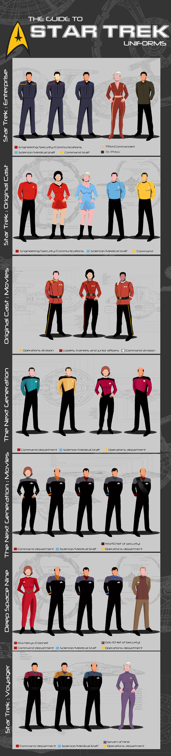
The Guide to Star Trek Uniforms
Randy Krum
Jun
3
Jun 3
The History of NFL Logo Designs
Randy Krum
Mar
20
Mar 20
The History of Home Heating
Randy Krum
Jul
31
Jul 31
Evolution of the F1 Car: Video & Infographic
Randy Krum
May
24
May 24
The Evolution of the Handgun
Randy Krum
Nov
21
Nov 21
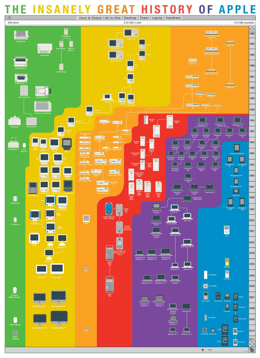
The Insanely Great History of Apple
Randy Krum