Home
Infographics
Book
Tools
Tools Directory
DataViz Guides
DataViz Shows
Word Clouds
Sankey Diagrams
Online Infographics Design
Online DataViz
Analytics Platforms
Infographic Resumes
Vector Graphics
Icon Libraries
Color Pickers
Presentation Design
JavaScript Charts
Free Stock Images
Jobs
Posters
Links
Appearances
About
Contact
Follow Cool Infographics
Need Infographics?
Randy Krum
Designer | Author | Instructor | Speaker
FREE Sample Chapter
Read More
All tagged
comic
Mar
5
Mar 5
The Evolution of Captain Marvel
Randy Krum
Sep
11
Sep 11
The Super Skin of Superheroes
Randy Krum
Jul
11
Jul 11
Fictional Travel Times Compared
Randy Krum
Oct
22
Oct 22
Murderers of Marvel
Randy Krum
May
11
May 11
History of the Batmobile
Randy Krum
Apr
28
Apr 28
Avengers Comic Book Cover Colors Data Visualization
Randy Krum
Mar
25
Mar 25
Ten Classic Superhero Vehicles
Randy Krum
Feb
4
Feb 4
The Evolution of Spawn
Randy Krum
Nov
4
Nov 4
Supermovies: Calendar of Comic Movies
Randy Krum
May
9
May 9
Comics That Ask "What If?"
Randy Krum
Jan
3
Jan 3
The Shield of Superman: The Evolution of an Icon
Randy Krum
Oct
11
Oct 11
xkcd - Tall Infographics
Randy Krum
Aug
29
Aug 29
Comic Tribute to Bill Watterson (Calvin & Hobbes)
Randy Krum
Jul
1
Jul 1
The Geek Zodiac
Randy Krum
May
13
May 13
Is Elon Musk The Real Life Tony Stark?
Randy Krum
Dec
24
Dec 24
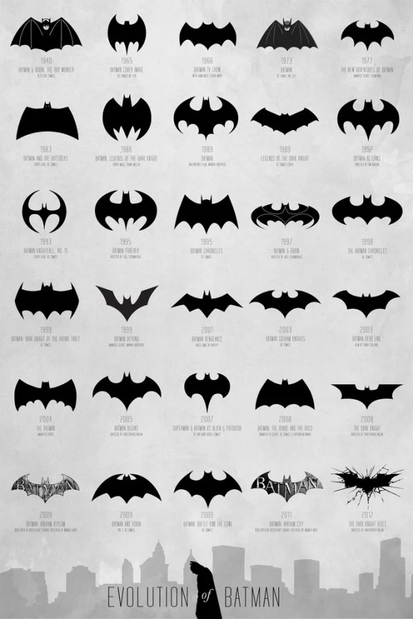
Evolution of the Batman Logo
Randy Krum
Jan
18
Jan 18
The X-Men Family Tree #infographic
Randy Krum
Jan
10
Jan 10
The (Visual) Evolution of the Batmobile
Randy Krum