Home
Infographics
Book
Tools
Tools Directory
DataViz Guides
DataViz Shows
Word Clouds
Sankey Diagrams
Online Infographics Design
Online DataViz
Analytics Platforms
Infographic Resumes
Vector Graphics
Icon Libraries
Color Pickers
Presentation Design
JavaScript Charts
Free Stock Images
Jobs
Posters
Links
Appearances
About
Contact
Follow Cool Infographics
Need Infographics?
Randy Krum
Designer | Author | Instructor | Speaker
FREE Sample Chapter
Read More
All tagged
clothes
May
26
May 26
The Colors of Mister Rogers' Cardigans
Randy Krum
Nov
17
Nov 17
Men's Hats - The Complete Guide
Randy Krum
Feb
3
Feb 3
Men's Dress Codes Made Simple
Randy Krum
Dec
17
Dec 17
An Illustrated Guide To The Galaxy Of Women's Shoes
Randy Krum
Aug
20
Aug 20
Why are Superior's Cotton Threads 'Superior'?
Randy Krum
Aug
19
Aug 19
Evening Etiquette: A Gentleman's Guide
Randy Krum
Aug
13
Aug 13
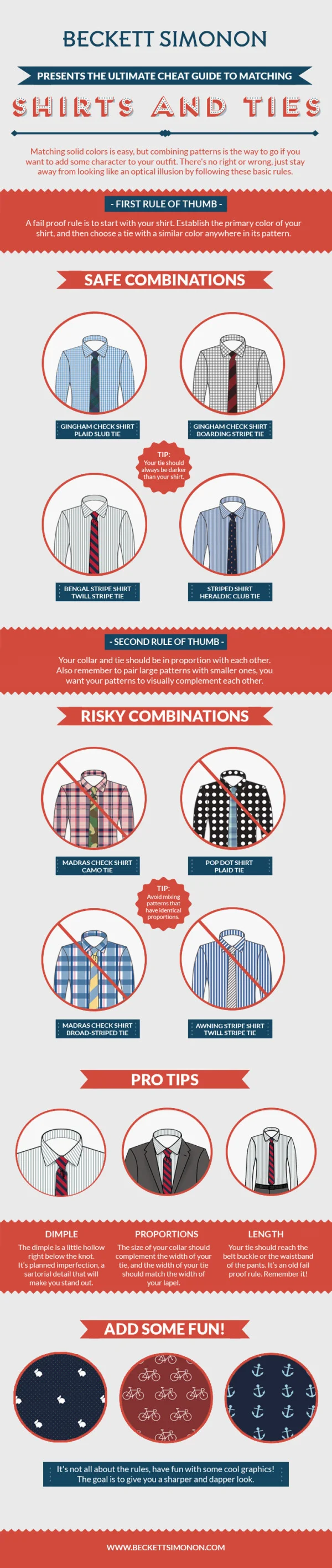
How to Match Shirt and Tie Patterns
Randy Krum
Jun
28
Jun 28
Ba-tee-nga: Sheldon Cooper Presents Fun With Tees
Randy Krum
Nov
27
Nov 27
Sheldon's T-Shirts of The Big Bang Theory
Randy Krum
Aug
27
Aug 27
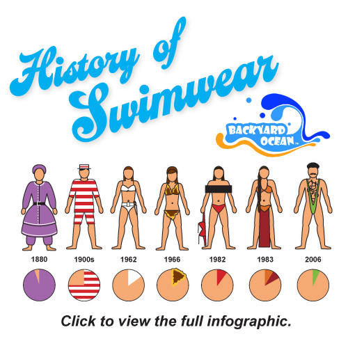
The Visual History of Swimwear
Randy Krum
May
17
May 17
INDi Unzipped - A Visual Business Plan?
Randy Krum