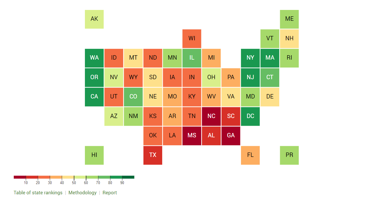
How can AI help with data visualization?

This image was created with the assistance of DALL·E 2
How can AI help with data visualization? This is the question I’ve been asking myself for the last few months. Can data visualization designers benefit from these tools?
The image above was generated in DALL-E 2 with the phrase “A simple pie chart as an oil painting in bright colors.” So far, I think the only use in our field is for aesthetic purposes. There’s no good way to tie it into a database or spreadsheet of data. When I tried the phase “Create a data visualization of the world's population” it came up with these artistic ideas that aren’t tied to any real data. You can see even the text is “Greeked” and not real.

Create a data visualization of the world's population
I’ve been hearing about programmers using ChatGBT (a text-based AI) to help develop code. They may not use the code that the AI generates, but it has given them new ways to think about coding a solution to whatever problem they were working on.
When I entered the phrase “Explain the appropriate use of a pie chart” in the AI chat, it actually came up with a really good explanation:
“A pie chart is a circular statistical graphic, which is divided into slices to illustrate numerical proportion. In a pie chart, the arc length of each slice is proportional to the quantity it represents. Pie charts are good for displaying data for two or three categories.
Here are some guidelines for using pie charts effectively:
Use a pie chart when you want to show the proportions of a whole.
Use a pie chart when you want to compare the parts to the whole.
Use pie charts when you have only a few categories (2-5). If you have more than six categories, consider using a bar chart instead.
Make sure the categories are clearly labeled and easy to understand.
Use a title that clearly and accurately describes the data.
Use data labels to clearly label the percentage or value for each slice of the pie.
In summary, pie charts are best used for comparing parts of a whole and for displaying data for a small number of categories.”
So, back to my original question. How can AI help with data visualization?
I like the idea that programmers are using it as a brainstorming tool to help find new coding solutions. I think data visualization designers can use the different AI tools as a source of inspiration to create new ideas for visualizing data. The results may be artistic, but we can take those ideas back into our own visualization tools to create the actual charts/graphs/maps/diagrams.
One immediate use case would for accessibility. Text-to-image generator tools can be used to test the effectiveness of the ALT TEXT description of your visualizations. You can try DALL-E 2, Craiyon and Midjourney. See if the generated image is anywhere close to your original chart. If not, you probably need to write more descriptive text.
Of course, these tools will continue to get better, but I think we’re a long way off from AI understands how to design good data visualizations built on real data that clearly communicate an insight or message to an audience.
What are your thoughts? Have you experimented with any of these tools to help with your data visualization design process?