Visualizing NBA Passing Frequency Data
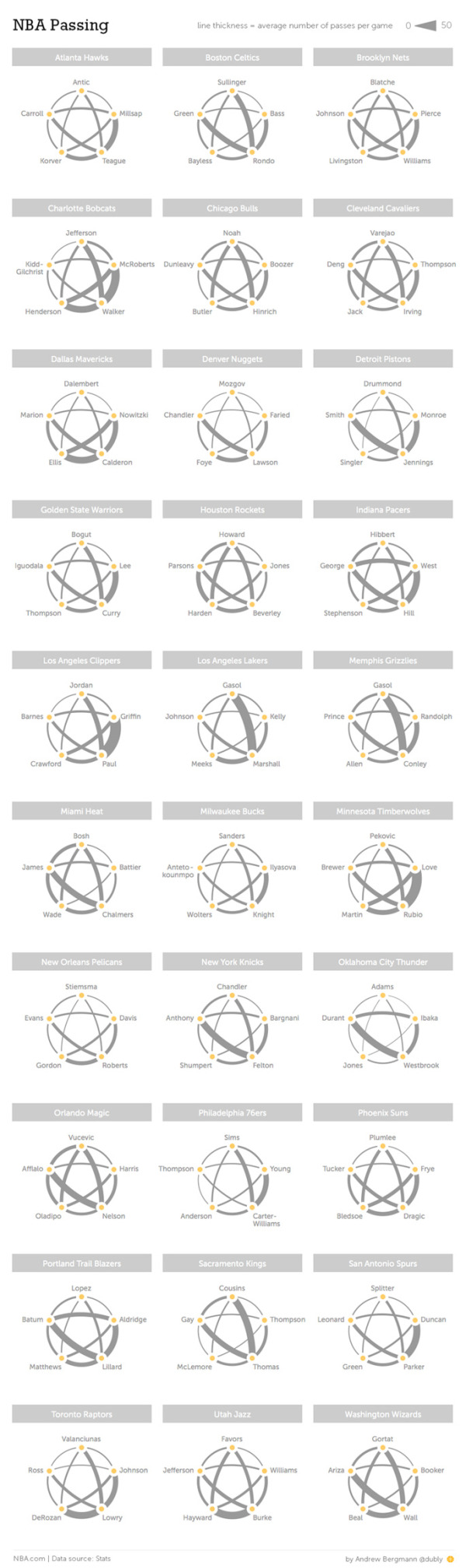
NBA Passing by Andrew Bergmann was designed for NBA.com. By analyzing data gathered by SportVU technology cameras installed in NBA arenas, the line thickness represents the average number of passes per game between specific players.
Here’s a look at how starters on all 30 NBA teams share the basketball.
The thickness of the gray lines on the accompanying chart represents the average number of passes per game between two players.
A very clear picture emerges on which teams distribute the ball more evenly between players, such as the Nets, Bulls and Cavaliers. On the flip side, Chris Paul and Blake Griffin dominate passing for the Clippers, and likewise for Kevin Love and Ricky Rubio of the Timberwolves.
This is a great way to visualize this data set. The visualization method is unique, memorable, and really makes the connections between players easy to understand.
The infographic vaguely lists the data sources at “Stats”, and the original post explains that the data is gathered from the newly installed SportsVU camera systems. However, the actual data is still unavailable for readers to investigate on their own. This design would have been a great opportunity for the data set spreadsheet to be shared with the audience through a public spreadsheet in Google Docs.
Knowing the infographic is going to be shared online, the image file should include the URL back to the original post on NBA.com. Don’t make it hard for readers to fit find the original, full-size version of your infographic.
Found on Flowing Data and Fast Company