


Serif vs. Sans: The Final Battle
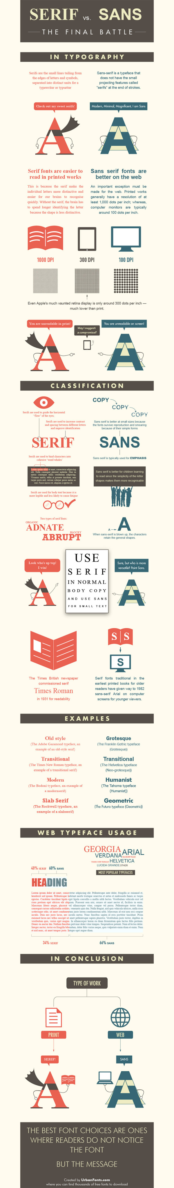
Ever have a problem deciding whether to use Serif or Sans? The Serif vs. Sans: The Final Battle infographic from webdesignerdepot.com has broken down when and why you should use each one. The final verdict? Serif is better for print and Sans is better for web.
First it was the Capulets versus the Montagues; then it was Coke versus Pepsi; and the latest epic battle? Serif versus sans-serif, of course.
Lucky for us, the crew at UrbanFonts has produced a nifty infographic to help clarify the age-old rivalry between serif and sans. Brief, yet information-packed, it covers everything from DPI to classification, and expertly explains why serif is better for print and sans serif is best suited for web.
This clever infographic — that smartly draws upon humor to drive home its points — offers a simple, insightful conclusion that designers should bear in mind: “The best font choices are ones where readers do not notice the font … but the message.”
Thanks to Jordan from Say It Visually for sending in the link!


