About

Randy Krum

President of InfoNewt.
Data Visualization, Infographic Design, Visual Thinking, Product Development and Marketing professional fascinated by good infographics.  Always looking for better ways to get the point across.


Like us on Facebook to help spread the word!

Click +1 to give us your stamp of approval or just to say “this is pretty cool.”

Infographic Design


Search the Cool Infographics site

Custom Search

Design Contest!

Infographic Design Contest!

Enter to win an iPad 2!

Subscriptions:


How to add the
Cool Infographics button to your:

- iPhone
- iPad
- iPod Touch


Read on Flipboard for iPad and iPhone

Featured in the Tech & Science category

The Cool Infographics Gallery on Pinterest

Strata Conference 2012

Follow Me!


Follow Randy (@rtkrum) 

Blog posts ONLY on Twitter

Twitter List: Cool Infographics People

Twitter Feed
Caffeine Poster

Gadget Map

Google Insights

« Sushi Etiquette | Main | Seven Deadly Sins Nationwide »
Thursday
May142009

Who is Coming to America?


From GOOD magazine.  If you look closely, this is essentially a bar chart dressed up, but it's the dressing up into the shape of the U.S. flag that catches your eye.  I love it!
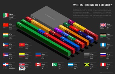
Immigration may have taken a back seat during the financial crisis, but the issue still needs resolving. While illegal immigrants sneaking over the border is still a primary concern, it’s good to know who came to our country legally, and from where. Our latest Transparency is a look at the 20 countries from which the most people came to America in 2008, how many immigrants already had family here, and how many received asylum when they arrived on our shores.
Found on SimpleComplexity.net, thanks Nathan!

PrintView Printer Friendly Version

EmailEmail Article to Friend

Reader Comments (2)

It's a nice design, but it fails to communicate a coherent message. It's obvious to see that lots of people are immigrating from Mexico and from "all other countries" to the US, but that's about it. Who is next after that? You can see it's China, once you guess that the blocks of text with the detailed numbers are in descending order, but that's not obvious. The 3d American Flag layout of this graphic adds no information whatsoever, and actually forced the designer to scramble the data for the purpose of the display, which is poor practice. The design should serve the data, not the other way around. To convey this message, they would have been better off with just a table of numbers, with the country name in column 1, and the total in column 2. Then, you would immediately know which countries the greatest numbers of immigrants are coming from, without having to parse this arrangement. If you wanted to be able to compare them easily, a normal bar chart would have done the job better than this cryptic graphic.

May 17, 2009 | Unregistered CommenterMark Middleton

I find this chart confusing---where is Nigeria, with over 300,000 immigrants to the US each year? Was the point of the chart to make the Central American countries have more of a pull?

May 22, 2009 | Unregistered CommenterDeziginer

PostPost a New Comment

Enter your information below to add a new comment.

My response is on my own website »
Author Email (optional):
Author URL (optional):
Post:
 
All HTML will be escaped. Hyperlinks will be created for URLs automatically.