Home
Infographics
Book
Tools
Tools Directory
DataViz Guides
DataViz Shows
Word Clouds
Sankey Diagrams
Online Infographics Design
Online DataViz
Analytics Platforms
Infographic Resumes
Vector Graphics
Icon Libraries
Color Pickers
Presentation Design
JavaScript Charts
Free Stock Images
Jobs
Posters
Links
Appearances
About
Contact
Follow Cool Infographics
Need Infographics?
Randy Krum
Designer | Author | Instructor | Speaker
FREE Sample Chapter
Read More
All tagged
video
Oct
7
Oct 7
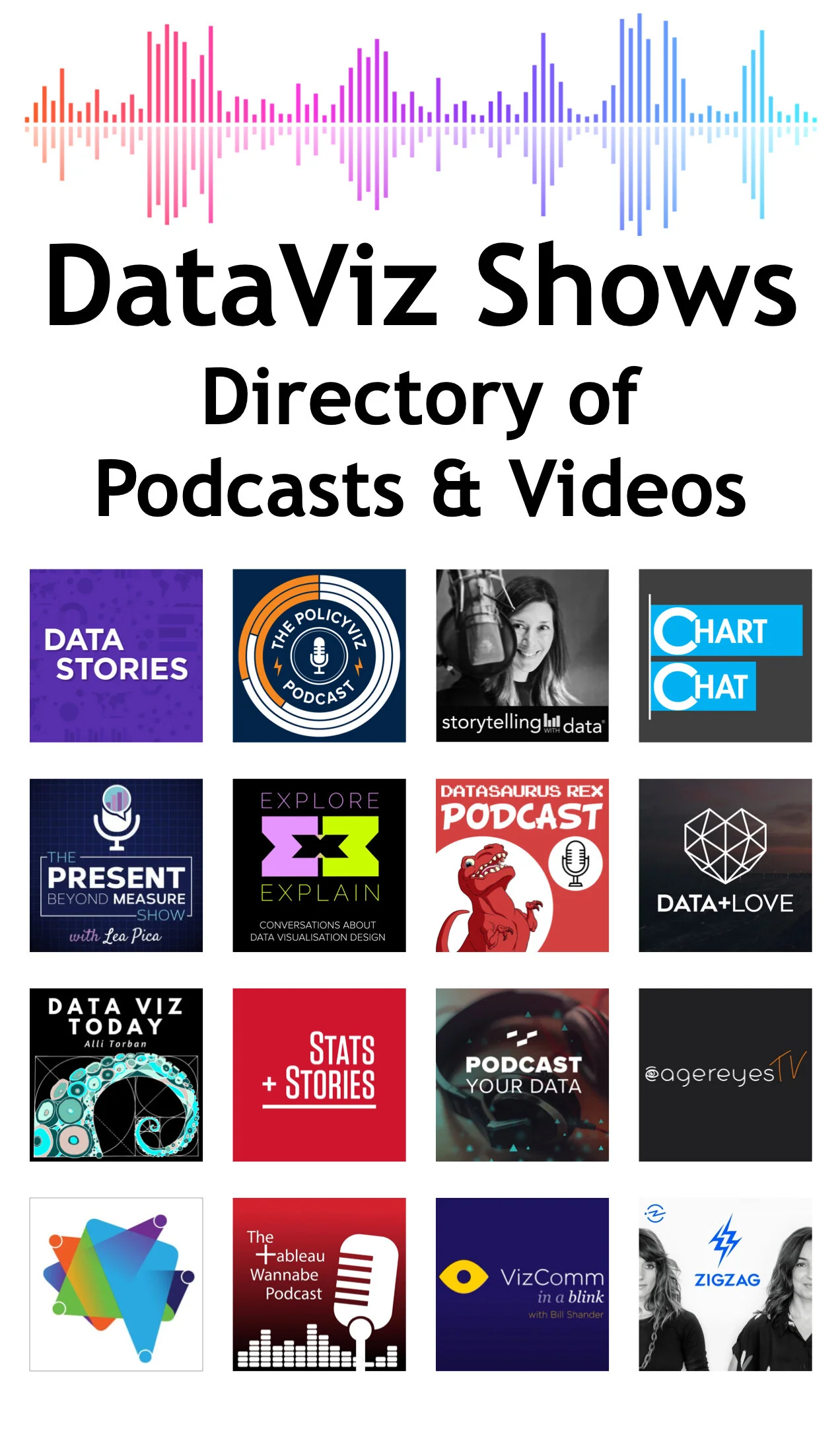
16 DataViz Shows: Podcasts and Video Series
Randy Krum
Jul
10
Jul 10
Everything You Need to Know About TikTok as a Business
Randy Krum
Apr
14
Apr 14
10 Things To Do Before Any Video Interview
Randy Krum
Nov
25
Nov 25
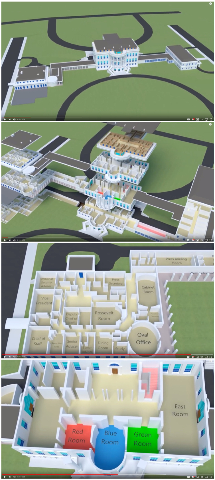
What's Inside the White House?
Randy Krum
Oct
22
Oct 22
Star Wars Size Comparison Video
Randy Krum
Aug
16
Aug 16
NCAA 2018 - Basketball Shot Visualisation
Randy Krum
Mar
1
Mar 1
Animated DataViz: Top 15 Best Global Brands Ranking (2000-2018)
Randy Krum
Oct
10
Oct 10
4 Ways to Set Up Your Talking Head Shots
Randy Krum
Feb
6
Feb 6
The ICO Explosion of 2017
Randy Krum
Jan
28
Jan 28
Design Better Charts in PowerPoint Class on Skillshare
Randy Krum
Jul
24
Jul 24
Laniakea: Visualizing Our Home Supercluster
Randy Krum
Oct
10
Oct 10
5 Great TED Talks about DataViz
Randy Krum
Jun
13
Jun 13
Choosing the Right Explainer Video
Randy Krum
May
16
May 16
Kung Fu Motion Visualization
Randy Krum
Apr
18
Apr 18
Experts Predict the Future of Data Analytics and Visualization
Randy Krum
Feb
15
Feb 15
What Happens on YouTube in 24 Hours?
Randy Krum
Dec
14
Dec 14
DataViz Gift Guide 2015
Randy Krum
Oct
12
Oct 12
Giveaway: Data Visualization Training Video Package
Randy Krum
Aug
21
Aug 21
Visual Storytelling: The Big Trend for SXSW 2016
Randy Krum
Jun
15
Jun 15
Infographics Are Evolving into Many Formats
Randy Krum
Load More