Home
Infographics
Book
Tools
Tools Directory
DataViz Guides
DataViz Shows
Word Clouds
Sankey Diagrams
Online Infographics Design
Online DataViz
Analytics Platforms
Infographic Resumes
Vector Graphics
Icon Libraries
Color Pickers
Presentation Design
JavaScript Charts
Free Stock Images
Jobs
Posters
Links
Appearances
About
Contact
Follow Cool Infographics
Need Infographics?
Randy Krum
Designer | Author | Instructor | Speaker
FREE Sample Chapter
Read More
All tagged
security
Aug
9
Aug 9
MacBook Setup Essentials for College Students (2021 UPDATE)
Randy Krum
Aug
13
Aug 13
MacBook Setup Essentials for College Students
Randy Krum
Jan
2
Jan 2
Securing Your CryptoCurrency Trading Account
Randy Krum
Oct
6
Oct 6
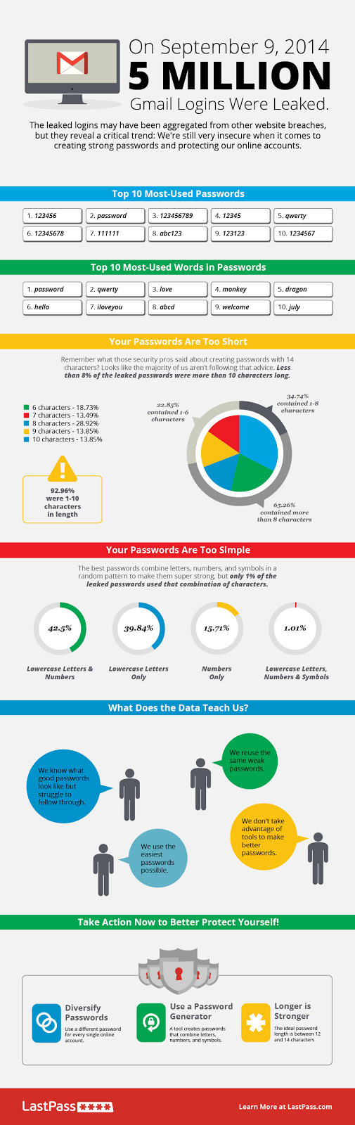
The Scary Truth About Your Passwords: An Analysis of the Gmail Leak
Randy Krum
Nov
22
Nov 22
EFF Encrypt The Web Report
Randy Krum
Aug
22
Aug 22
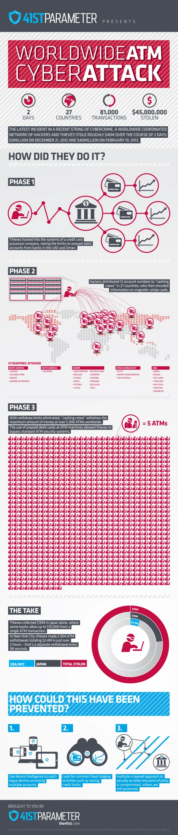
Worldwide ATM Cyber Attack
Randy Krum
Mar
22
Mar 22
460 Million Connected Internet Devices
Randy Krum
Jan
7
Jan 7
Can You Protect Yourself from Hackers at CES?
Randy Krum
Dec
24
Dec 24
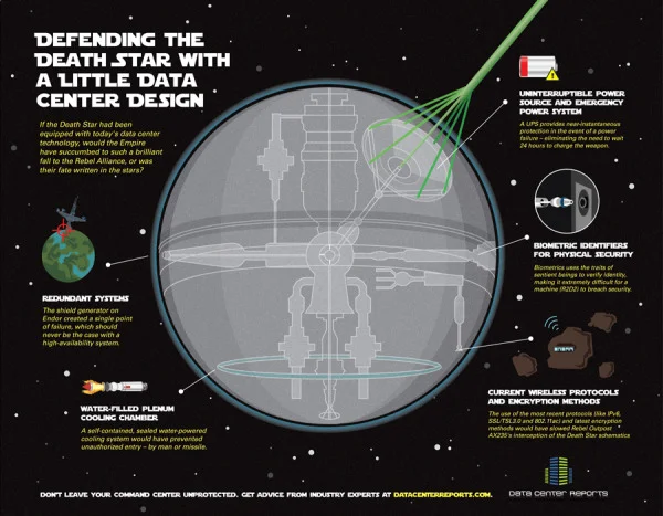
Defending the Death Star
Randy Krum
Jun
23
Jun 23
Stuxnet: Anatomy of a Computer Virus [video]
Randy Krum


![Stuxnet: Anatomy of a Computer Virus [video]](https://images.squarespace-cdn.com/content/v1/5bfc8dbab40b9d7dd9054f41/1552606954192-3PTOIS6H0BIUPGTXH4S5/Screen+Shot+2019-03-14+at+5.41.03+PM.png)