Home
Infographics
Book
Tools
Tools Directory
DataViz Guides
DataViz Shows
Word Clouds
Sankey Diagrams
Online Infographics Design
Online DataViz
Analytics Platforms
Infographic Resumes
Vector Graphics
Icon Libraries
Color Pickers
Presentation Design
JavaScript Charts
Free Stock Images
Jobs
Posters
Links
Appearances
About
Contact
Follow Cool Infographics
Need Infographics?
Randy Krum
Designer | Author | Instructor | Speaker
FREE Sample Chapter
Read More
All tagged
presidential
Apr
30
Apr 30
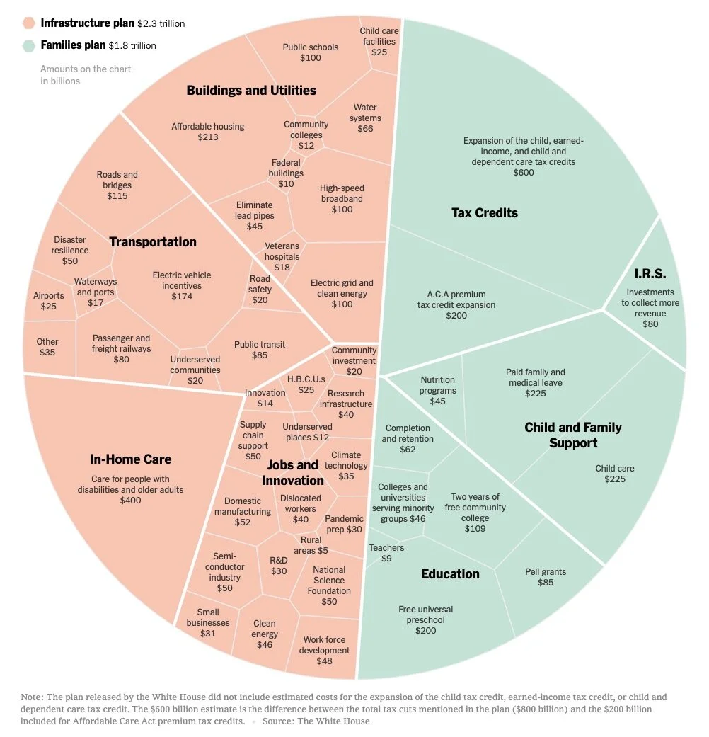
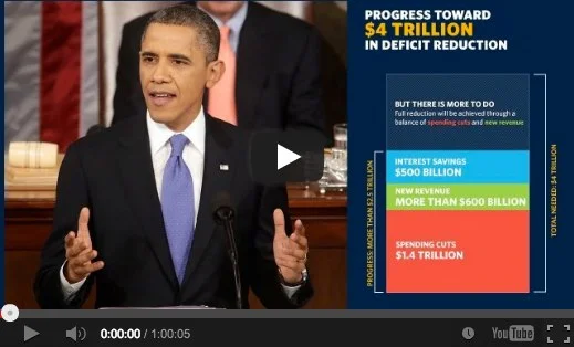
President Biden’s $4 Trillion Economic Plan, in One Chart
Randy Krum
Sep
12
Sep 12
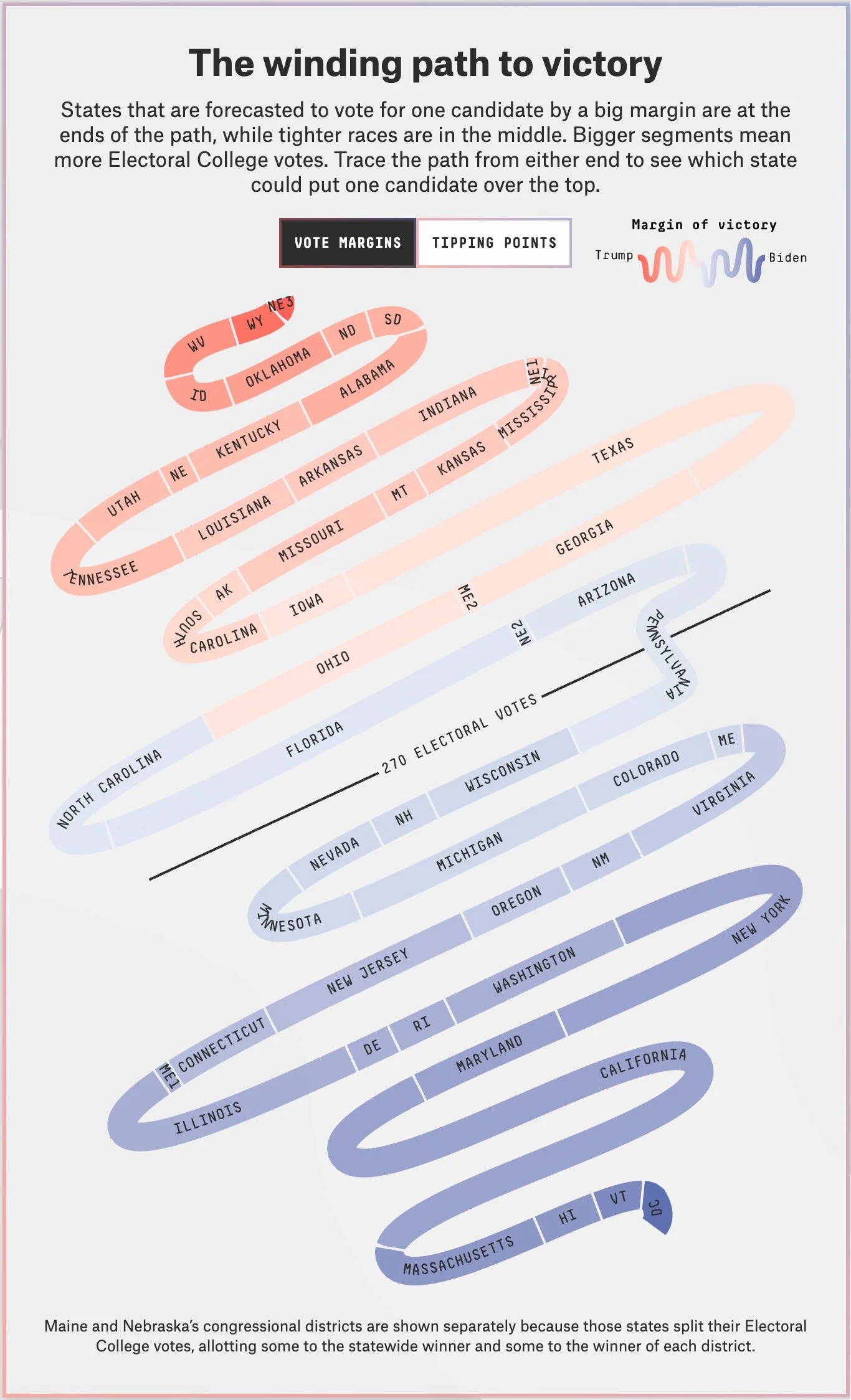
Meet the New "Snake Chart"
Randy Krum
Dec
16
Dec 16
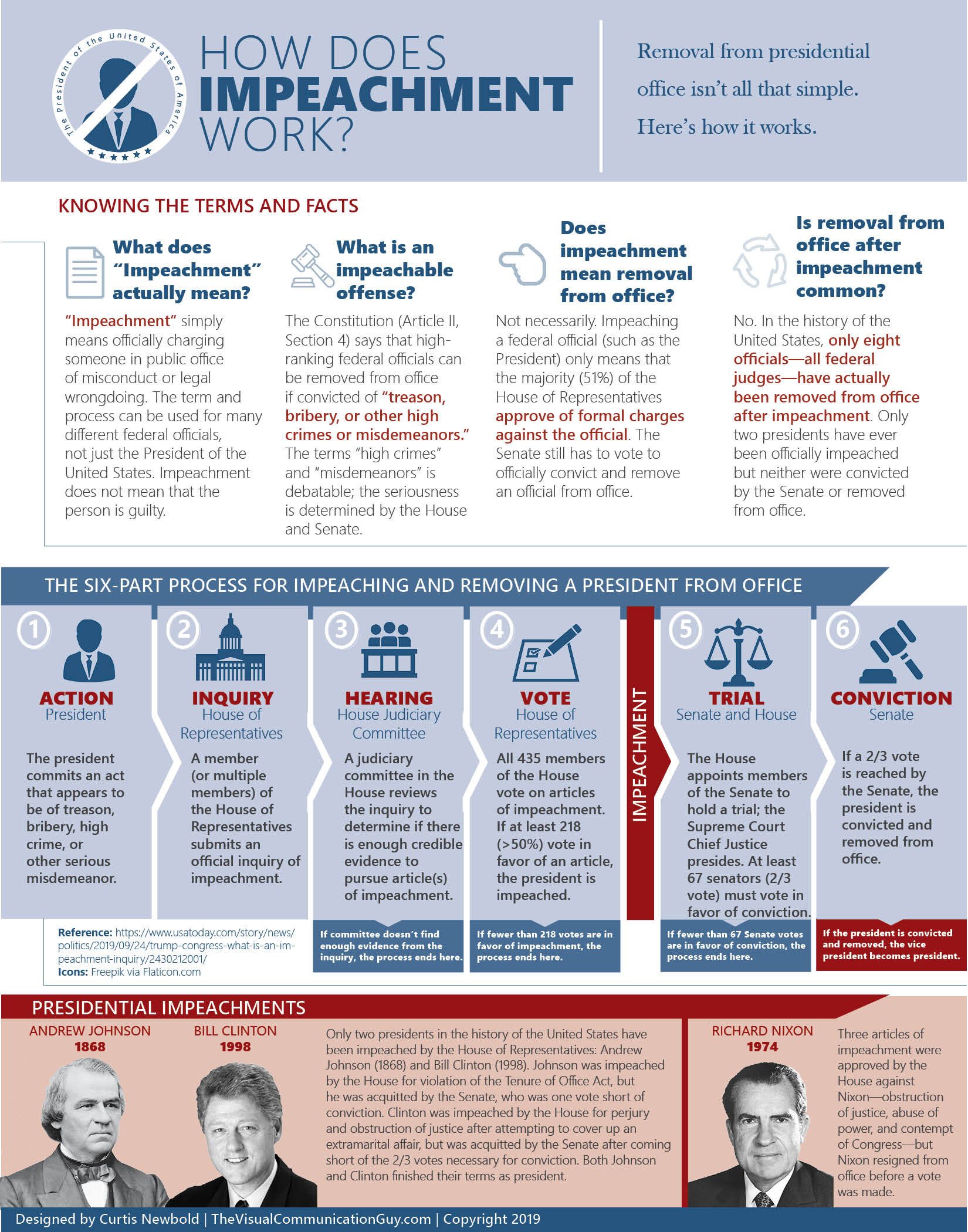
How Does Impeachment Work?
Randy Krum
Aug
9
Aug 9
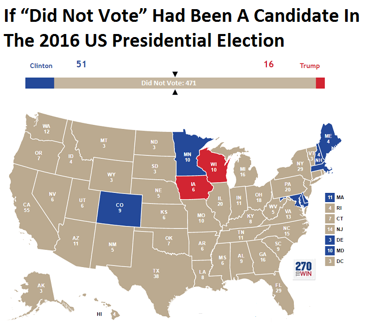
Landslide for the "Did Not Vote" Candidate in the 2016 Election!
Randy Krum
Mar
4
Mar 4
Planes, Trains & Automobiles of U.S. Presidents
Randy Krum
Aug
25
Aug 25
Examining the Real Cost of Donald Trump's Wall
Randy Krum
Aug
9
Aug 9
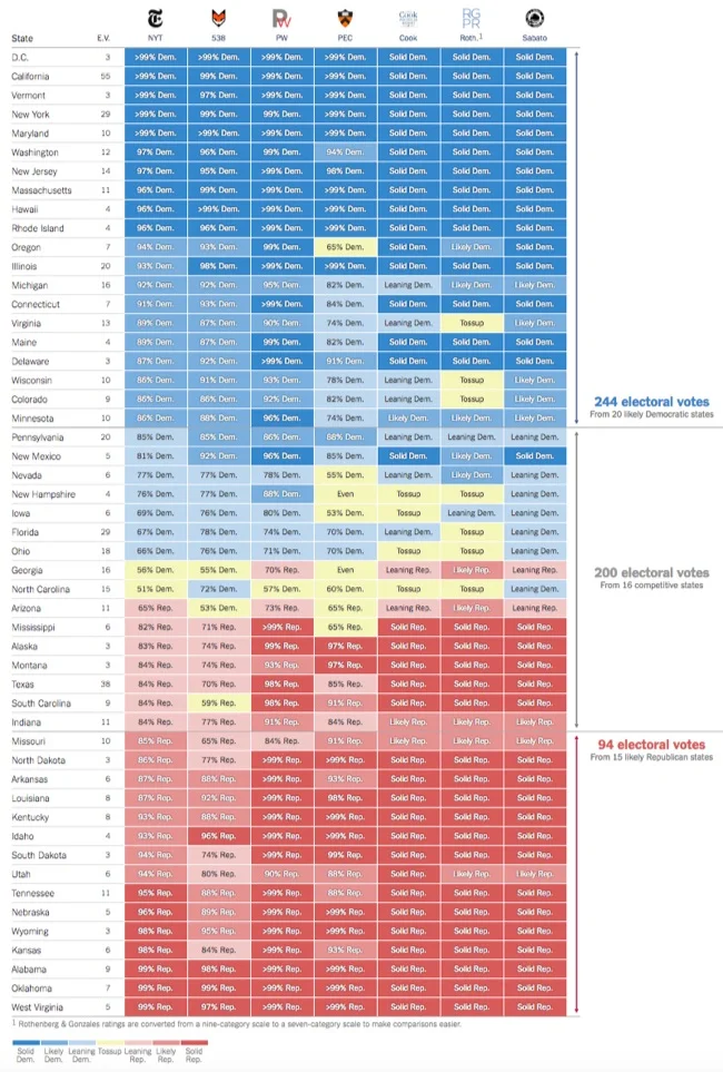
Comparing Presidential Election Forecasts
Randy Krum
Aug
3
Aug 3
Very Few Americans Nominated Trump and Clinton
Randy Krum
May
17
May 17
Election Exodus - Moving to Canada?
Randy Krum
Jun
5
Jun 5
Legislative Explorer: Watch Government In Action
Randy Krum
Oct
17
Oct 17
What is the Debt Ceiling?
Randy Krum
Jul
26
Jul 26
Death & Taxes 2014 Poster and Interview
Randy Krum
Jul
22
Jul 22
What the Health? Understanding Obamacare's 11 Year Health Plan
Randy Krum
May
20
May 20
The Obama Energy Agenda: Gas Prices 2013
Randy Krum
Apr
30
Apr 30
White House will be Posting More Infographics
Randy Krum
Feb
20
Feb 20
NPR Chart Check from the Enhanced State of the Union (SOTU)
Randy Krum
Nov
2
Nov 2
How to Travel Like a President
Randy Krum
Oct
11
Oct 11
Obamacare: The Price of Socialized Medicine
Randy Krum
Sep
6
Sep 6
White House Infographic: Extending Middle Class Tax Cuts
Randy Krum
Dec
6
Dec 6
Timeplots Poster Sale - 30% OFF!
Randy Krum
Load More